Interview with Book Designer Leo Nickolls | Spine Magazine Collaboration
Harry Potter Sketchbook Tour
My Favourite Art Supplies
Illustration and Picture Books
Harry Potter Book Covers | 31 Day Challlenge
Interview with Suzanne Dean, Creative Director at Vintage Books | Spine Magazine Collaboration
Harry Potter International Book Covers
The Girl Guide | An Interview with Sinem Erkas and Marawa Ibrahim
Book Design | Naked Hardbacks | Spine Magazine Collaboration
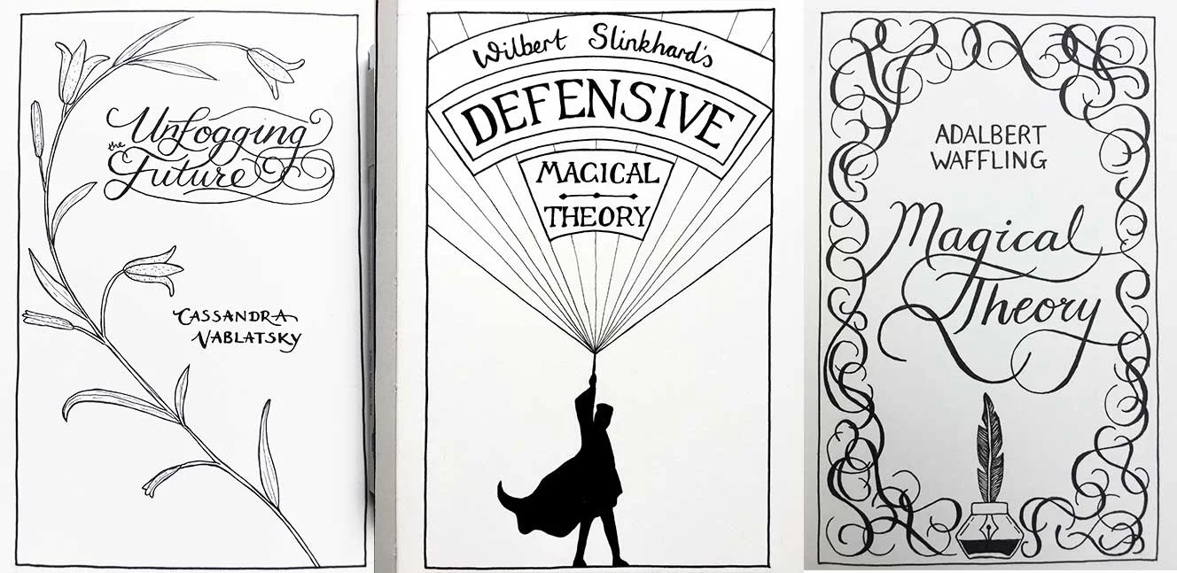
Harry Potter Textbook Covers: An Epic, of Sorts
The Harry Potter textbook covers are live on my website!
Drawings for the 31 covers were created over the month of July 2017, and I have been colouring them since then. Here’s the link to the brief that I set myself at the beginning of the month.
Constraints breed creativity...
The interesting thing about doing a daily challenge like this is that you have to go with your first idea, as you don’t have time for a lot of brainstorming. My Pinterest board of vintage book covers was my reference point throughout the project. I would look through the board until I found a composition or typography style that I could use as a springboard for my own design.
...but so does freedom
The great thing about this challenge was that there was very little information about the books themselves. This gave me the freedom to interpret the title as I liked, an opportunity not often given to cover designers. That said, I did particularly enjoy designing the covers for Tales of Beedle the Bard, Quidditch Through the Ages and Fantastic Beasts and Where to Find them, all of which have published texts associated with them. I wanted to make them very different from the published versions, as well as those created for the films, while also making them look credible within the world of the books.

Fictional non-fiction
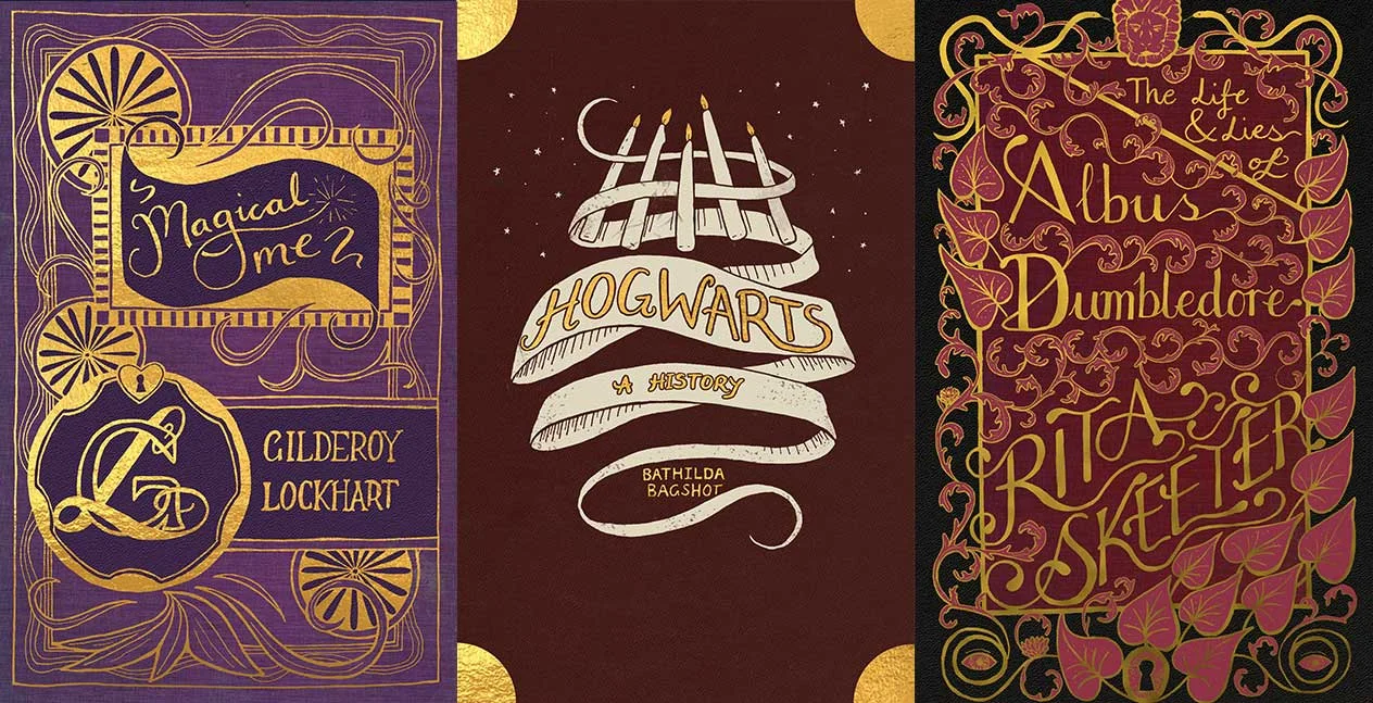
This is one of my first forays into non-fiction cover design. Ironically, the non-fiction is fictional, so had to fit within the visual language of the Harry Potter universe. The way that J.K. Rowling describes objects within the Wizarding World suggests that wizards have appropriated and modified a hodge-podge of muggle artifacts, as well as creating their own from scratch. Having the books take influence from Victorian book design made a lot of sense, as well as allowing me to do a deep-dive into the history of the books of this time. As well as fictional works, I looked at textbooks and non-fiction from the late 19th Century through to the 1940s. Non-fiction covers can be, and often have to be more literal than fictional works. I found that this left me with more time to focus on the typography and illustration.
Drawing from the books...
There were a few times where additional knowledge from the books was very helpful, rather than just going on the title and author alone. The first cover, Hogwarts: A History features the floating candles of the great hall, first described in Harry Potter and the Philosopher’s Stone. The Gilderoy Lockhart covers subtly mock the wizard’s hubris, using excessive amounts of gold, silver and rich colours. The Rita Skeeter biographies, widely known for being more fiction than fact, hold her name in as high esteem as the wizards she is featuring. The biopic of Albus Dumbledore is a tangle of vines, and at the top shows a pair of snakes whispering into the ears of a lion, a reference to the headmaster’s secret past.
...and interpreting from the titles
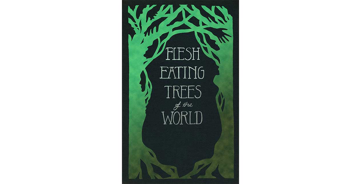
My favourite of the set is still Flesh Eating Trees of the World. This is an example where I only had the title to go on. The book has no credited author and the only mention of flesh-eating trees in the books is the reference to this textbook. The design became an exercise in negative space. How could I make the cover look like fairly normal trees at first glance, with a more sinister message lurking underneath? I’m pretty chuffed with how it turned out.
Click here for the full 31 covers.
And here's a video I made looking through my sketchbook at the original inked covers.
Harry Potter Book Cover Challenge
For the jolly month of July I am doing a Harry Potter themed 31 day challenge. This is based along the lines of Inktober. Each day I will have a different Hogwarts textbook, or text mentioned in the Harry Potter books or films, and I will create a new cover design in ink.
Objectives:
To improve my lettering and inking skills.
To make daily posts on Instagram and potentially reach more people.
To have a set of designs at the end of the month that I can publish in a booklet.
To have a set of drawings ready to be made into final designs for my portfolio.
Parameters:
Drawings must be completed in ink, but can be sketched in pencil first.
I am allowed to sketch and plan ahead of time. The finished drawings must be posted to social media daily in July with the hashtag #hpbookcovers.
Each drawing will be a lettering piece that will fit into the portrait format of a book cover.
The vision is for these to be able to be printed in one or two colours onto a single-colour background, giving the set of drawings a cohesive vintage look.
Inspiration:
Drawings are modelled on vintage book covers from the late 19th Century/early 20th Century. Here is the Pinterest board of influential covers.
Q&A
What does your typical day look like for you?
At the moment I get up at around 5am and start by doing some creativity exercises. Then I'll write, maybe a blog post, or the outline for a video. Following these two things I’ll start on whatever the most important task is. After breakfast I’ll check my emails and get ready for the day. If I don’t have to go to my day job I’ll keep working on whatever is most important. I love getting up early because I can get so much accomplished before the rest of the world is awake.
Do you have any particular methods for coming up with concepts?
Yes. I use a method that I call 3x3, which I’m going to film a video on shortly. Each morning I get Goodreads to randomly generate three titles that I’ve read in the past, and I have to come up with three concepts for each. They don’t have to be good ideas, but I find that this is a great way to give that creativity muscle a workout every day. It also means that I have a library of ideas at my disposal whenever I want to do a self-initiated project.
Where do you look for inspiration?
It depends on the project. If it’s a period piece and that’s what I want to focus on, then I’ll look for typography from that time. That usually starts with a Google search, although sometimes it’s nice to go straight to my bookshelf. For things like colour schemes I’m more likely to look to physical books.
How do you know when a design is finished?
You don’t exactly. You can always push a design further, but there's a time when that ceases to be helpful. I try to work on a design in concentrated periods of work. If I let it sit around for too long it becomes stale and I can’t look at it objectively - that’s where I really struggle to know when it’s done or not. Speed is the best way I’ve found to combat this.
What is the single most valuable thing that you do in your design work?
Recently, the creativity exercises. It often pushes me out of my comfort zone, but there isn’t that pressure to make anything great. I just have to come up with three concepts. They don't have to be good ones.
Have you got any exciting projects coming up?
Yes! I’m working on some typographic covers for Sarah Waters’ novels. It’s been a few years since they were updated and I thought it would be a fun challenge to help me practice my hand lettering. I’m also going to be doing some Harry Potter related designs, which is always fun. In the month of July I’ll be doing 31 days of Harry Potter hand lettering, based on the titles of books in the Wizarding World. I’m also planning a series of covers for the Harry Potter books themselves, which I’m Siriusly excited about!
What ratio of your work is analogue to digital?
Probably about 90% of what I do is analogue. I like sketching, but don't enjoy doing it on a computer. For a final design it’s probably more like 60% analogue to 40% digital, but if we include all of the doodles, sketches and scribbles, then the vast majority of my work is done on paper.
What design resources do you use on a regular basis?
My everyday tools are a sketchbook and pencil. I like to use a mechanical pencil, and I carry these two things with me everywhere. The social media platform I use the most, aside from YouTube is Instagram. I’m working up to posting on there daily again. In July I want to be posting my Harry Potter designs each day. For inspiration I use Pinterest to keep track of visuals that I want to be able to reference again. I also read Spine Magazine, which is an online and print magazine about book design. The interviews are especially fascinating, as I’m always interested in the processes of other designers.
Do you have a favourite project that you’ve worked on?
It’s always the one that I’ve just finished, or the one I’m working on. I have a tendency to look back on my work, even from a few months ago and say ‘I could do that better now.’ It’s good because it means that I’m always growing, but it’s very frustrating too. Sometimes I have to restrain myself from going back and changing old designs, because I think it’s important to see that development over time. As I do better work I can always replace the old designs in my portfolio.
You use a variety of different mediums in your work. Is there one that you most enjoy?
What I most enjoy is mixing it up. If I just worked in watercolour, for instance, I think I’d get bored of it pretty quickly. One of the great joys of book design is that you can work in so many different mediums. I’d definitely go stir crazy if I could only work digitally. The tactile and potentially messy side of things, the process of figuring out how to photograph something in the most effective way, or how to use unlikely found objects to create a typeface - to me that’s the true joy of creativity.
What do you think makes a great book cover?
It always comes back to an element of surprise. I can’t say that I always achieve this in my own work, but it’s something I strive for. Whether it’s something hidden on the cover that isn’t apparent immediately, or something truly surprising in the design at face value. I think that it’s our job as designers - to challenge, or delight the viewer, and sometimes both.
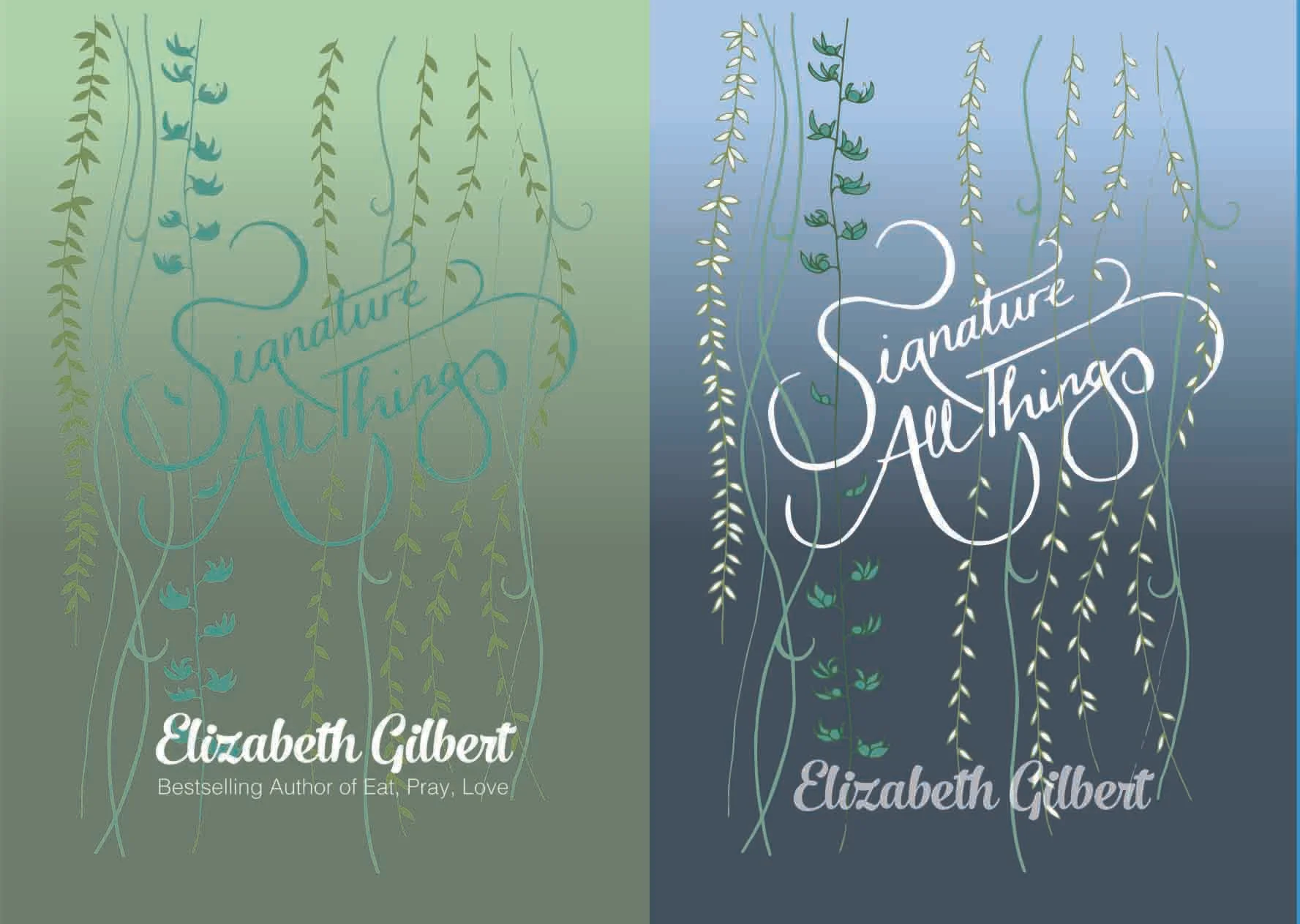
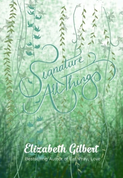
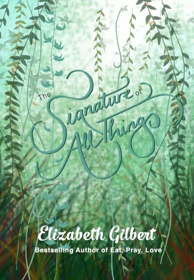
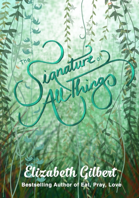
Making The Signature of All Things
I listened to the audiobook of The Signature of All Things during my first trip to Kew Gardens last year and was completely swept away in the historical world that Gilbert created. I wanted to make a cover that represented the beauty and strangeness of this novel, while also conveying the core theme of connection. The title, Signature of All Things comes from an theory developed in the 1500s of all natural things being marked by God with clues as to their purpose to humans, implying an interconnectedness of all living things. This is what I wanted to capture in the typography that I used.
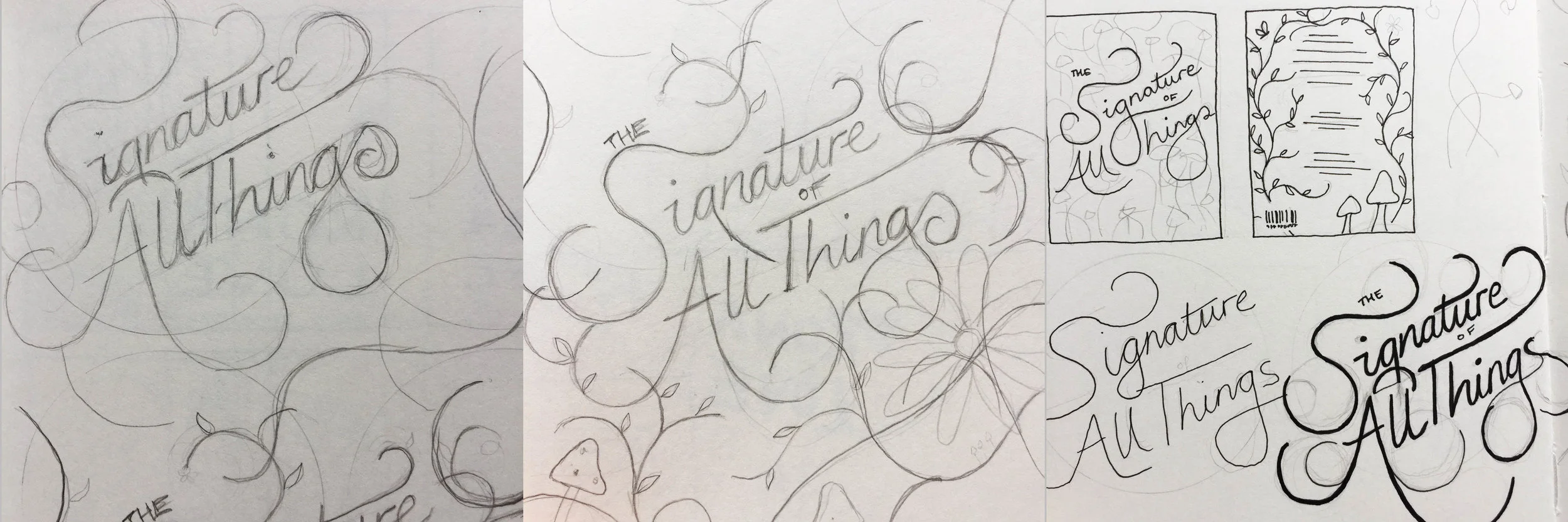
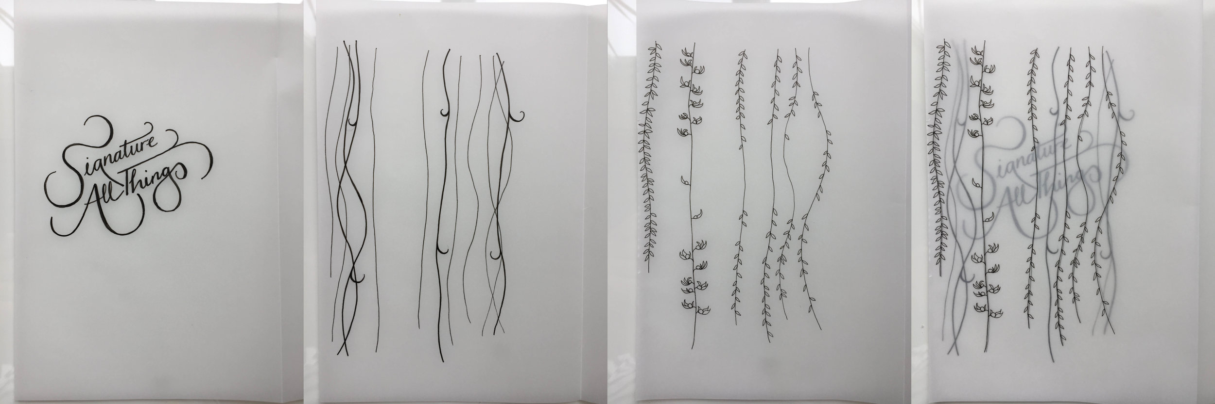
To begin with I sketched out the words, experimenting with different ways they could connect. I looked at creating swirling flower patterns that looped into the type. I liked this, but it looked a little too quaint and manicured, and the aspects of nature that Alma, the protagonist, explores are wild and mysterious.
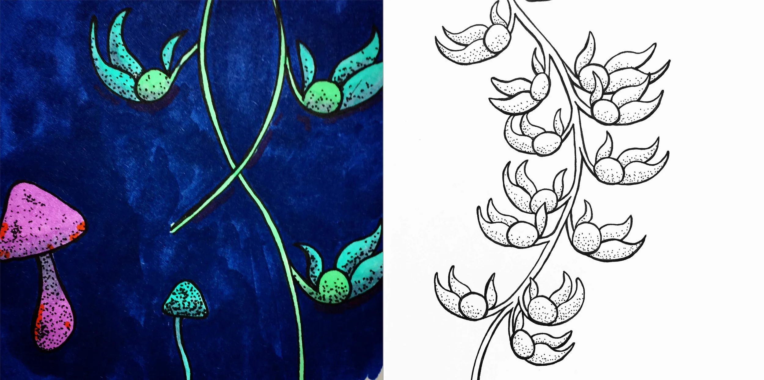
The island of Tahiti is a key component to the novel, so I looked for plants that were native to that place. I discovered that the Strongylodon Macrobotrys vine is native to Tahiti, and it was a plant that I had seen on my trip to Kew. I decided to incorporate this, as well as some other vines, into my design. The Strongylodon Macrobotrys' vibrant blue-green would also be the base of my colour palette.
I drew what would become part of the final design on tracing paper, allowing me to isolate the different layers ready to import into Illustrator.
This was coming together, but was still looking a bit flat when I put it into Illustrator. I tried a few different colour combinations, but they needed more depth.
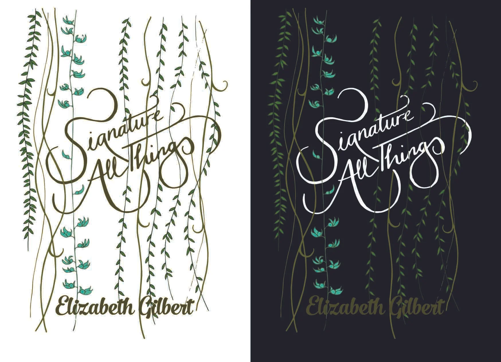
I took the design from Illustrator and transposed it into Photoshop, deciding to try some digital painting to create more depth. This worked really well.
The first iteration was a bit light, so I added more contrast, along with some patches of complementary red and orange to bring out the greens and blues.
Finally, I added a coloured foil effect on the text for an added touch of luxury.
Book Design: Illustrated Feminists
Book Design: Natural History & Geography
Book Design: Art of the Film Books
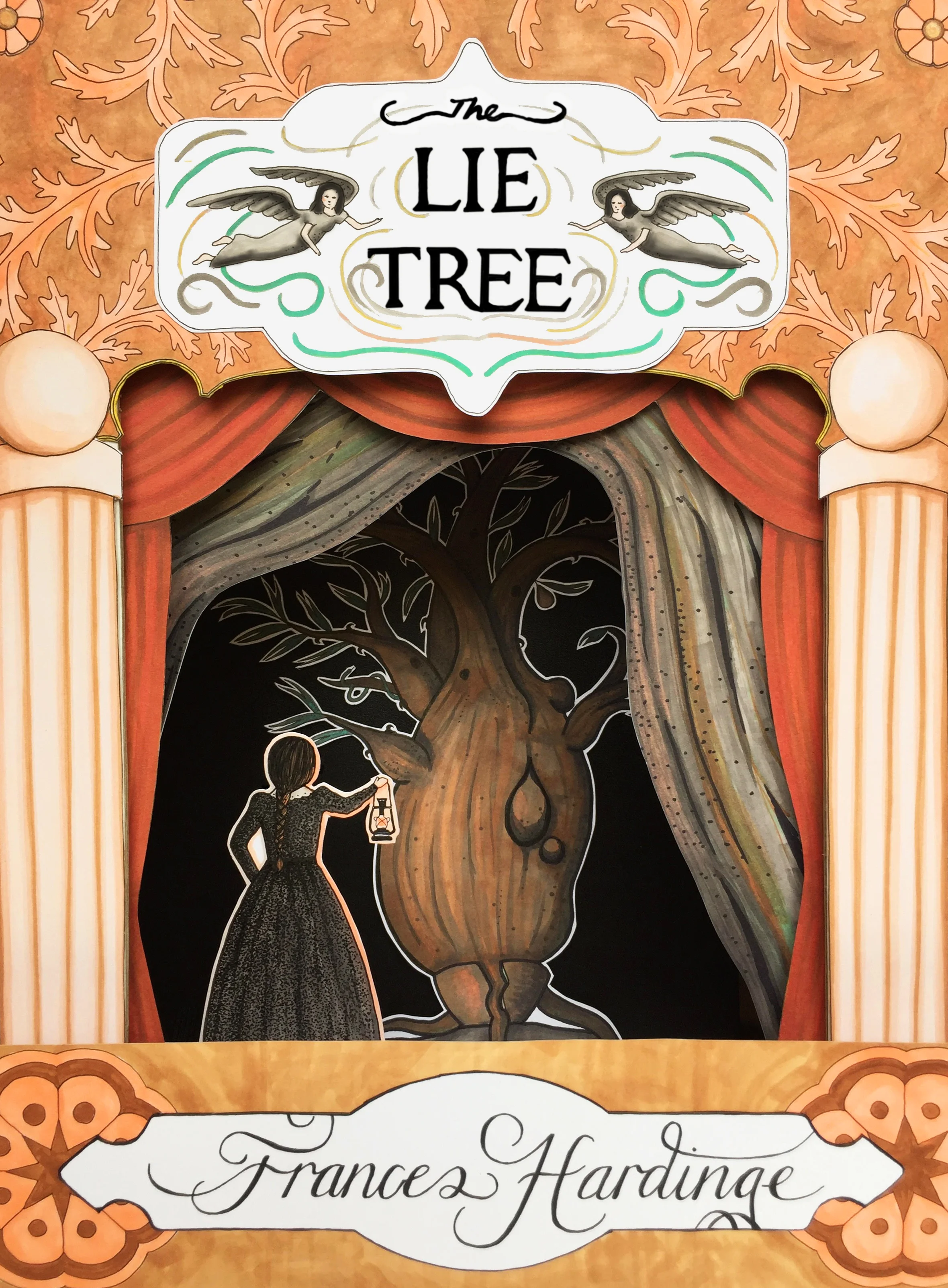
Making The Lie Tree Cover
Costa Prize winning Frances Hardinge’s The Lie Tree was one of my favourite reads of 2016. As I was listening to the audiobook for the second time (it really is that good) I was struck by the image of Faith’s paper theatre. I was inspired, and set about building one of my own.
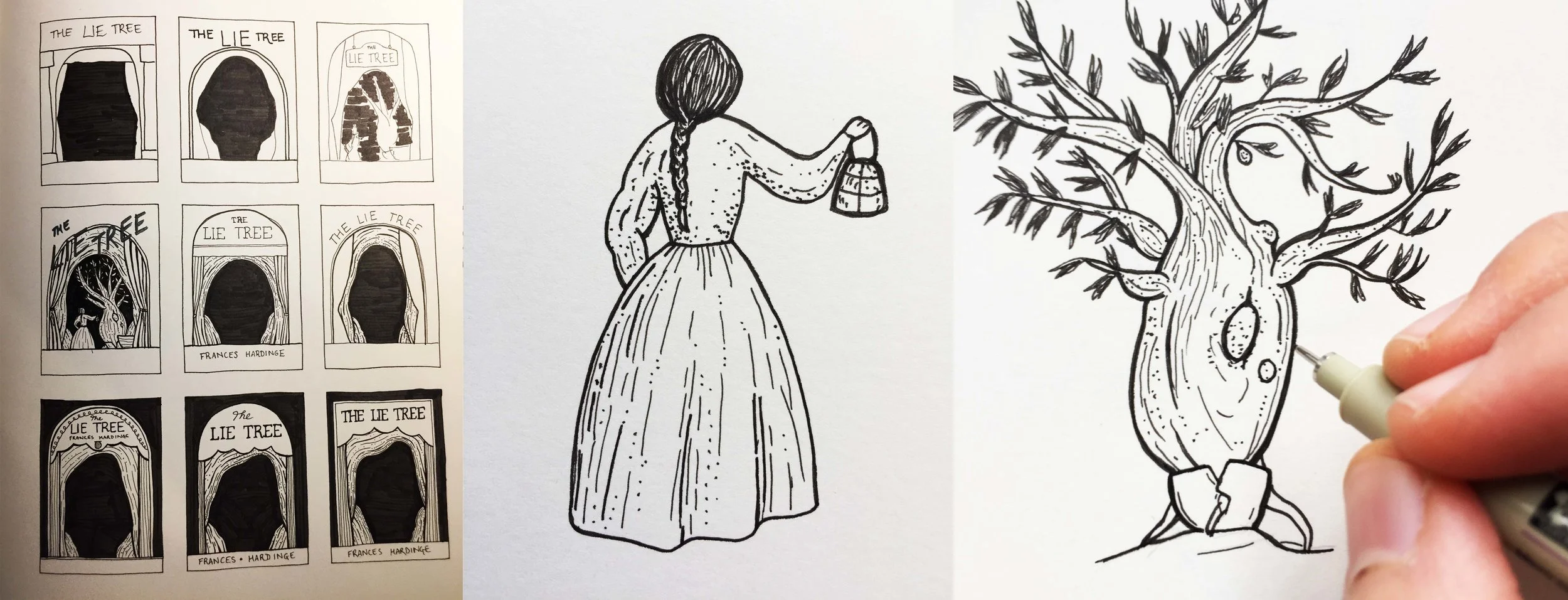
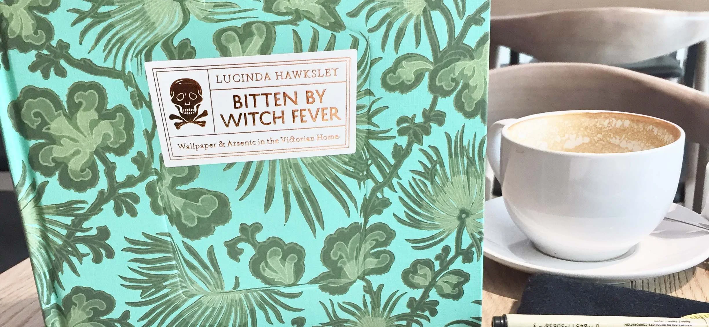
I researched paper theatres of the Victorian era, which is a fascinating Google image search, and drew from a number of different designs to create this hybrid. For pattern inspiration I used this Thames and Hudson book about poison and wallpaper in Victorian England. This provided a plethora of different ideas for both colour and style.
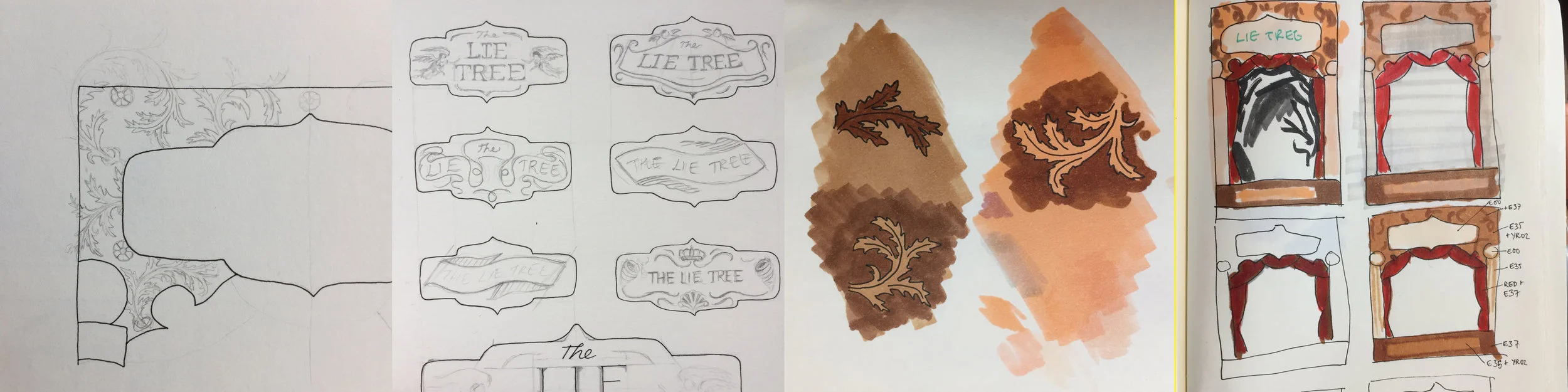
The illustrations were done on a white craft card with Copic Markers, and the linework with black fineliner. I cut out each element and put them together into a 3D structure, which I then photographed. A couple of final tweaks were made in Photoshop and voila!
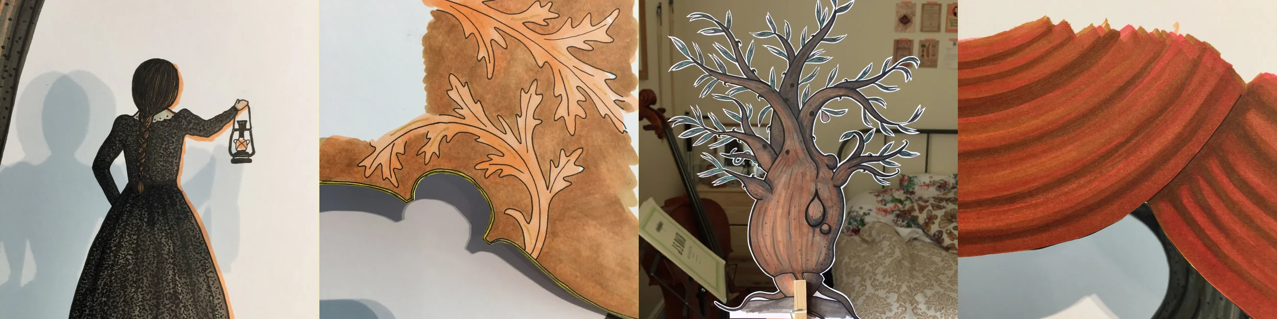
The paper theatre itself isn’t fully functional, as the elements are stationary, but I am intrigued by this medium, and keen to do more explorations within it.
Favourite Reads of 2016
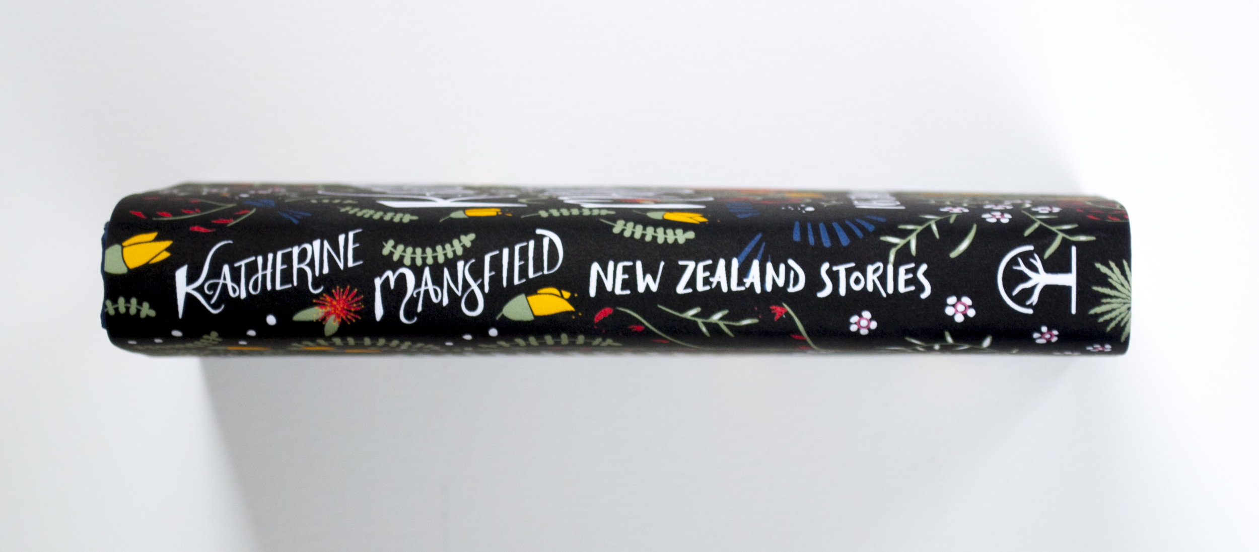
Katherine Mansfield Book Cover: Behind the Scenes
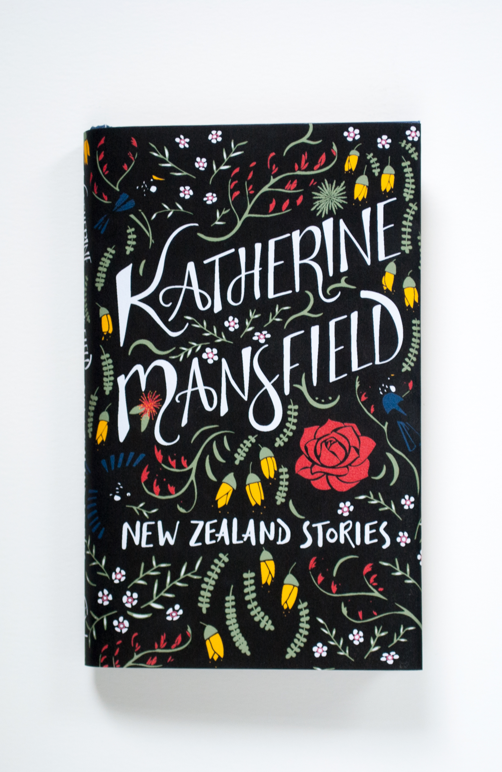
Katherine Mansfield is one of my very favourite authors, so I was upset to find that there were so few beautiful editions of her works. Many look like textbooks or simply have paintings from the time that she wrote. Most of these are very typically feminine and old fashioned and don’t capture the vitality of her stories. So I decided to create my own cover for a modern Mansfield, one that would appeal to a wider and more modern audience.
I started by finding an edition of her New Zealand stories, one that had a dust jacket that was less than inspiring. I chose her New Zealand stories because I wanted to do a botanical design that represented her antipodean roots.

My initial sketches were of various New Zealand plants, especially ones that I knew were mentioned in her stories such as kowhai, manuka and an aloe. I also sketches out some different typographic configurations. My ink drawing expanded the thumbnails and I worked in the botanical elements around the type.


In Adobe Illustrator I added in extra flowers to fit the dimensions of the dust jacket and ensure that the graphics flowed seamlessly through the front, spine and back cover.
Choosing colours was also a challenge. The flowers were dictated by nature, as I wanted to remain true to the actual colours. The background colour was the most difficult to determine and I went through countless iterations of greens, greys and blues. In the end the simple black background was the most effective in making the feature colours and title stand out.
The main problem with the black background was the black of the tui birds. They didn't stand out very well, but I wanted to keep them true to their actual colour. My idea for getting around this was to apply a spot uv coating to the birds so that they would show up in the light.

To make the dust jacket I printed out the design from my home printer onto watercolour paper. Luckily the hardback was small enough that it would fit onto an A4 sheet. I then used the plastic that was covering the original jacket to protect the new one, as the ink can smudge with use.

The full bleed image that I printed.
The photographs of this jacket were what I posted on my website, Pinterest, Instagram and Twitter. Several months after posting this I got an email from HarperCollins in the US.
HarperCollins wanted to license my cover for use on their new edition of The Garden Party and other stories. I made some changes to the design, namely the change in title, typography for which was provided by Allison, the art director. I also rearranged some of the flowers to accommodate the new type and made the birds blue so that they would show up against the black.
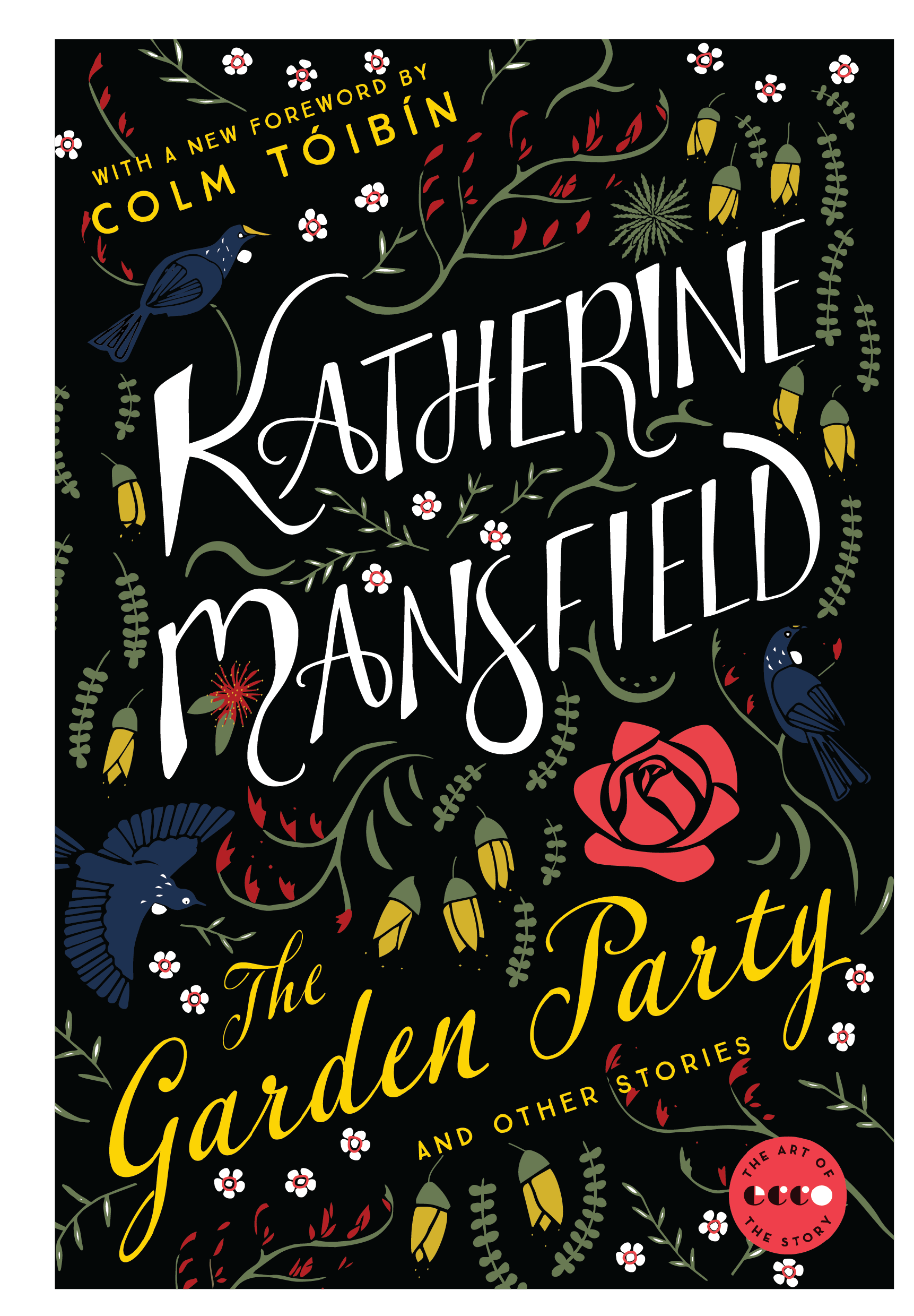
And here's the finished result! You can be sure that I will be sharing pictures of the paperback when it is published.