Cupid’s Fall Book Series
When romance author Beth C. Greenberg came to me with her brief, I knew it was going to be a good one.
The Book Design Brief
It went something like this:
A Greek myth retelling
Cosy romance
Modern setting
Gods behaving badly
A pansexual protagonist
Uh, yes please, count me in!
Here were the initial concepts. I experimented using motifs inspired by ancient Greece. Beth also wanted feathers and arrows to be central to the design.
Concepts
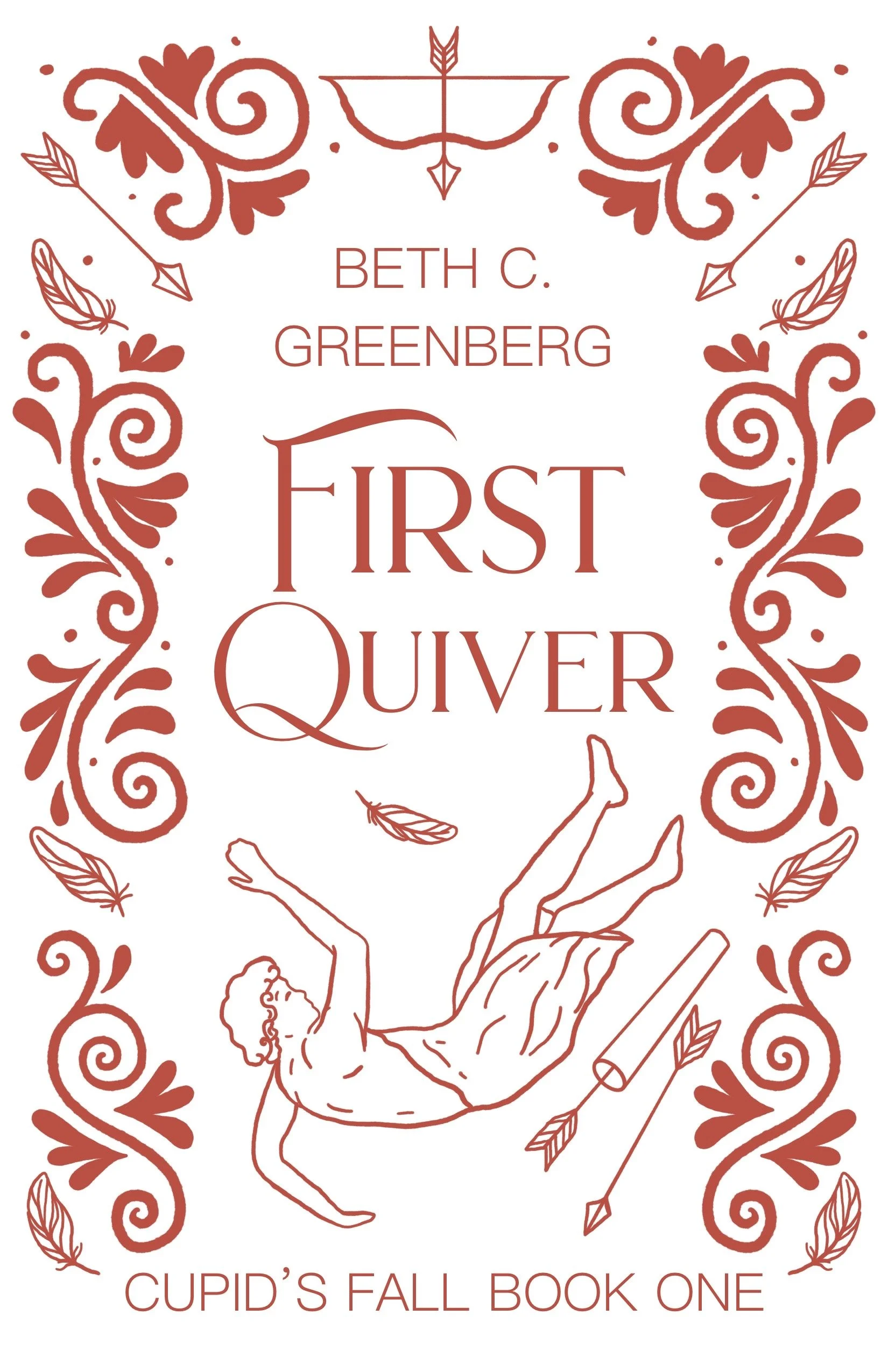
I liked the third design here, and Beth agreed. Some changes needed to be made though.
While she liked the idea of having the upper part of the cover represent what was going on on Olympus and the lower part representing the mortal world, she thought that the figures made it too literal. I agreed that the depictions of the gods on the cover might be a bit much.
Development
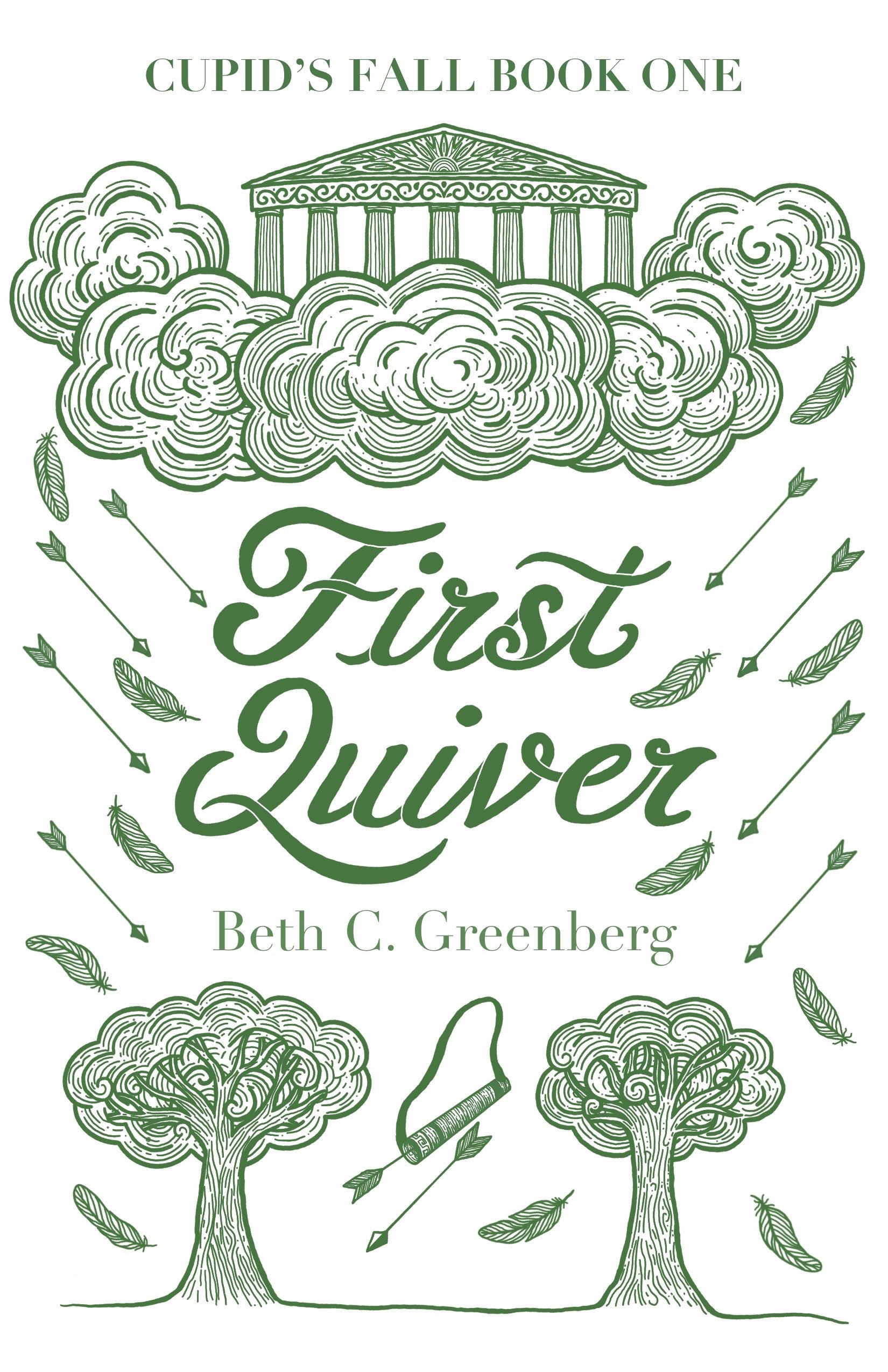
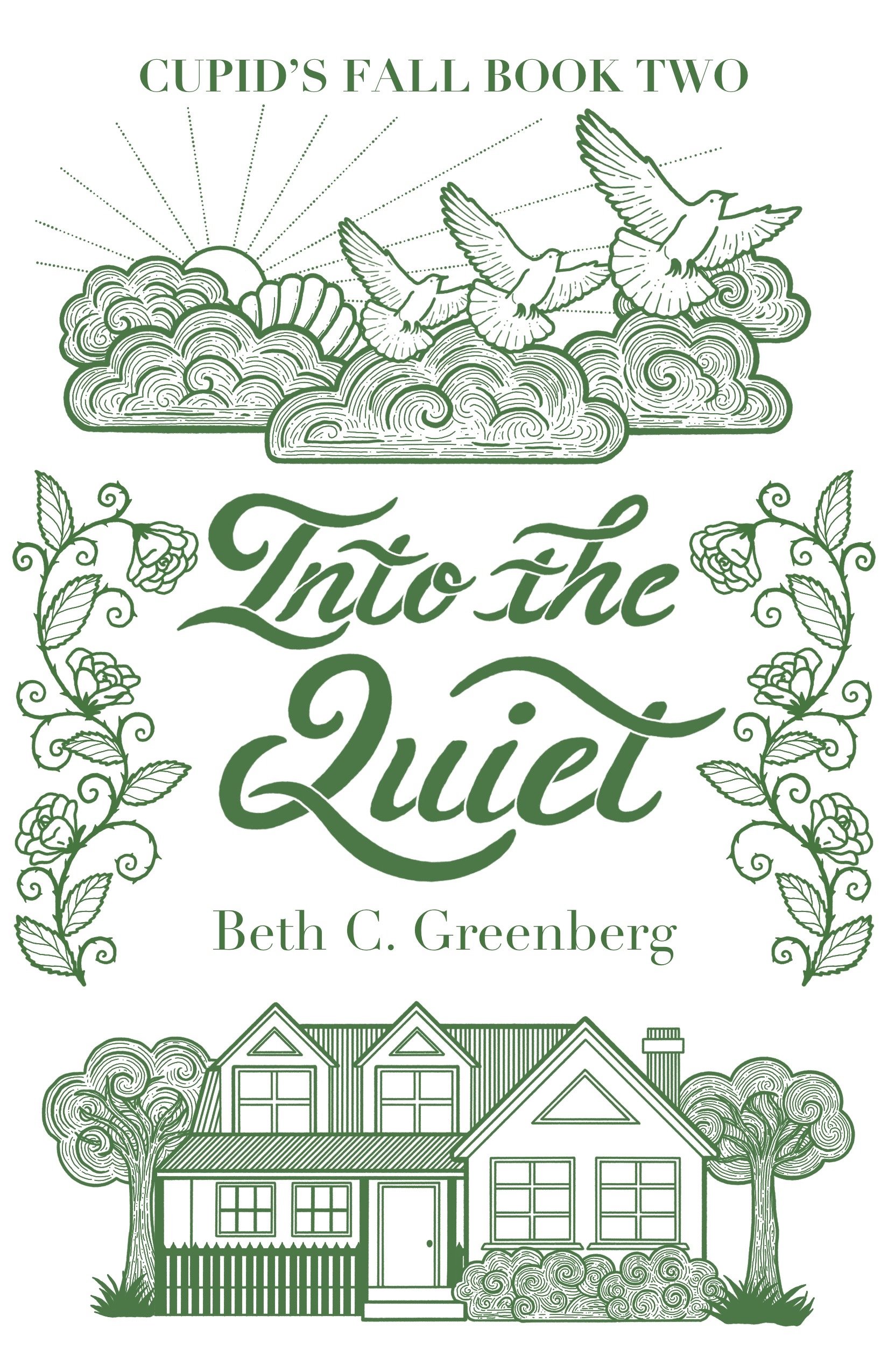
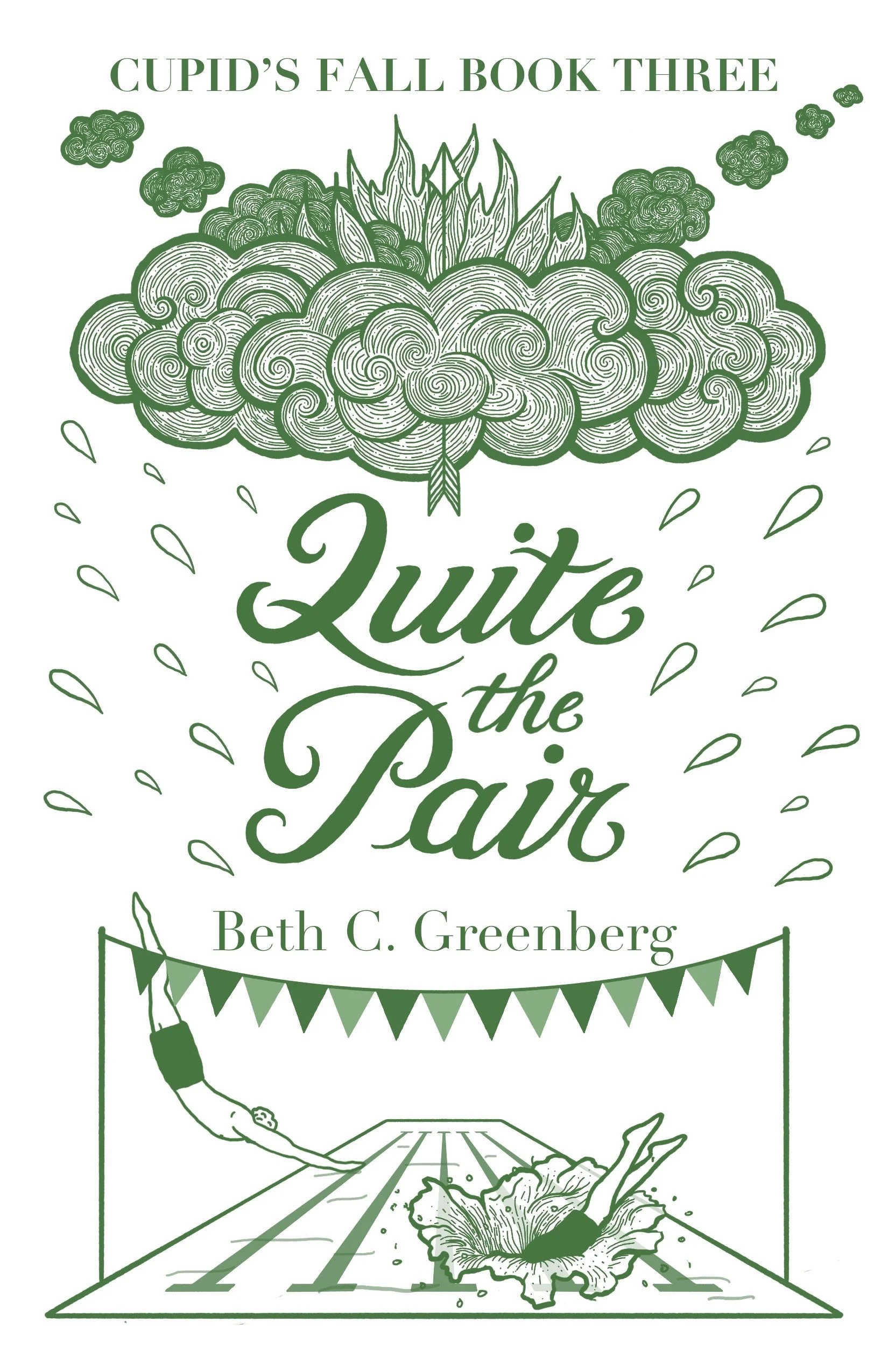
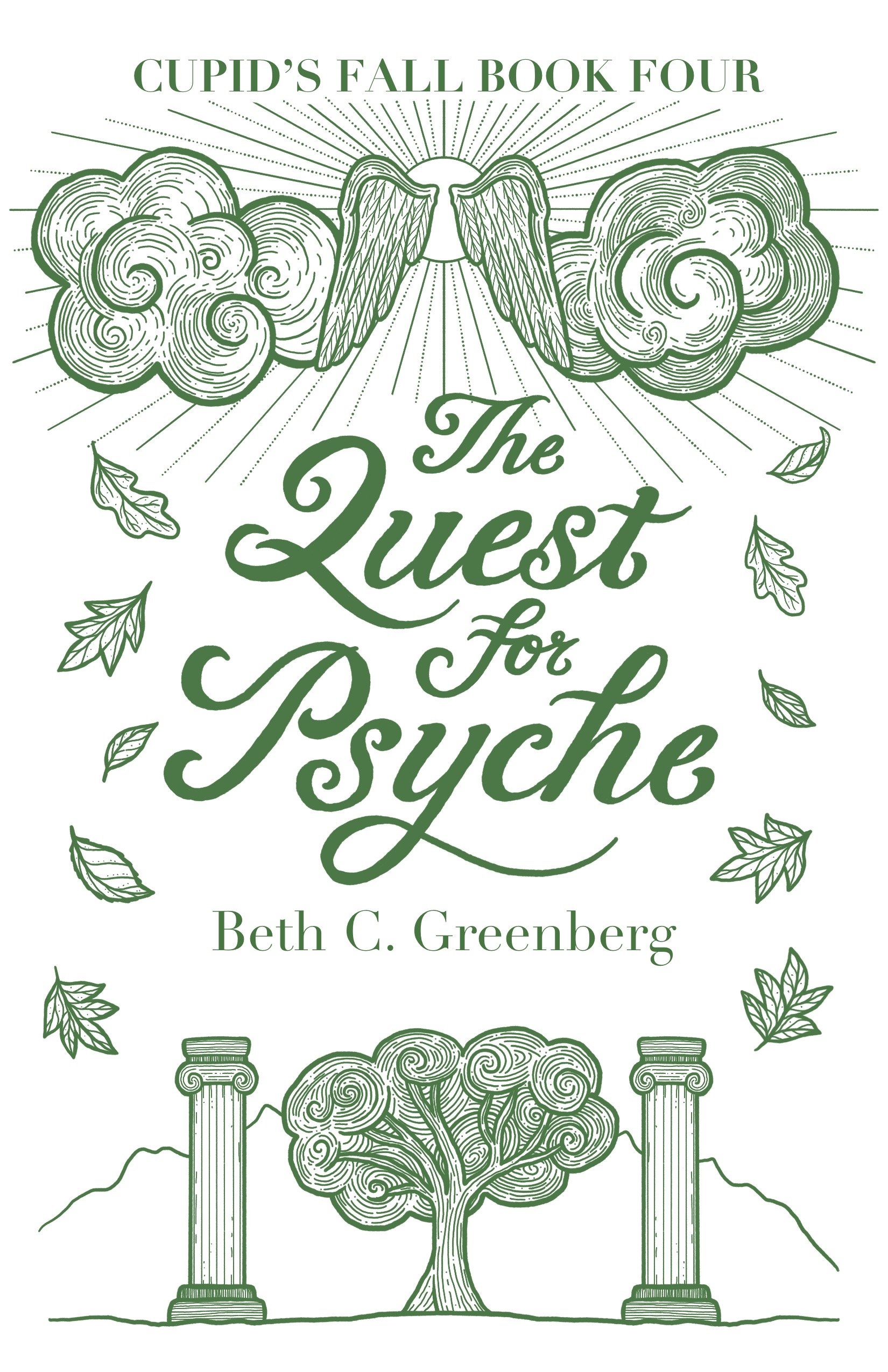
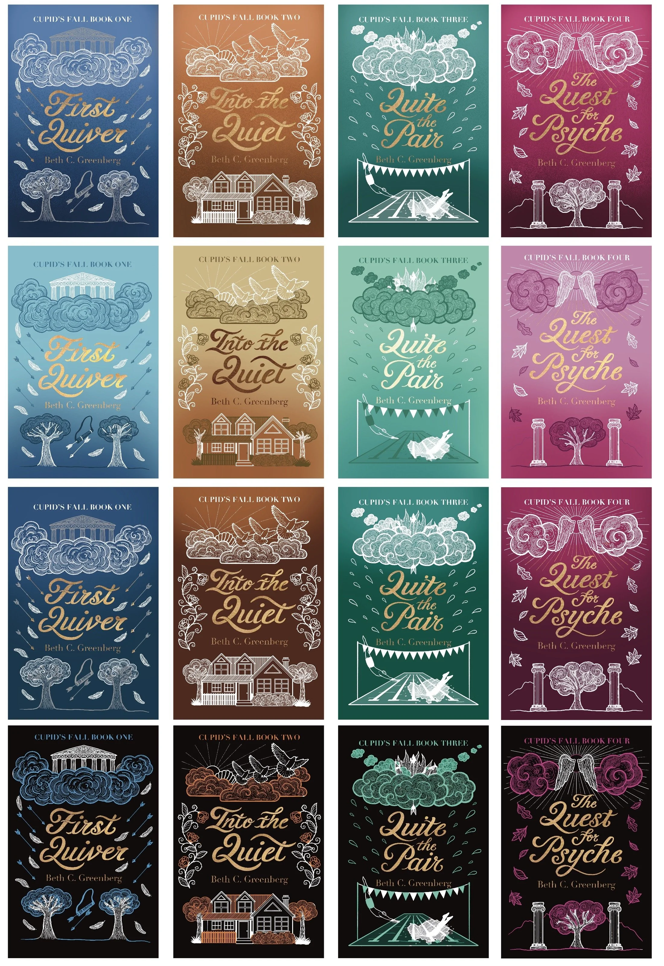
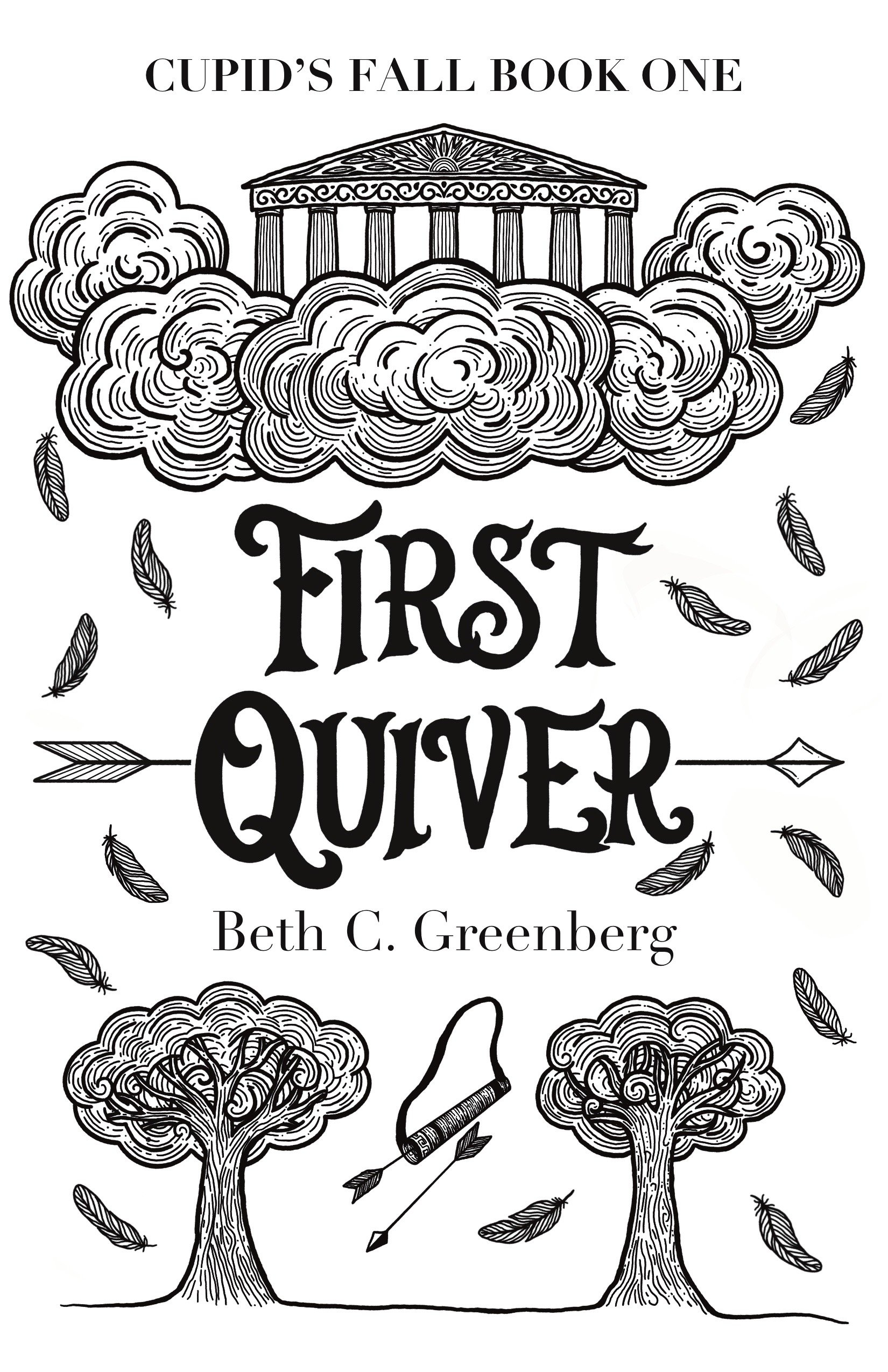
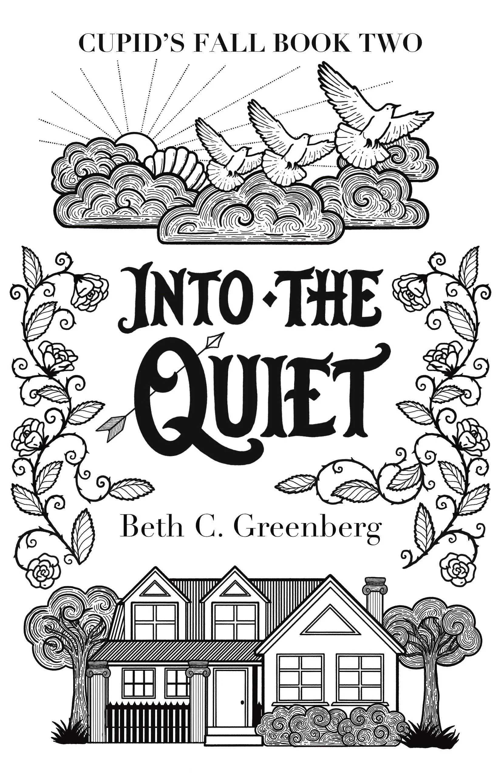
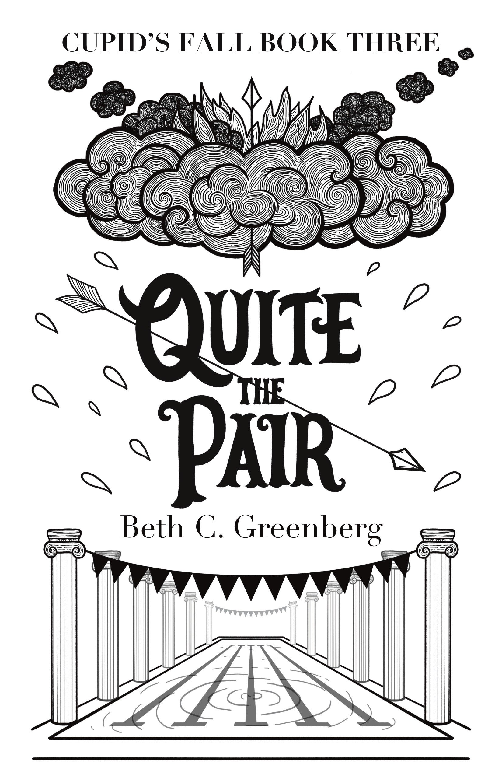
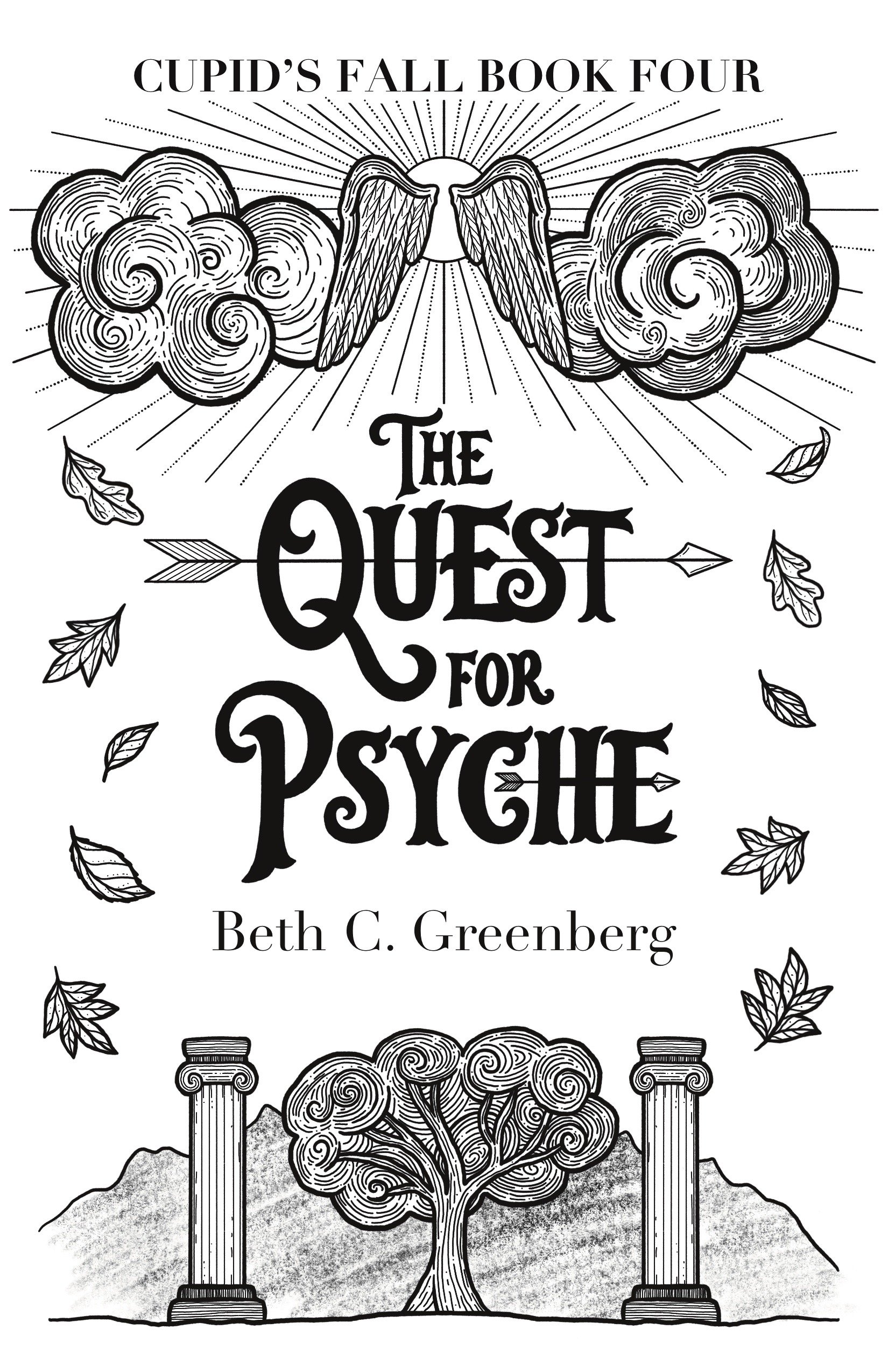
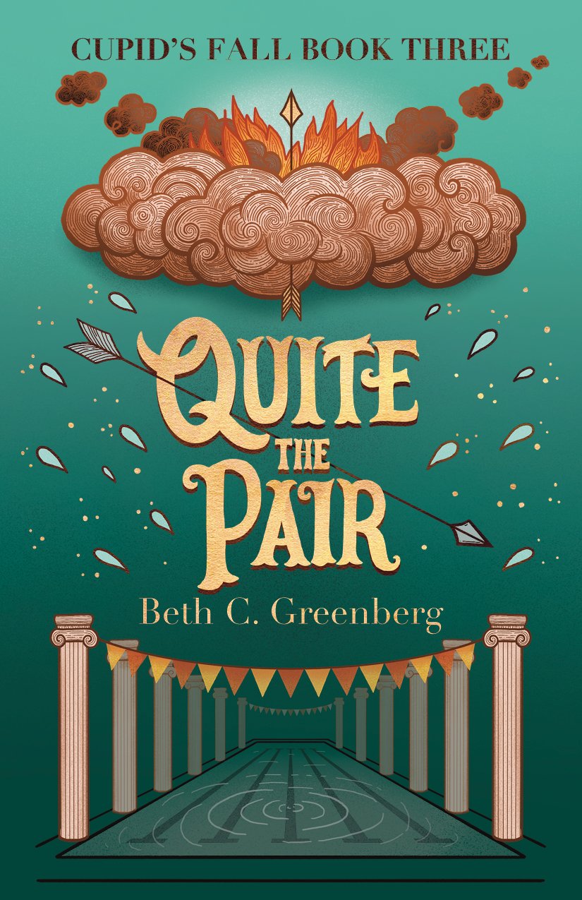
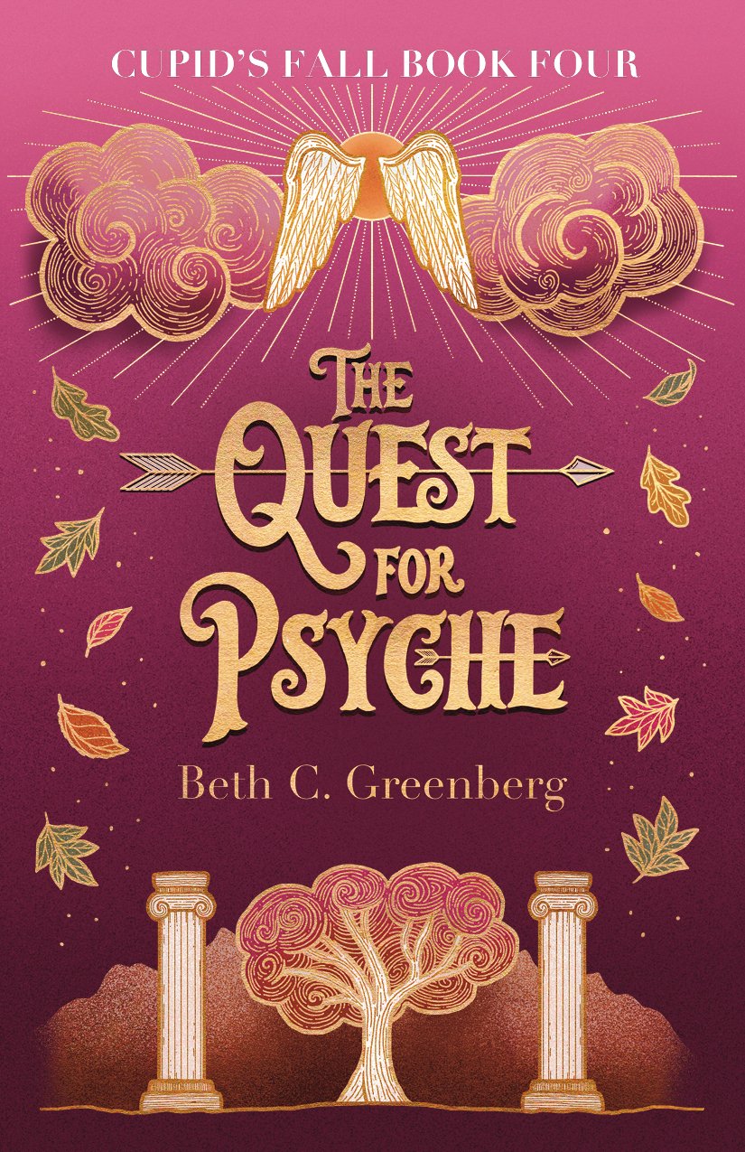
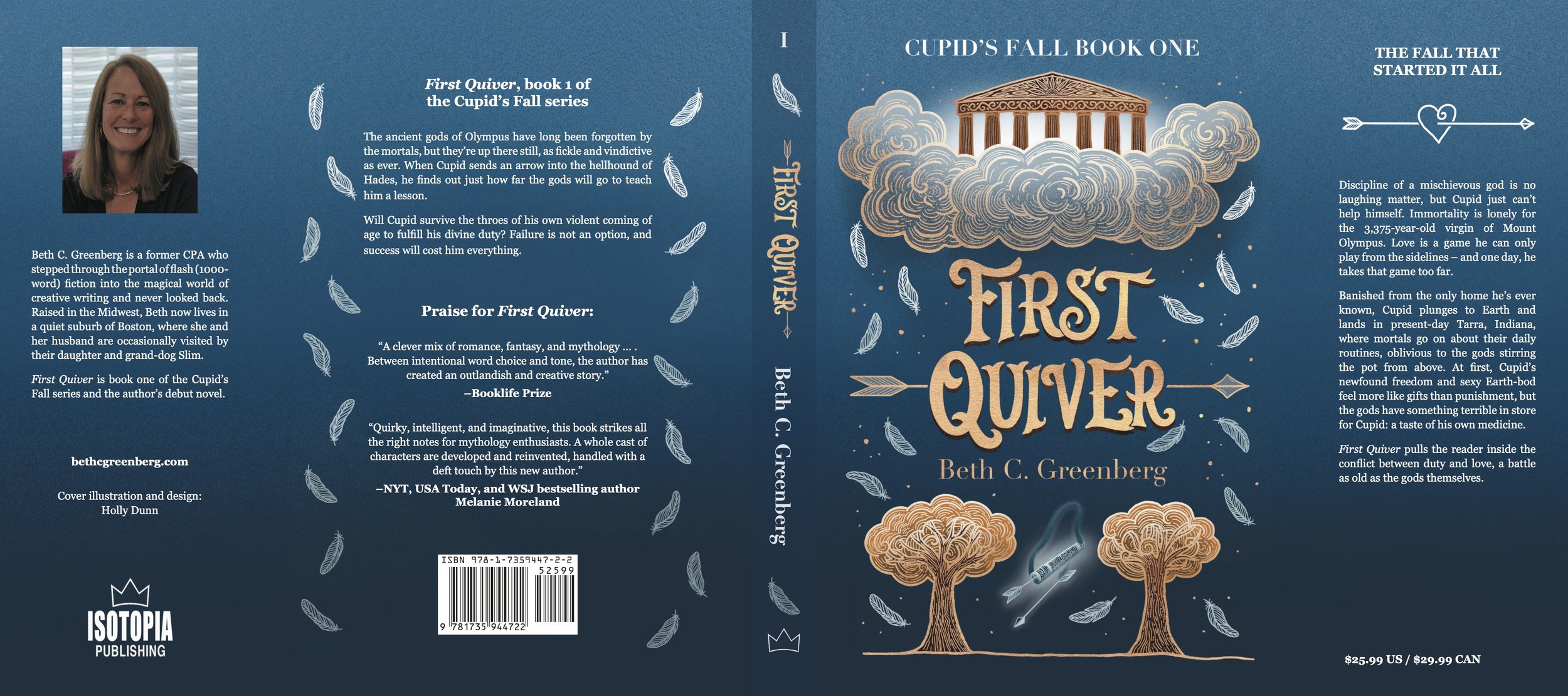
In the next round we removed the figures and added symbols in their place. For the first book, that meant an image of the Pantheon instead of Aphrodite and Hephaestus and a falling quiver in place of Cupid. For the second book, we have Aphrodite’s chariot drawn by doves and a typical suburban American house. The third book has Hephaestus’ forge with a golden arrow above a swimming pool scene. And finally, we have Cupid’s wings and an autumnal scene on the fourth cover.
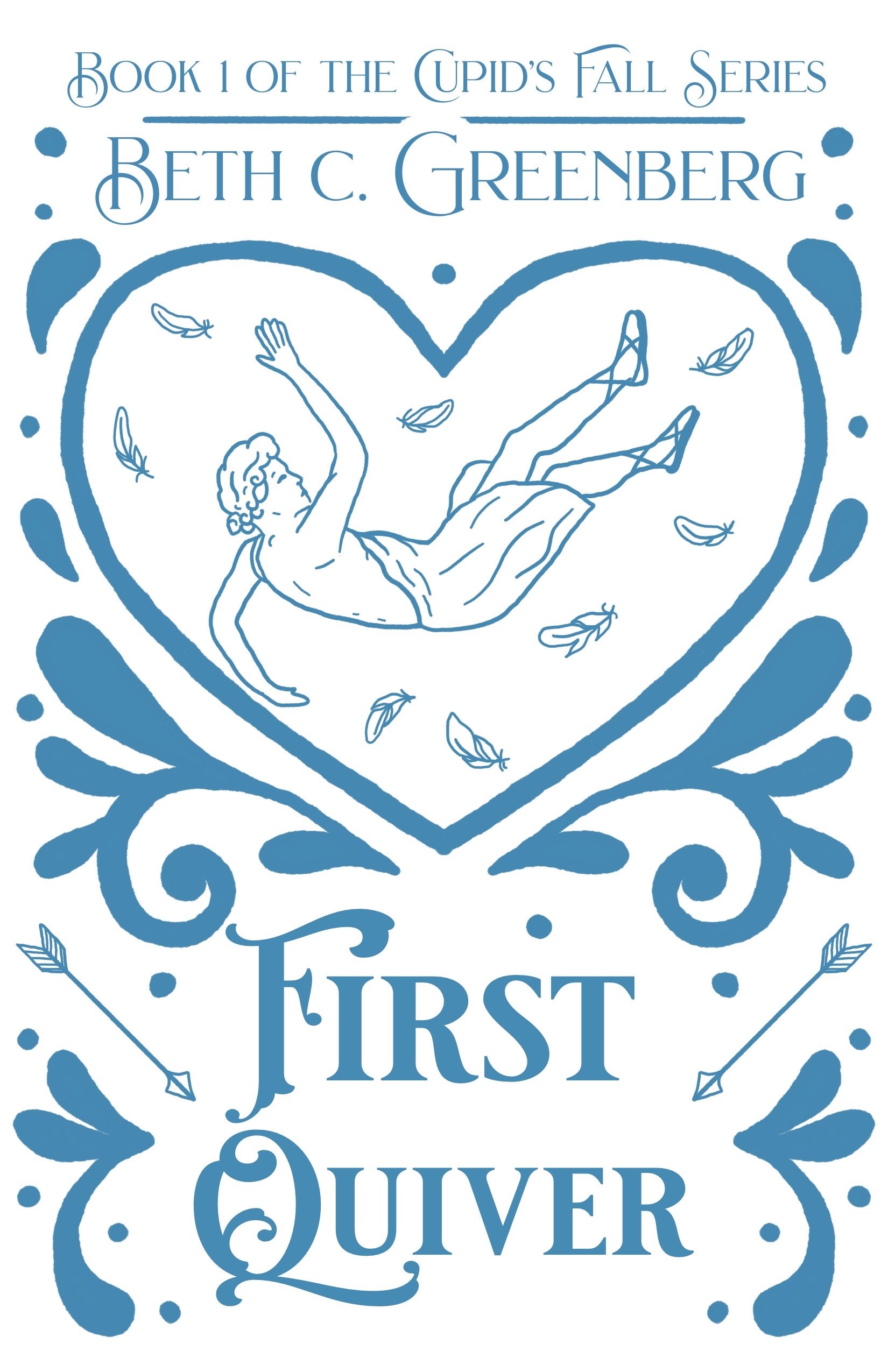
Then we started looking at some colour options.
Developing the Colours and Adapting the Lettering
Beth wanted to continue with the colour sequence used on the original book covers, which made a lot of sense thematically for the stories.
During this process, we both realised that we might need to make some changes to the lettering on the title. Looking at the covers in thumbnail size and in colour, the text wasn’t as legible as we would have liked. Beth pointed out some lettering samples from my website and I got to work making the new titles.
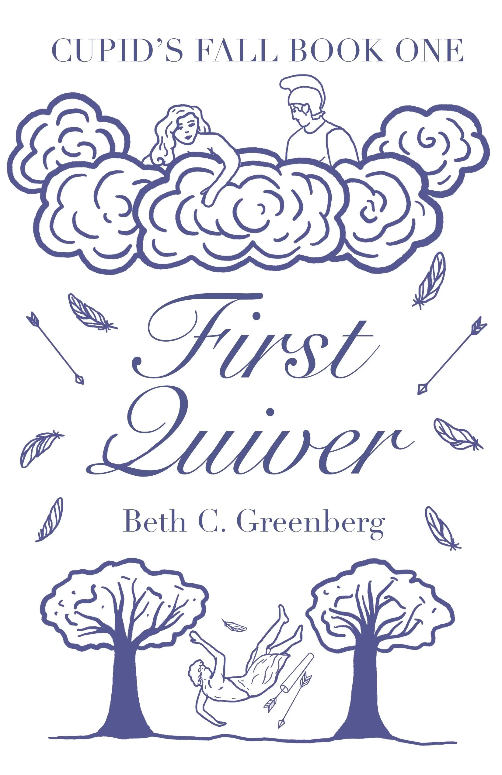
Nailing Down the Line Art
With those changes made and a few more tweaks to the illustrations, especially for Book 3, we were ready to move on to the final colour schemes.
The Finished Covers
And here we are! The final covers include more detailed shading and some gold touches. A drop shadow on the title text helps it to stand out against the background and all those details in the clouds really pop with that extra shading and highlighting.
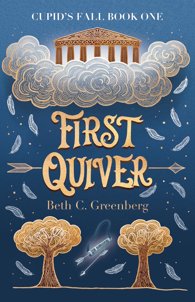

Beth went for three formats: paperback, hardback and ebook. Here’s the full design for the hardback version of First Quiver.
All of the illustrations were drawn in Procreate on the iPad. I prepared the final files for print in Adobe InDesign.
For more information about the Cupid’s Fall series and Beth’s other writing, visit her website: https://bethcgreenberg.com/