Type Matters
Why would I spend money to have my book formatted (or ‘typeset’) when I can just upload it straight to Amazon as it is?
Typesetting is a crucial part of book publishing, as it can greatly impact the readability and overall aesthetic of a book. Good typesetting can enhance the reading experience by making the text more visually appealing, easier to follow, and more engaging for the reader.
There are many reasons to have your book professionally typeset. However, perhaps the best way to answer this question is with an image.
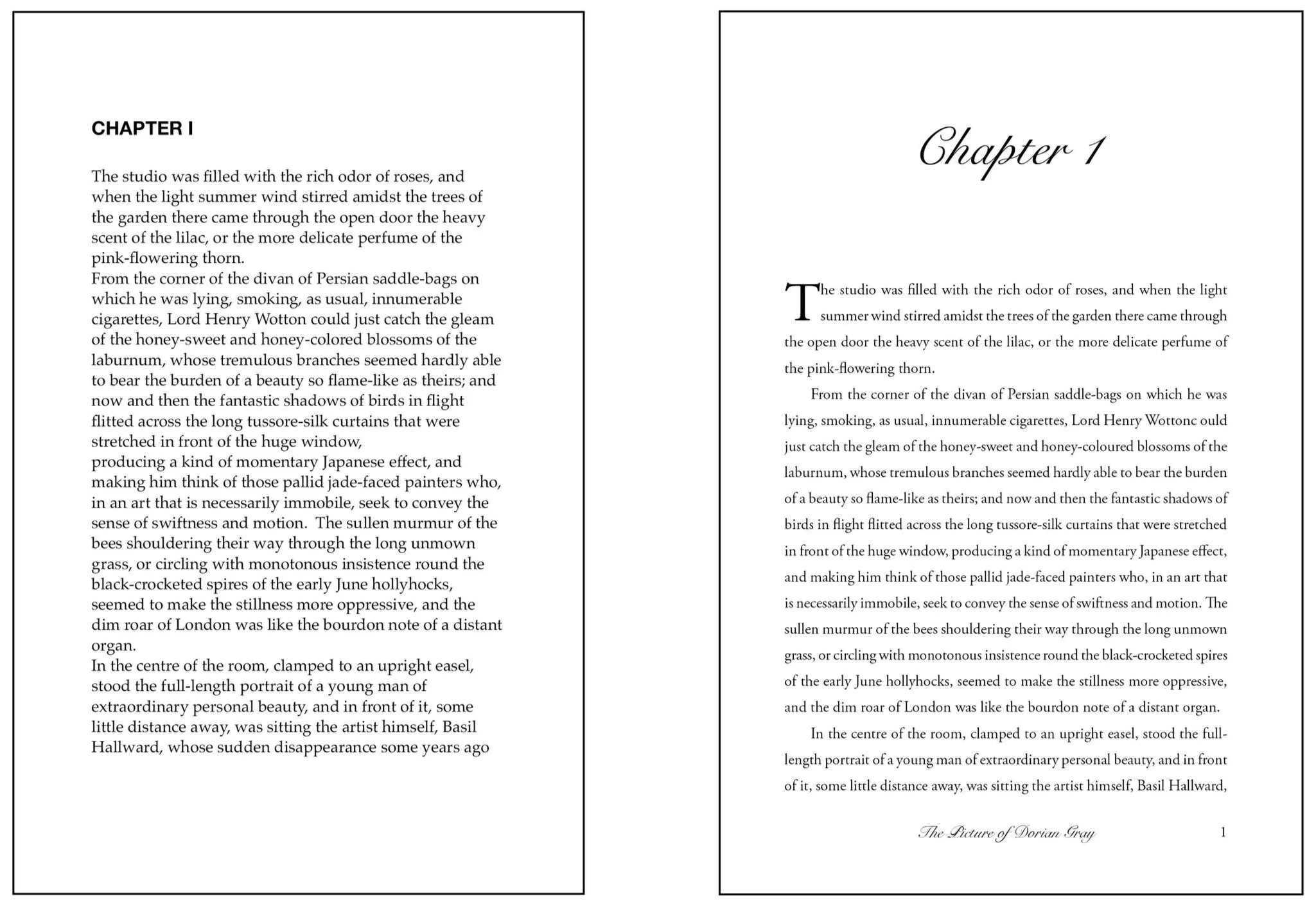
One of these pages has been professionally typeset and the other hasn’t. Can you see the difference?
Easy Reading
One of the primary benefits of good typesetting is readability. Well-chosen fonts, appropriate line spacing, and proper margins can make a huge difference in how easily readers can read and understand the text. Poor typesetting can lead to eye strain, fatigue, and even discourage your readers from continuing. Not something you want as an author!
Book Like a Pro
In addition to readability, typesetting can help create a cohesive and professional look for a book. Consistent use of fonts, colours, and formatting can give a book a sense of unity and help establish your brand identity as an author or publisher.
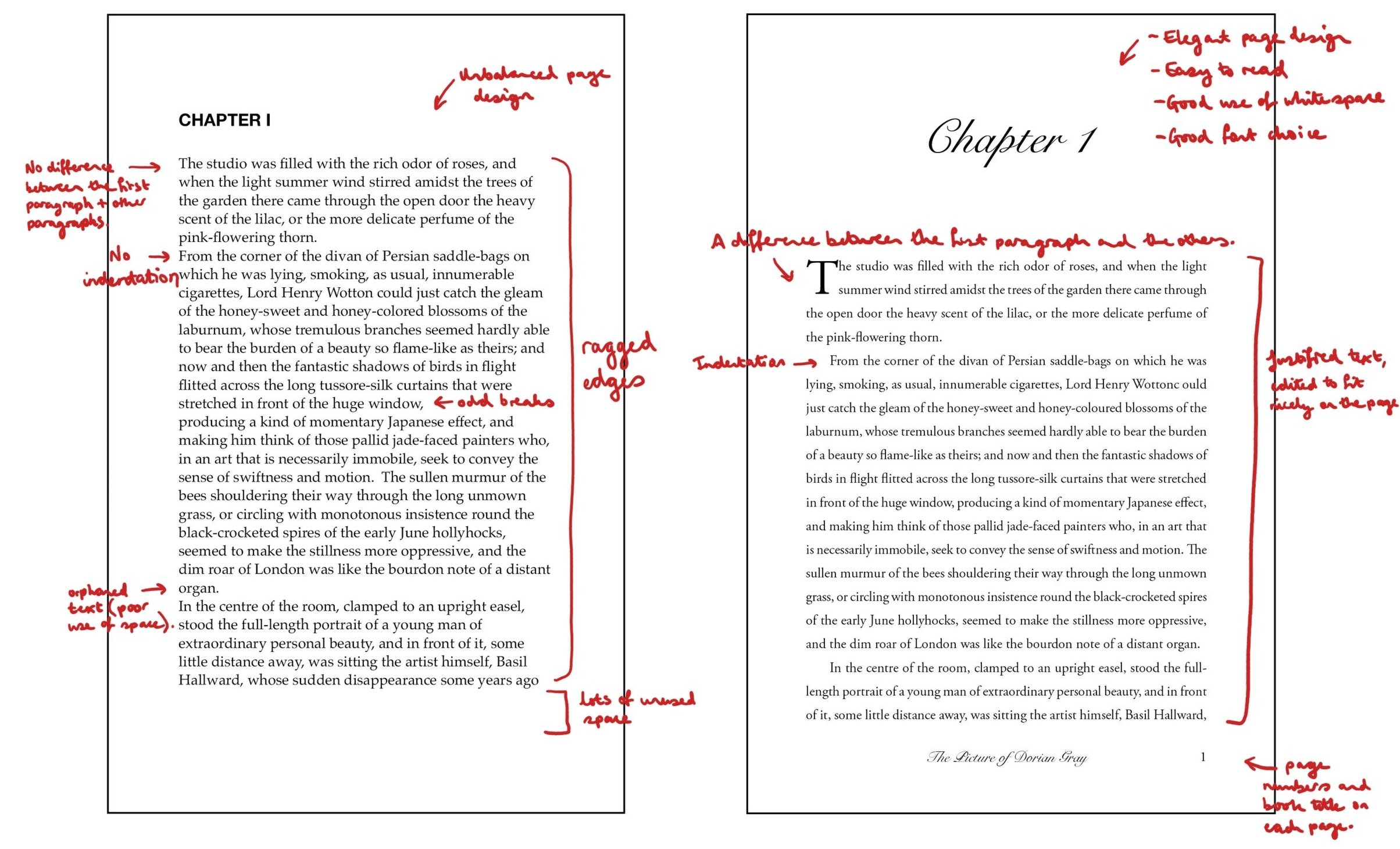
Here are some of the errors and corrections made to enhance the reader experience.
Every Page Counts
Another important aspect of typesetting is its impact on the length of the book. Proper typesetting techniques can help control the number of pages and reduce printing costs. This can be especially important for self-published authors or small publishing companies that have limited budgets.
The “Invisible Art”
Typesetting is often referred to as the "invisible art" because readers are often unaware of its presence when it is done well. I’ve never heard anyone outside of publishing remark on how great the typesetting is in a book. However, the impact of good typesetting can be seen in the ease of reading and overall aesthetic appeal of a book.
Technicalities
One aspect of typesetting that is often overlooked is the use of white space. White space, or the areas on a page that are left blank, can greatly impact the readability and flow of a book. I like to think of it like rests in music. The silences are just as important as the notes, as they help to enhance the melodies and chord progressions. Likewise, in design, proper use of white space can help guide the reader's eye to what’s important while also making the text more visually appealing.
Another important aspect of typesetting is the use of kerning, or the adjustment of space between letters. Proper kerning can help improve the legibility of text and make it easier for readers to distinguish between different letters and words. If done poorly, it can hamper the reading experience.
In the Mood to Read
Typesetting can also impact the emotional tone of a book. The choice of font, font size, and formatting can all contribute to the overall mood of a book. For example, a sans-serif font may be used to convey a modern, sleek feel, while a serif font may be used to create a more traditional, classic feel.
Accessible to All
Finally, typesetting can also impact the accessibility of a book. Proper use of font size, line spacing, and contrast can make a huge difference for readers with visual impairments or reading disabilities.
In summary, typesetting is an essential part of book publishing that can greatly impact the readability, aesthetic appeal, and emotional tone of your book. By prioritising high-quality typesetting, you can create books that are not only easy to read, but also visually engaging and emotionally resonant to your readers.
If you would like help with typesetting your book, please get in touch by clicking the button below!