Beautiful Picture Books from Flying Eye
March 2016 Reading Wrap-Up
Podcast Recommendations
Brideshead Revisited Book Cover
Evelyn Waugh's Brideshead Revisited was one of those books that I read back in high school and made a big impression on me. It has since become one of my favourites, but I never owned a copy, in part because I couldn't find a cover that I liked. In the end I bought a second-hand edition and created my own design to cover it.

This book evokes such a lavish setting and I wanted to make an illustrated cover to reflect the time period. I experimented with a few ideas, but the framed silhoutettes were what made the most sense to me.

All of the imagery used was custom made, apart from the author's name. For the title I experiemented with various styles of lettering, tracing and retracing until I was happy with the letter forms. Then I photographed it and imported it into Illustrator by tracing it with the pen tool. I then played around with the weight of the lines. The wallpaper was created using the same process.

In general I don't like to the see faces of characters illustrated on books, but I do like the use of profiles because they obscure the features and allow the reader to use their imagination.
For Sebastian's profile I used the pen tool to trace and modify a photograph. For Julia I made a copy of Sebastian's image which I reflected and tweaked to make more feminine. In the book the two are described as being very similar, so I wanted to honor that description.
Having the siblings illustrated in frames is supposed to reflect the way that our narrator Charles Ryder puts the two of them on a pedestal. He's always on the outside looking in and is never quite at their level, just like the reader.
The inclusion of Sebastian's teddy bear, Aloysius, adds a touch of humour and makes it less generic, preventing this from being confused with any other novel of the period.

The colours I chose are typical of interiors of the time. They are also perhaps more masculine, which contrasts with the more typically feminine lettering. I didn't want the cover to be gendered because it is a classic with universal appeal.
Book Design: Book Edges
Lolita Book Cover

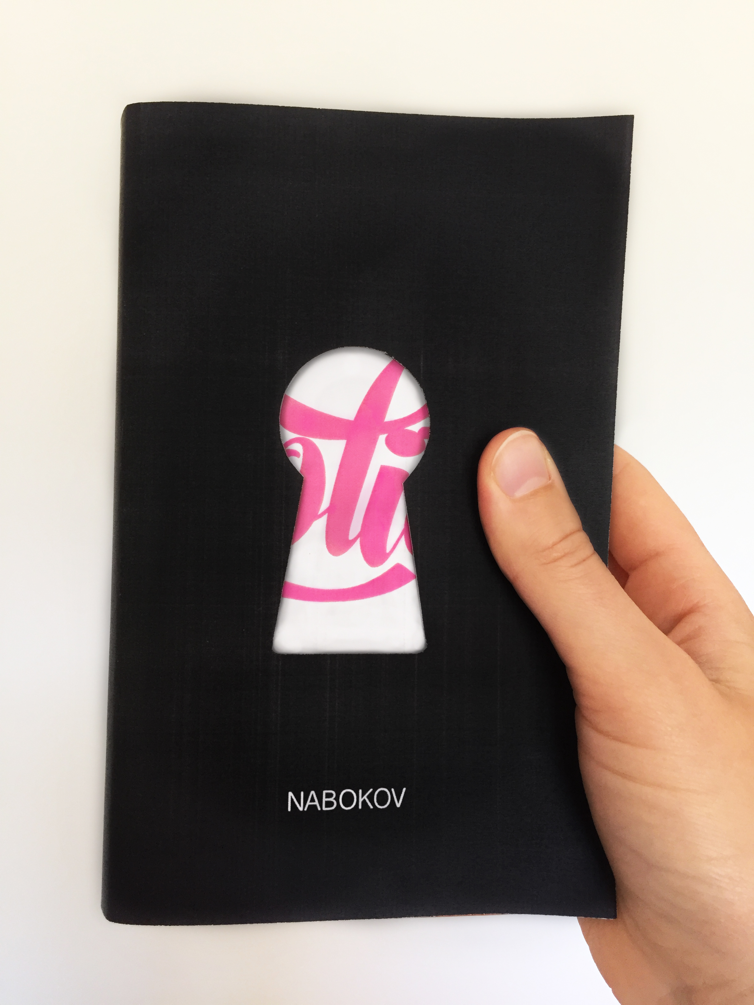
Vladimir Nabokov's Lolita is a novel that fascinates me in the ways that it has been interpreted visually. It has been designed and redesigned countless times and there has even been a book published on the novel in art and design (Lolita: The Story of a Cover Girl ed. John Bertram).

I recently read Lolita and found it to be one of the most difficult novels I have ever read. Not because of the writing, Nabokov's writing is famously lyrical, but because the subject matter was so difficult to stomach. Of course that is the point of the novel, you're supposed to be made to feel uncomfortable by the material whilst being seduced by the language. This tension is part of what drew me to it as a design challenge.

While many existing covers suggest that Dolores is the main focus of the novel, I concluded that the main focus was actually Humbert Humbert's fixation on her. It's a subtle difference, where the act is the most important thing; the verb trumps the noun. Of course this idea has been noted by many designers who have suggested Humbert's gaze in a more sophisticated fashion, rather than simply showing a sexualised young girl (which is the most obvious way of putting us into the shoes of the male viewer).

When designing this I decided to take a more symbolic approach. While trying to steer clear of cliche, some commonality with previous designs was inevitable, most notably in the use of the colour pink and the stereotypically 'feminine' script type. But I am yet to come across another design for this novel that uses the keyhole. Symbolically the use of this motif is threefold. Firstly there's the obvious sexual symbolism of a lock and key. Other symbols used to similar effect on other covers include a water gun, socks and even the typography itself. Then there's the male gaze. The placement of the keyhole puts the reader/viewer in the place of Humbert, viewing Lolita from behind closed doors. Finally there is the sense of secrecy, of something (Lolita's sexuality) being locked away and out of reach. Symbolically speaking, when the reader opens the cover and begins the book the door is unlocked and Lolita is no longer innocent to the view of Humbert. This makes the reader complicit in this betrayal. All three of these ideas are crucial to the text.

Type used:
Script for 'Lolita' title: Bonbon (bold) created by Emily Bertell 2013.
Font for author's name: Helvetica.

Originally published on Behance, March 2015.
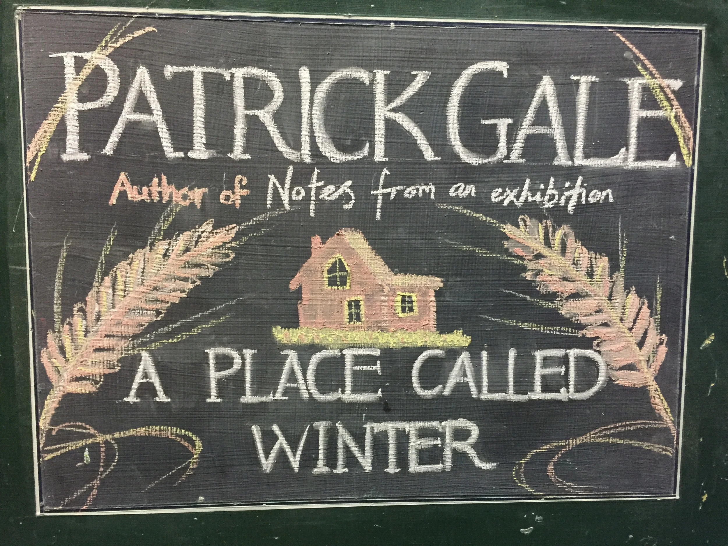
Chalkboard Bookselling
One of my favourite jobs while working at Page & Blackmore Booksellers was updating the chalkboard outside the shop. It's an interesting medium because it is so temporary. Of course this means it has its hazards. One day I went into work only to discover that one of my boards had been speedily re-chalked by a colleague because a child had come along and smeared their hands across the blackboard. After that I resolved to start recording what I created, which resulted in this mini portfolio.
Most are based on existing book covers, but the final two are my own original designs.
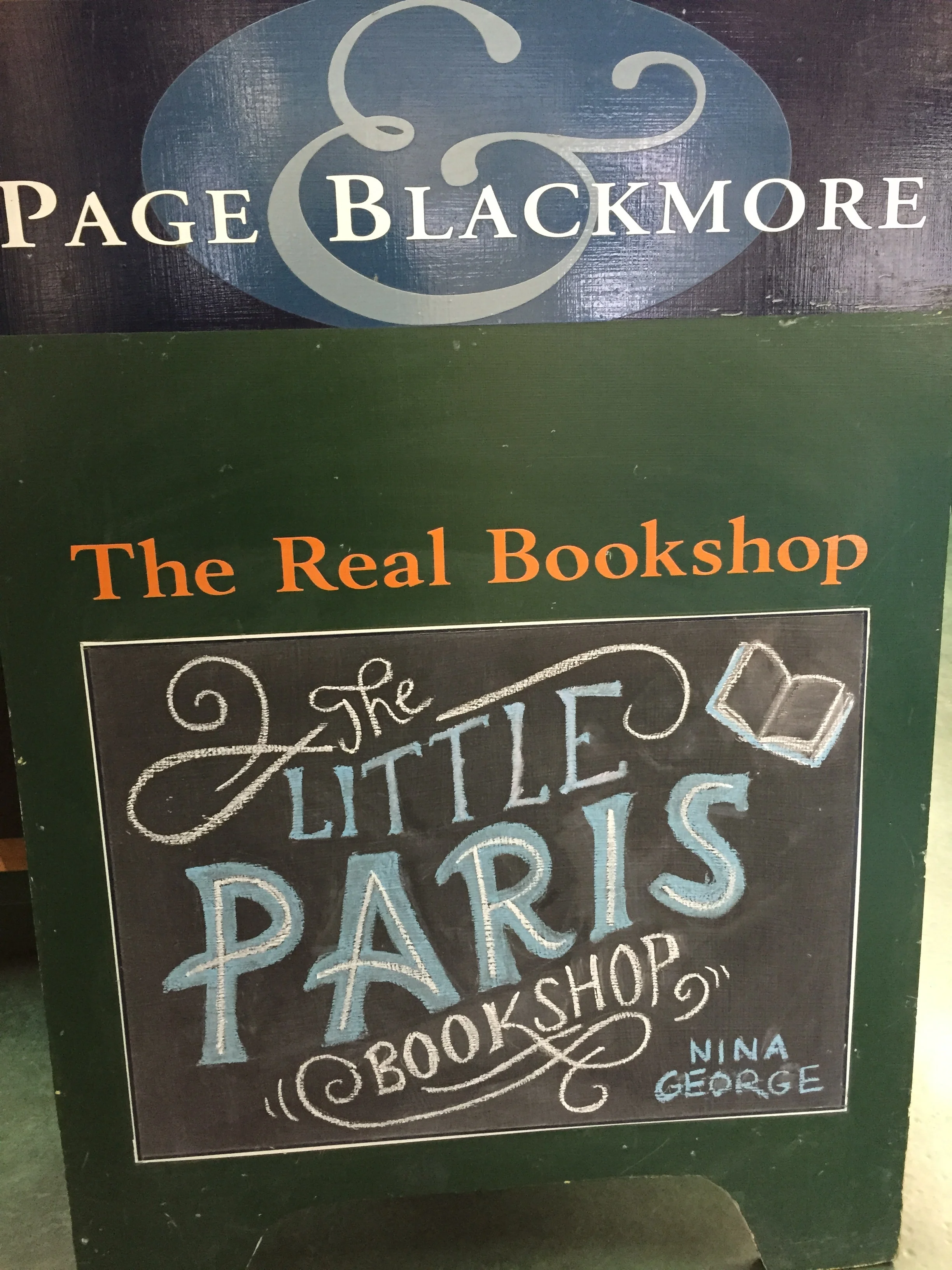
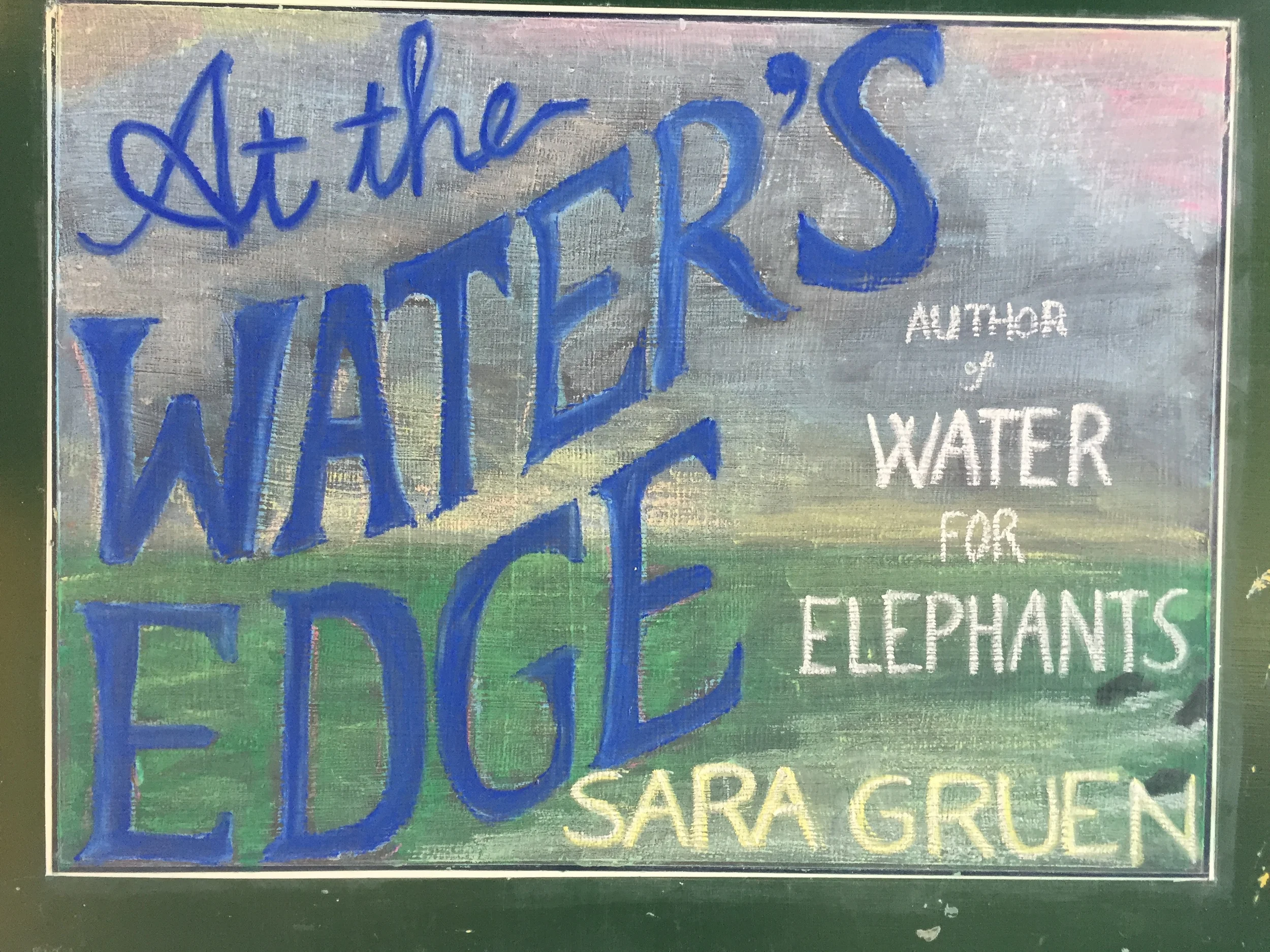
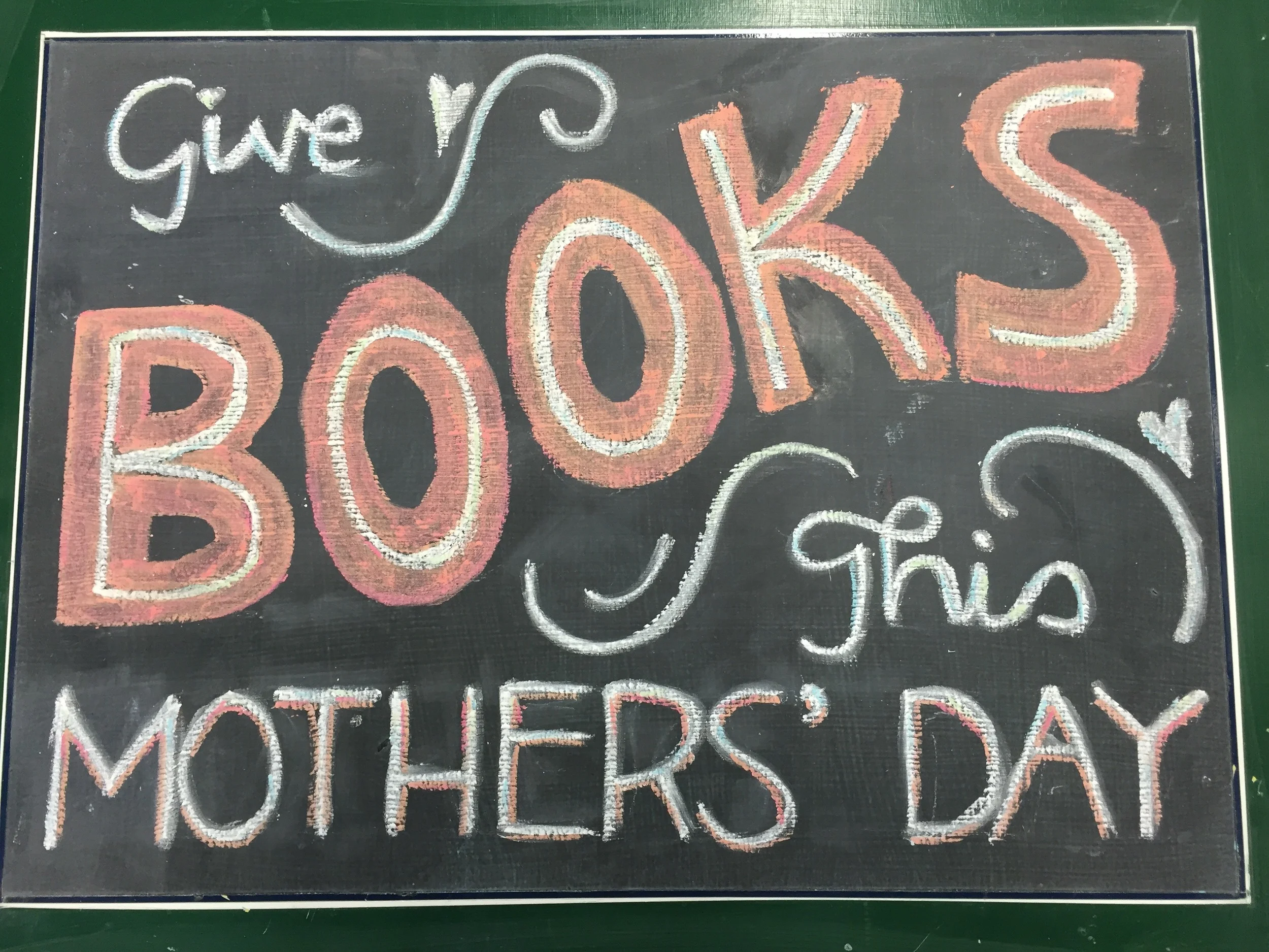

This final one is my favourite, mostly because I had more creative freedom, not having to work from an existing book cover.
Three Book Cover Finishes
February Reading Wrap-Up
Unboxing: Under the Radar Books
February Book Haul Part II
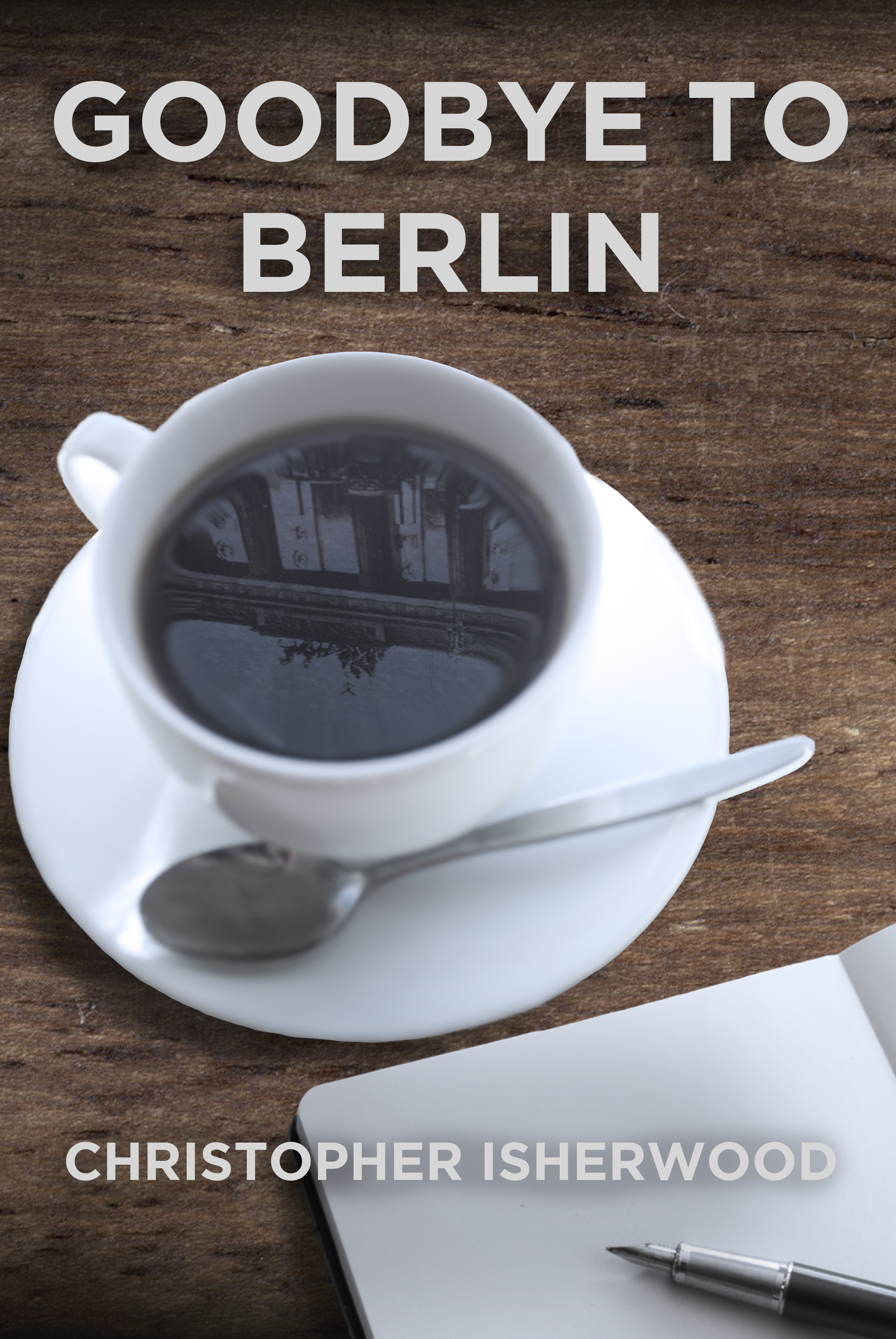
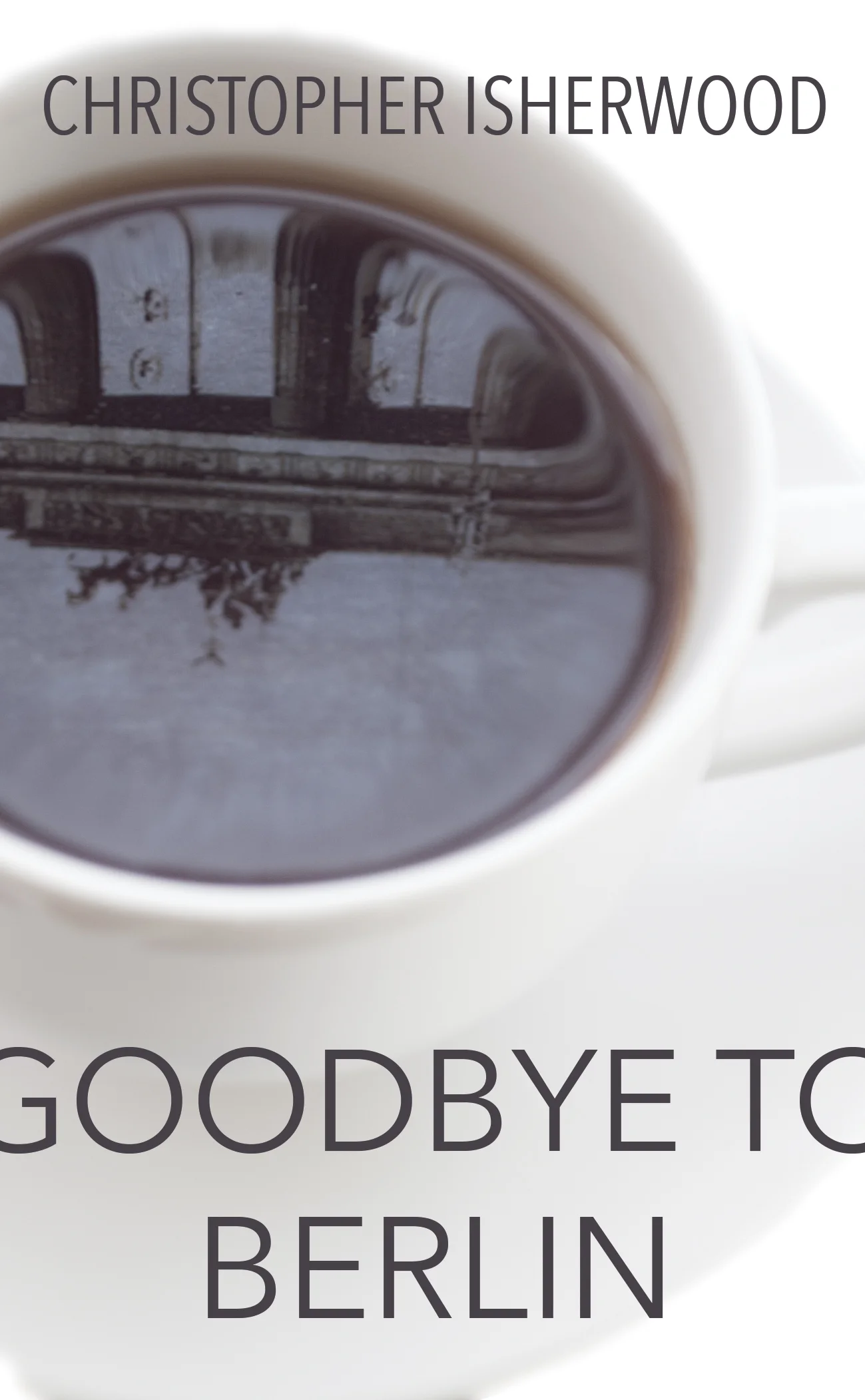
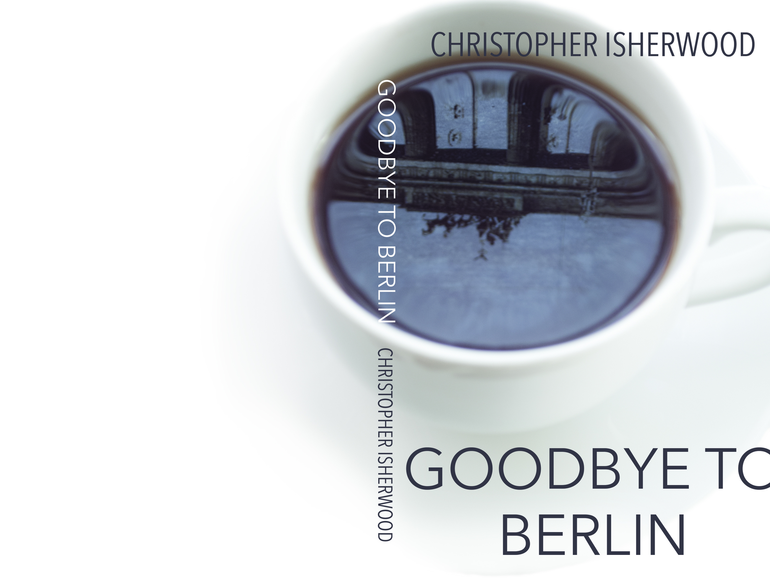
Goodbye to Berlin Book Cover: Behind the Scenes
I am a camera with its shutter open, quite passive, recording, not thinking.
- Christopher Isherwood, Goodbye to Berlin
This is the most famous quote from Isherwood's 1939 novel Goodbye to Berlin. It is also the central theme of the text, which is a series of observations of 1930s Berlin.
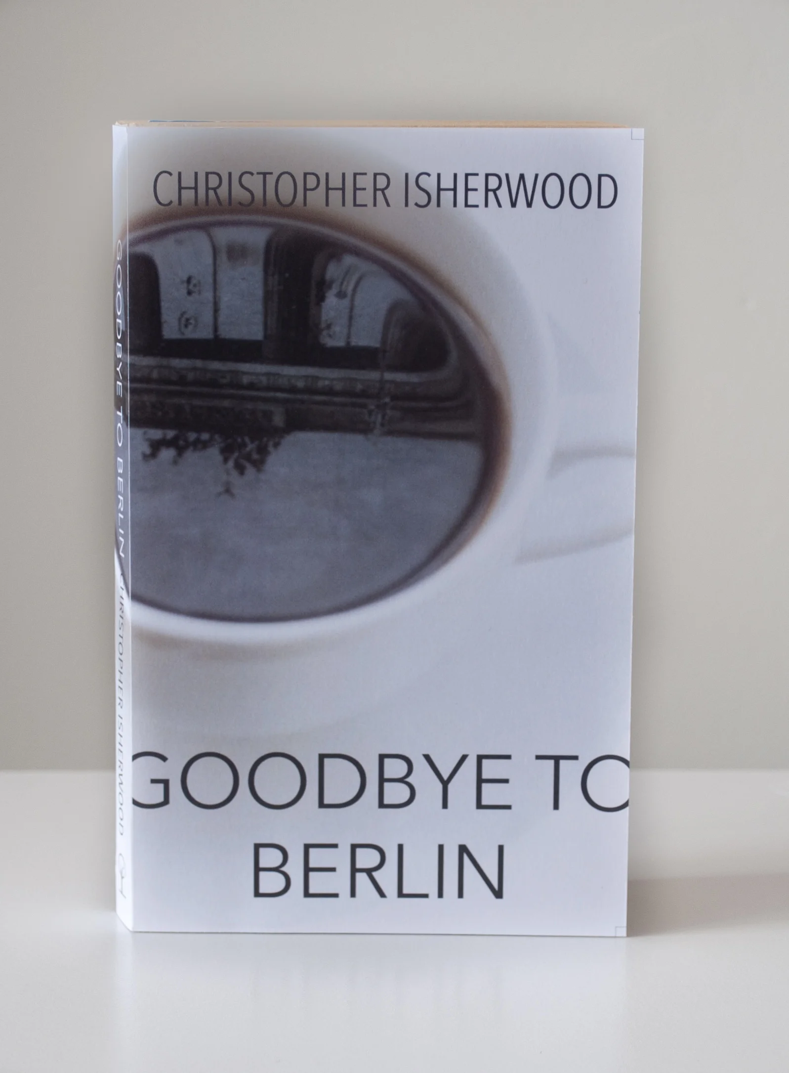
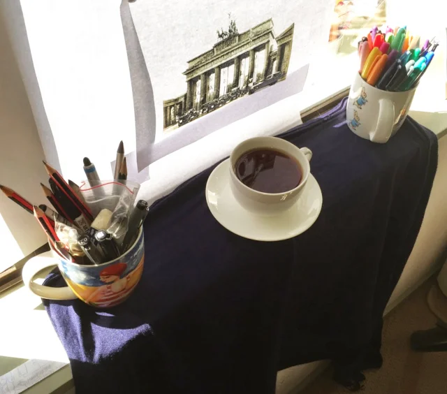
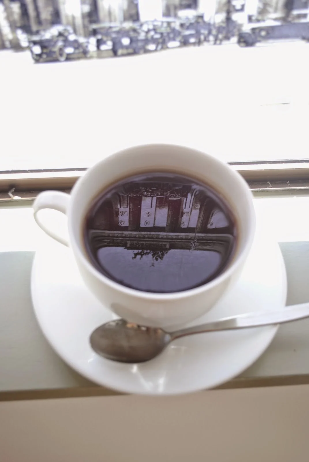
It was the sense of reflection and recording that I wanted to capture in this book cover. I imagined Isherwood sitting outside a cafe in the German capital, drinking a hot beverage and observing and writing about the world around him. This led me to the image of the cup and saucer. The shape of the cup looks like a camera lens, especially with the reflection reversing the image like a camera does.
Capturing a reflection of 1930s Berlin in a teacup was no easy feat. I wanted the design to look as realistic as possible, so decided that it would be better to make it as 'real' I could, creating the image in-camera rather than with Photoshop.
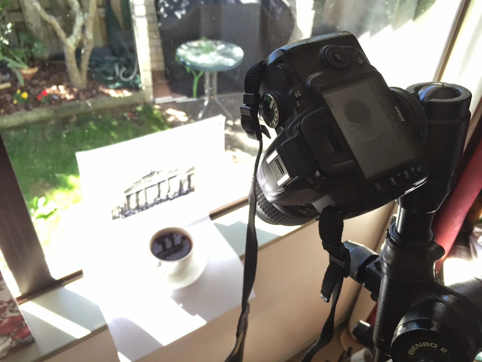
I printed a high-contrast image of the Brandenburg Gate and tried reflecting it into the teacup. This was unsuccessful to begin with because the subject was too dark. I then tried sticking the photo to a window with the sunlight behind to create a sort of light-box. This created enough brightness for the image to show up in the reflection.
The images were shot in RAW, which allowed me more freedom when it came to editing. I used the manual settings and overexposed the subject to get a very white, bright image with enough contrast in the reflection.
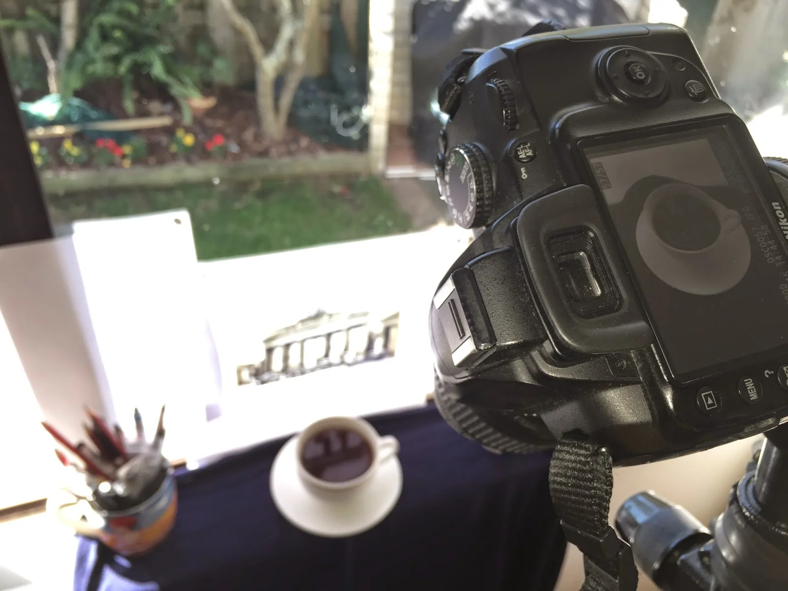
After a first attempt I found that it was much easier to cut out the cup in Photoshop if I put it against a dark background. A navy blue scarf held up with some weights allowed me to do this.
I experimented with a number of different compositions. In my initial sketches I considered including a notebook and pen, but when transferred into Photoshop the image became too fussy.
I also tried inverting the colours to make a negative image. I really like this result, as I think it makes for a very striking image, but while this went well with the concept of photography, it made the reflection too abstract and the symbolism of the teacup was lost.
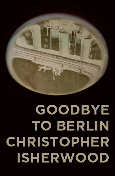
In the end the simplest image was the best, with the teacup off-centre.
This is the final result, and I was very pleased with how it turned out. It goes to show that you don't need a lot of fancy photography gear to make an interesting and unique image.

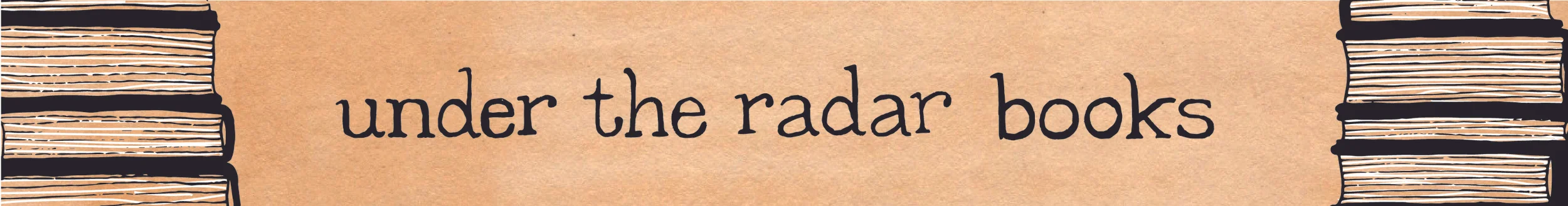
Under The Radar Books Banner Case Study
Under the Radar Books is a new Etsy shop created by Brittany Johnson. She wanted to create an online equivalent of the bookish lucky-dip, or 'blind date with a book.' Brittany has a YouTube channel and a group of loyal subscribers who trust her opinion when it comes to literature. Under the Radar Books takes that to the next level, offering a mystery book in a number of categories, including 'Brittany's Choice.' Her existing brand has a vintage aesthetic that is accessible to her contemporary audience.
Objectives
To begin with I looked at what Brittany had built so far. There was already a set of imagery going on within her packaging, so I wanted to build on that. My style usually incorporates lettering and illustration, and I asked if she wanted just lettering, just illustration, or a combination of the two. She told me that she wanted a combination and that she wanted typewritten or printed lettering and neutral colours, both of which fit within the existing brand. The banner also needed to have a version that would work on YouTube and across multiple devices.
Research
I started researching different printed and script fonts, but quickly narrowed it down to the typewritten options. I ended up looking at some beautiful examples of typewritten pages from the 1940s. I wanted to capture the sense of uniformity, but also of irregularity that occurs in typewriting, depending on how hard the keys are pressed, the quality of the paper and any quirks of the typewriter itself, for instance, sometimes certain keys are out of line.
Sketching
When sketching out the letter forms I attempted to draw the T slightly higher than the baseline of the text, but I decided that it looked odd, as there was only one T in the phrase. After image-tracing the sketch in Illustrator I put the T back in line and moved the three Rs out of line, so as to create the sense of both uniformity and irregularity. I also tried out some different lettering styles, but the typewritten solution was the one that fitted best with Brittany's objectives.

Making it Digital
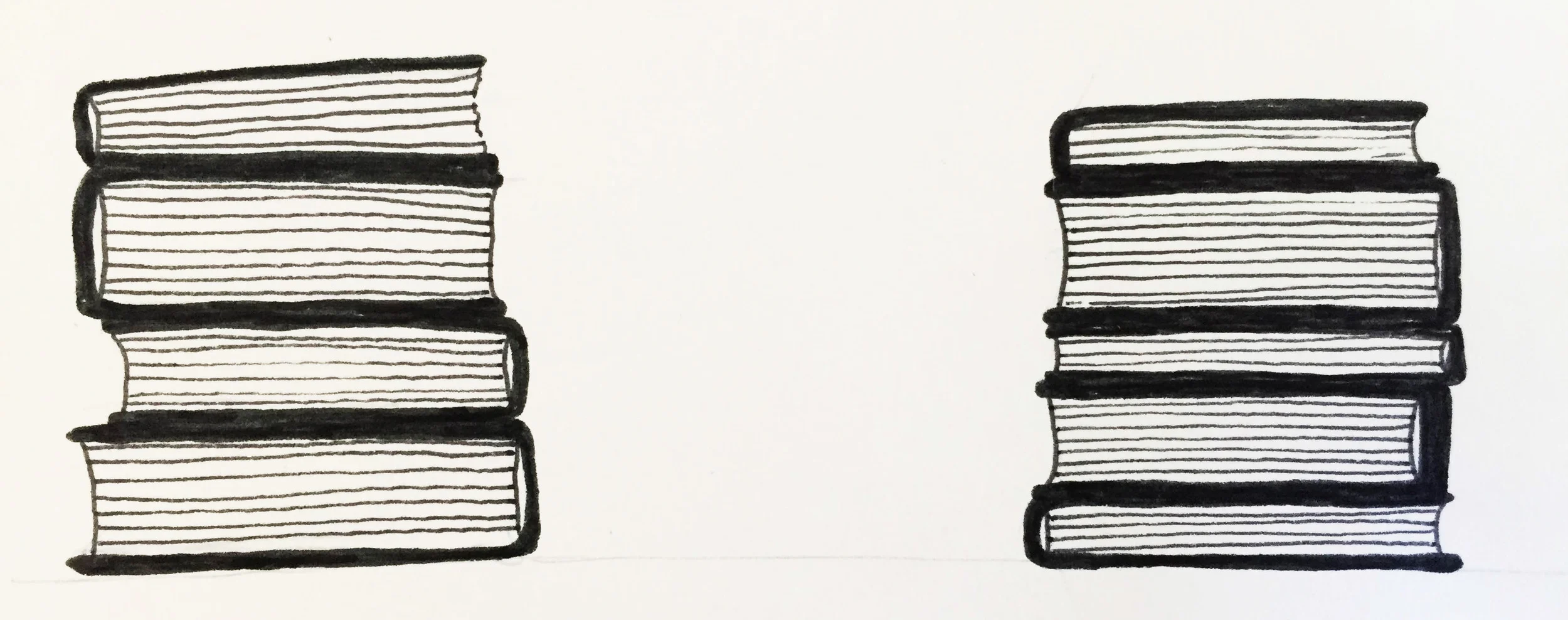
The next part was the book illustration. I wanted to keep this quite simple and in black and white. The sketches are simply black ink, with different weights of fineliner. I always increase the contrast of image in Photoshop before importing it into Illustrator for an image trace. The image trace tool often requires some refining, but if the imported image has a high-contrast it can sometimes work as it is.
Putting it All Together
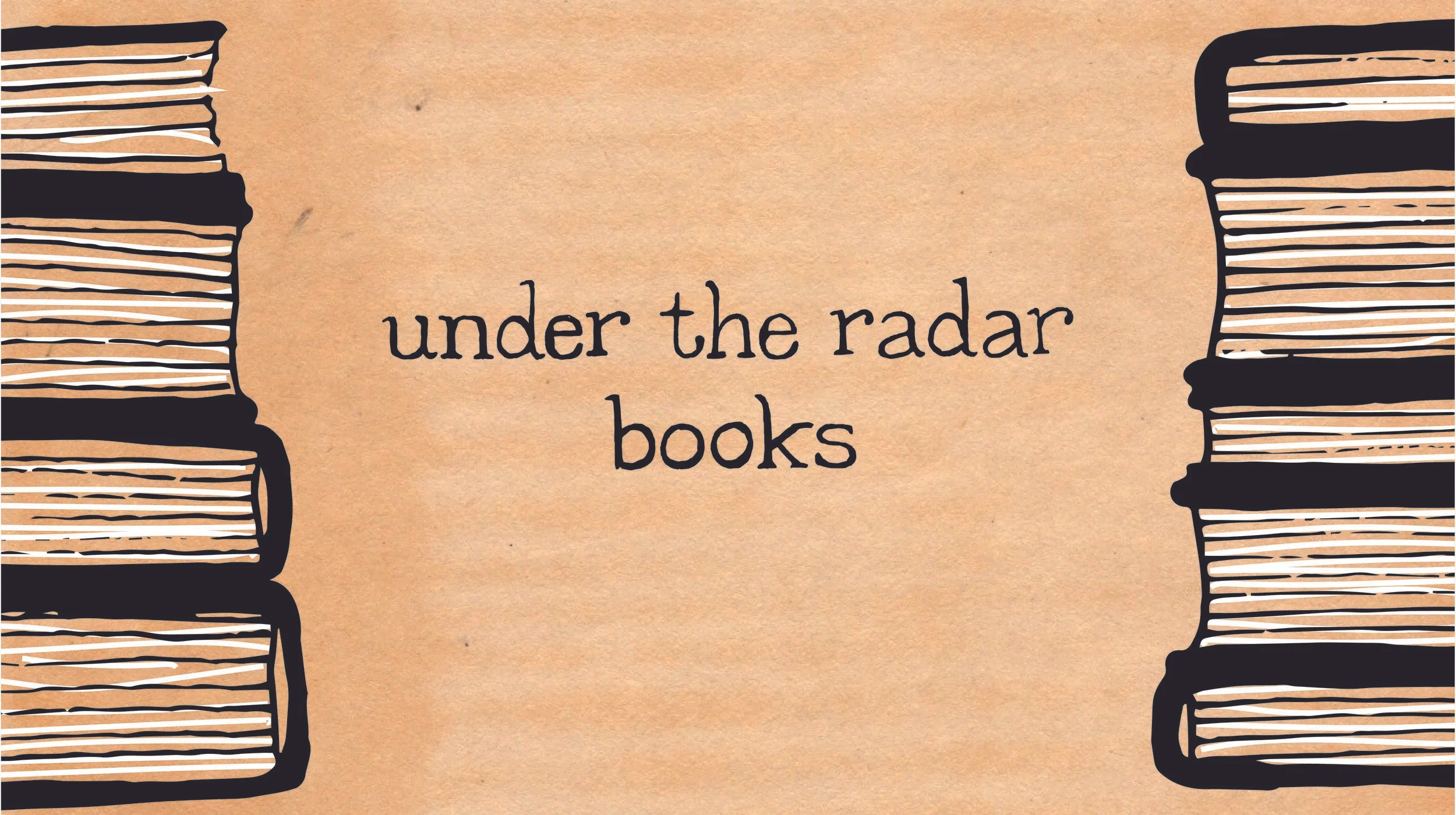
I found some free paper textures online that had that vintage parchment look to them. The one that I went with has a nice colour saturation, but is still light enough for the black to really stand out.
I first created the Etsy version of the banner, which needed to be 760x100 pixels. In this version the text is all on one line and only the edges of the books are visible. I also added the white highlights on the pages to create some extra depth.
The YouTube version was more complicated, as it had to work across a variety of devices and platforms, from a full-screen television to the smallest mobile device. This meant that the important information had to go in the middle section of the banner. I moved the text onto two lines and made the books larger. The text will always be visible, regardless of the device being used. The books will be visible on larger devices.
The final images are versatile, and timeless. The style is vintage-inspired, but still clean looking and bold enough to be recognisable across platforms.
To see the final design in context take a look at Brittany's YouTube channel and her Etsy Shop.
Design, Drawing and Life | Updated Illustration Portfolio
January Wrap Up 2016 | Part II
January Wrap Up 2016 | Part I
January Book Haul 2015
This was my first video of 2016. For past videos please visit my channel.