The Legacy of Witches — Behind the Scenes

I was SO excited when the one and only A.K. Mulford reached out to me wanting to do a special edition omnibus of her Okrith novellas.

Honestly, I’m in my happy place whenever I get to work with shiny things (gold foil, I’m talking about you). ✨ But this project also involved a custom dust jacket AND a map! 🗺️ Talk about dreamy.

After reading the novellas, (which are great, BTW), these were the initial concepts I sent. We agreed that the first design was the best for the jacket and that the second would work perfectly for the case binding.

I cleaned up the lettering for the title and drew out the design in black and white to get the contrast right.

The colours for this project were so fun! A purple forest at night with pink mushrooms and leaves faintly glowing in the moonlight? Yes, please!

We kept the title lettering the same on the case binding for consistency.

And I’m always over the moon when I get to design a fantasy map! I love A.K’s imaginative place names and the fact that there are a variety of climates within her world. In the south we have palm trees and desert. In the north there are mountains, swamps and pine forests. And when there’s an ocean you know there’ll be some fantastical sea creatures! Can you spot them?

And here’s the finished jacket, featured on A.K’s Instagram.

And the foiled case binding in all its shiny glory. Yes, I’m a magpie. Gold foil is my greatest weakness.

And the map endpapers! I love endpapers nearly as much as I love foil.

This special edition omnibus is only available at A.K’s in-person signing events (in Australia) or exclusively on her Patreon.

Hand Lettering for Book Covers

What is Hand Lettering?

Hand lettering is the art of drawing letters and words

Whereas fonts and typefaces are pre-existing, hand lettering is created for a specific use. It is often used on book covers for the title text.

Isn’t That Calligraphy?

No, calligraphy is the art of writing in a specific style. Lettering is a type of drawing.

Lettering typically gives more customised and varied results.

 This makes it perfect for book covers!'

Here are some examples of hand lettering designed for book covers.

Examples of hand lettering for book cover design. Lettering by Holly Dunn.

Should You Redesign Your Backlist Book Covers?

Why create new covers for your backlist book titles?

As a writer, your backlist is one of your greatest assets.

  • It can be a form of passive income 

  • It provides multiple entry points to your work, bringing in new readers

  • It gives you somewhere to send people after they’ve finished (and loved) your more recent titles

Breathe life into your backlist

One of the best ways to breathe new life into your older titles is to relaunch them with new covers.

  • It gives you a reason to shout about your books

  • It allows you to reach different people than before

  • Usually, a writer’s best sales numbers are during launch week. Redesigning and relaunching your books gives you a chance to experience that again

An example of an effective book design rebrand

The original cover for Cinder was published in 2012 when YA covers were still riding the Twilight wave. We saw a lot of minimalist covers with red highlights.

10 years later and YA design has changed a lot. The covers were re-released to appeal to the current market, using a bright new colour scheme and a much more intricate and stylised illustration.

When is the right time to redesign your covers?

  • When sales have slowed

  • When you want to reach a new audience

  • When trends in your niche change

  • When you want to better align your covers with your author brand

  • When you want to! They’re your books, after all :)

What Are Comp Titles or Comp Book Covers?

‘Comp’ or comparative covers are other books that are similar to yours. These might be books with similar content or ones that have a similar target audience.

Comp titles are often used in marketing. Think, “this book is like X crossed with Y.”

Why do comp covers matter?

When it’s time to design your book cover, you’ll need to have a selection of comp covers to give your designer.

This helps them better understand your tastes and your book.

A good book cover designer will help you to find good comp covers.

Free comp cover resource

I’ve put together a compilation of recent and bestselling covers arranged by genre into a free download with commentary on each genre. It’s designed to help you formulate a brief for your cover designer, whether that’s me or someone else.

Get the guide.

Questions to Ask When Designing a Book Series

Designing a series of books comes with some different considerations to designing a standalone.

A book series is a brand and it needs to look cohesive and recognisable. If someone has read the first book, they need to be able to recognise Book 2 as belonging to the same series.

I like to know from the outset if I’m designing for a series, as this informs the way I design the first book. The more information I know about the rest of the series, the better. But, they don’t all have to be designed at once.

These are the main things I think about when designing a series:

 1) Text

Are we using a font or utilising hand lettering? There are pros and cons to both.

Will it be easy to replicate this style of text on future covers? The whole set needs to work as a team.

Where will the author’s name and series name go? This usually needs to remain consistent across the series.

Will the typography style work for different lengths of titles and words? For instance, if the first book is called The Fae and the second is called The Fae Prince Who Fell Into the Human World and What He Found There, I’ll need to do quite a bit of work to make the two covers match.

How can I set up the spines so that the text matches? Or your readers might get angry that the books don’t match on their shelves.

 2) Imagery

What imagery is being used? Do we have characters or symbols from the story on the cover?

What visual themes are used throughout the series? How can we extend that across the covers?

Can we replicate the way the imagery is used across the series? We might not use the same images, but we could use different ones in a similar way.

What images might we use on the subsequent covers? It’s useful to know about this sooner rather than later.

Are there things to leave off the first book so that we can use them on future covers? Again, this is good to know from the outset.

 3) Colour

What colours suit the tone of the series? Are we going for jewel tones, bright colours, pastels, neutrals or something different?

Are there particular colours that suit one book over another?

Do we want all the books to have different colours, or keep them the same? Usually, each book will have a different colour, but that isn’t always the case.

What about the spines? How will they all look together?

The other question I get asked is: do you offer a discount if I hire you for the series? And the answer is YES! Designing the second, third, fourth, fifth (and beyond) takes fewer steps, as we already have a framework for the design. Because of this, I offer a discount after the first book cover in a series.

👉 Want to learn more? Head over to my CONTACT page to send me a message or book a call.

How to Work With a Book Cover Designer

As an author hopefully you understand how important it is to have a book cover that attracts readers and represents your work well. That's why working with a book cover designer is an essential part of the publishing process. Here are some tips to make your collaboration fruitful and fun!

Research and choose a designer

Do your research and find a designer whose style and portfolio resonate with you and your book's genre. If you already have a favourite artist who would suit that style of your book, you can reach out to them! Pinterest, Instagram and Google image search are good ways to find designers. There are also artist databases, or you can simply pop into your local bookshop and look at who designed some of your favourite covers. Most books will list the cover designer on the back of the book. If you can’t find it there, look on the inside flap of dust jackets and on the copyright page.

Provide a clear brief

Before your designer starts working on your book cover, provide a clear brief that includes your book's genre, target audience, and any specific design elements you’d like to include. These might be key symbols or motifs from your story. Also, share your book's blurb and synopsis, so the designer can create a cover that reflects the story's essence. Be open to suggestions from your designer based on the synopsis and their knowledge of the industry.

Communicate effectively

Communication is key to a successful collaboration. Be open and clear about your expectations, feedback, and deadlines. Ask your designer for regular updates and progress reports, and provide constructive feedback to help them improve their work. If your designer is good at what they do, they should provide clear expectations and timelines from their end as well. I always like to get on a Zoom call with clients to discuss these points ahead of time.

Trust the designer's expertise

Remember that your designer is a professional who understands design principles and has experience in creating book covers that sell. While it's essential to provide feedback, trust their expertise and give them creative freedom to come up with designs that represent your book in the best possible way.

Be open to revisions

It's common for book cover designs to go through several revisions before the final version. Be open to feedback and suggestions, and work with your designer to make the necessary changes to improve the design.

Working with a book cover designer can be a rewarding experience that results in a book cover that attracts readers and represents your work well. Follow these tips, communicate effectively, and trust the designer's expertise to make the most out of your collaboration.

How do I format my book for self-publishing?

Why does typesetting even matter?

When it comes to book formatting, there are standard typesetting rules that every writer and publisher should follow. These rules ensure that your book looks professional and is easy to read. Failing to follow these basic rules can result in a book that looks unprofessional and can even discourage readers from continuing to read.

Typesetting also allows you to optimise space on each page, ultimately saving you money on each book by saving pages.

The cardinal rules for typesetting your book

Font

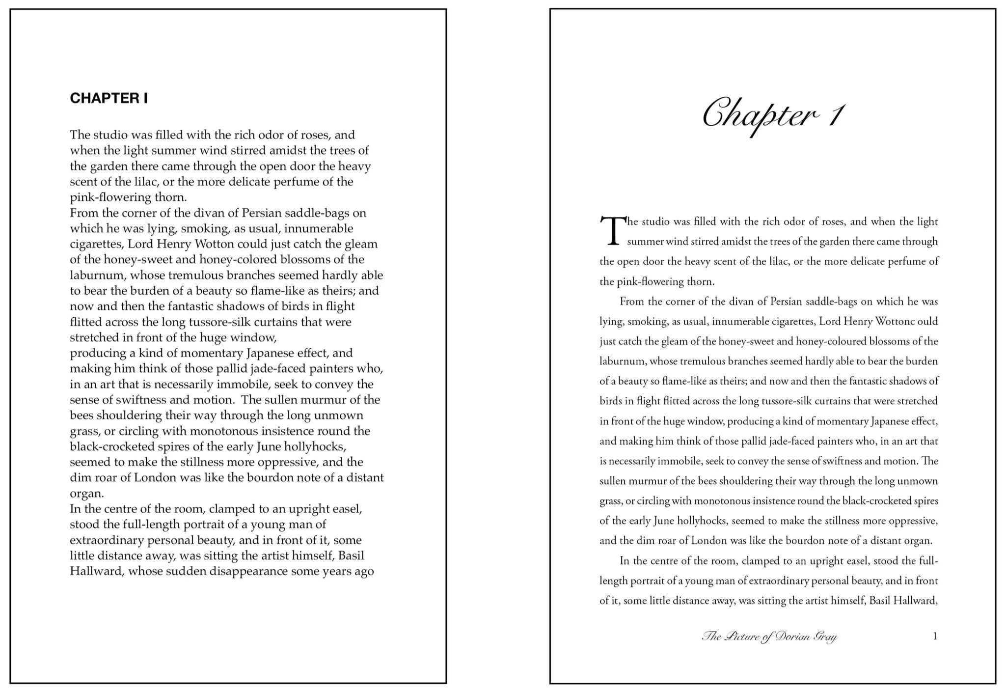
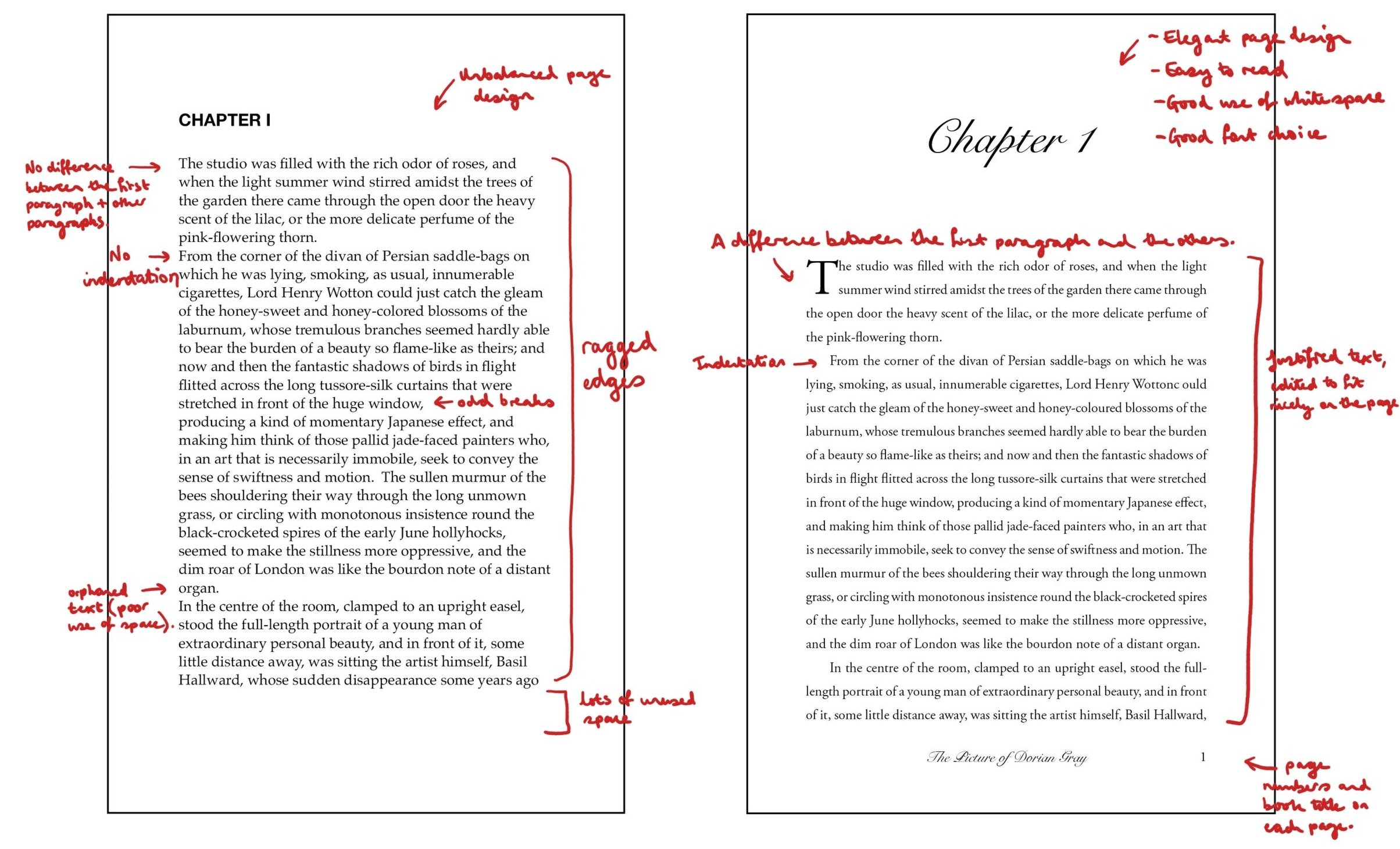
The first rule to consider is the font. It is important to choose a font that is easy to read and unobtrusive. If you’ve ever had someone send you an email in an elaborate script font, you’ll know how intrusive the wrong font choice can be. Commonly used fonts for books are Times New Roman, Garamond, and Baskerville. These fonts are serif fonts which means they have small lines or flourishes at the ends of each letter. Serif fonts are traditionally used in print, as they are easier to read, with the small lines helping to guide the reader's eyes along the text.

Font Size

The next rule to consider is the font size. The standard font size for books is 11 or 12 points. Anything smaller can strain the reader's eyes, and anything larger can make the book look unprofessional. It’s worth noting that some fonts look larger than others, even at the same point size, so it’s always worth ordering a printed proof copy of your book to check this before publishing.

Line Spacing

Line spacing is another important factor to consider. You don’t want the spacing to be too wide, but you also don’t want it too tight. Getting this balance right makes the text easier to read and gives the reader some room to breathe.

Margins

Margins are also an essential part of book formatting. You’ll want to leave at least 1 inch on all sides. This provides enough space for the reader's thumbs and fingers to hold the book comfortably. Another consideration is how much of the page gets swallowed up by the spine binding. Readers don’t want to be struggling to read words on the inside of each page, so make sure you leave more space on the inside than on the outside.

Page Numbers

Page numbers are a necessary component of book formatting. They should be placed in the header or footer of each page and should be consistent throughout the book. Numbering should start from the beginning of the book’s text, not including material at the front of the book. Odd numbers are always on the right hand side.
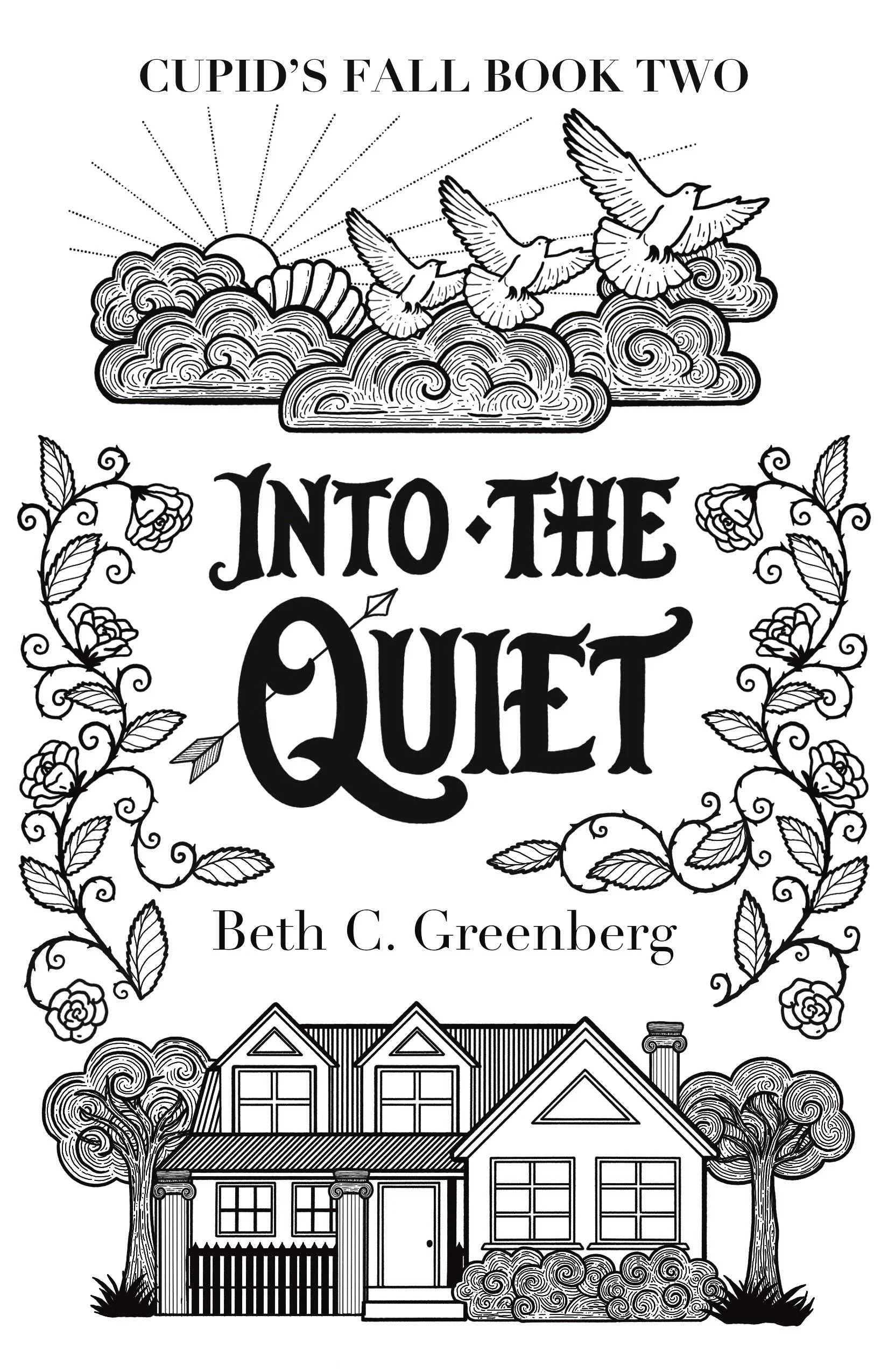
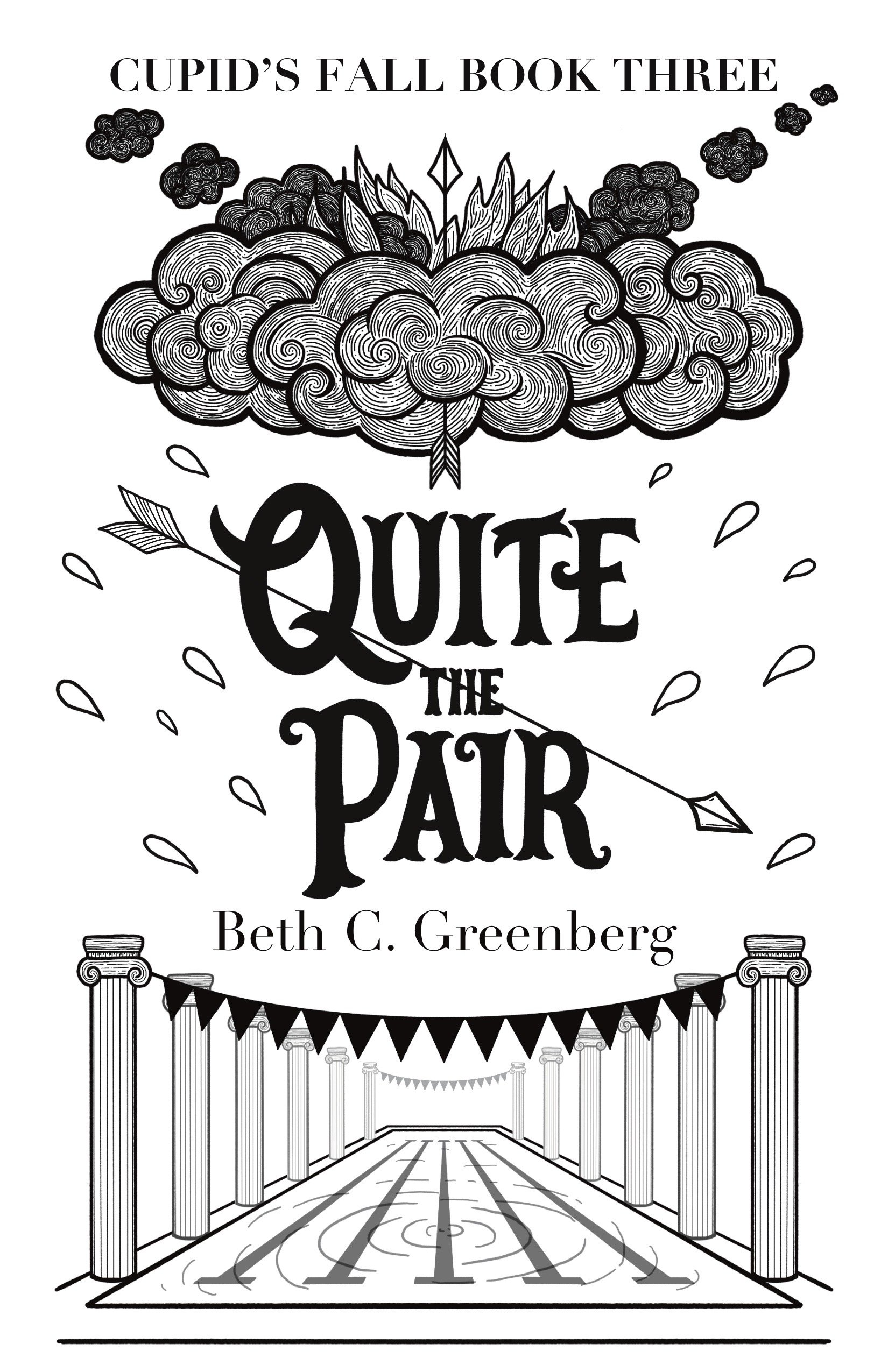
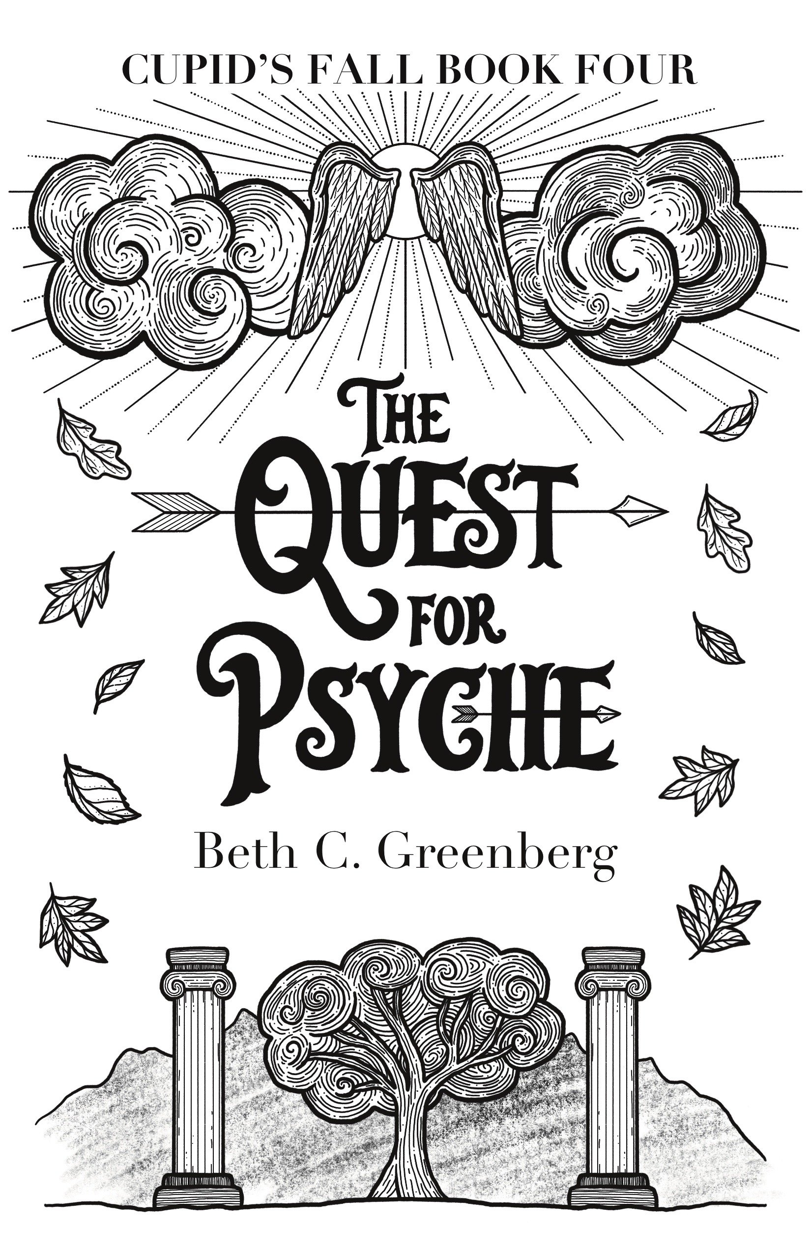
Chapter Headings

Chapter headings should be consistent throughout the book. They should be formatted in a way that is visually appealing and easy to read. Bold or italicised fonts can be used to make the chapter headings stand out. Or, you can use a display font to make it a little bit fancy. Personally, I like to use either the same or a similar font as on the cover.

Indenting

Indenting is another important aspect of book formatting. The first line of each paragraph should be indented by 0.5 inches. This makes the text easier to read and helps the reader differentiate between paragraphs.

However, there is an exception to this. For the first paragraph of a chapter or the first paragraph after a section break, there is no indentation. In this case, you may also wish to use a drop cap (where the first letter of the first word is larger than the standard and ‘dropped’ into the subsequent line for emphasis).

Hyphenation

Hyphenation should be used sparingly in book formatting. It is typically only used to break up long words at the end of a line. Overuse of hyphenation can make the text look cluttered and difficult to read. You want the text to flow without distractions.

On this subject, you also want to avoid ‘orphans’ and ‘widows’ where a word gets left on its own at the end of a paragraph. This can be avoided through adjusting the leading (space between the words) and/or the kerning (space between the letters).

DIY or Pro?

It’s possible to do a lot of these things in Microsoft Word. Personally, I find Microsoft Word and book formatting to be a recipe for the tearing out of hair and overuse of curse words. Vellum is a better DIY option, although it has very limited design options. I use Adobe InDesign for my formatting. It’s a professional program and provides many more features for laying out books.

Typesetting is a specialised skill. If you’re not confident in formatting books or don’t have the time to spend learning, I highly recommend hiring someone to do the job for you. Whether that’s me or someone else, look for someone who works with Adobe InDesign and has specific expertise in book formatting. It’s a specialised skill, and not all graphic designers will be able to do it well.

If you’d like a quote for formatting your book, email me with your word count and timeframe.

Brave Women Write | Design Case Study

Carolyn Tate came to me in August last year, she was looking for a beautiful cover that would express themes of hope following grief, personal healing and a connection with nature. She had a couple of ideas in mind, involving natural imagery with a woman’s fierce face coming through.

The Brief

Her target audience was very specific: women in their 40s who are moving through grief, wanting to write a book and make writing a practice for life. We talked about her themes and what she wanted from the cover over a Zoom call. She wanted to convey themes of feminism, strength, courage, boldness, vibrancy, spirituality, nature and community.

Conforming to genre

The first concept was a very simple one. The book’s genre is self-help and spirituality, as well as writing. I wanted to use some of the conventions of those genres in at least one of the cover concepts. This one explores the idea of growth and transformation while still being quite minimalist. In a bright colour, this would look right at home in the self-improvement or writing sections of a bookshop.

Branching out

For something more feminine, I tried using two faces in profile with flowering tree branches representing growth. I liked the symmetry, but this cover seemed a little too plain.

Forging a new path

This was one of my favourites. It works more with the idea of a creative journey (and creating your own path) and feels very tied to nature. There was also the possibility of hiding some female forms in the trees in the foreground. I thought this one could look fantastic as a paper collage with different colours and textures.

Blossoming

And finally, we have the concept we ended up going with. The flowers I’ve chosen are based on the Victorian language of flowers. We have marigolds for grief, protea for transformation and clematis for creativity. I also suggested adding some yarrow to mean ‘a cure for a broken heart.’ These flowers would lend themselves to a strong colour palette too.

And indeed, this is the direction we decided to go in. Carolyn asked for a few adjustments to the faces. She wanted them looking out at the viewer. We also changed up the typography. I hand-lettered the title so that it looked more like script handwriting to match the writing theme.

The final design

Here’s how the final design came together! Big, bold flowers have been a big trend across many genres of book covers recently and I think it will be sticking around for a while.

Check out Carolyn’s book here.

Or, if you’d like to read about some other recent design projects, click here.

A Greek Mythology Romance Book Series

Cupid’s Fall Book Series

When romance author Beth C. Greenberg came to me with her brief, I knew it was going to be a good one.

The Book Design Brief

It went something like this:

  • A Greek myth retelling

  • Cosy romance

  • Modern setting

  • Gods behaving badly

  • A pansexual protagonist

Uh, yes please, count me in!

Here were the initial concepts. I experimented using motifs inspired by ancient Greece. Beth also wanted feathers and arrows to be central to the design.

Concepts

I liked the third design here, and Beth agreed. Some changes needed to be made though.

While she liked the idea of having the upper part of the cover represent what was going on on Olympus and the lower part representing the mortal world, she thought that the figures made it too literal. I agreed that the depictions of the gods on the cover might be a bit much.

Development

In the next round we removed the figures and added symbols in their place. For the first book, that meant an image of the Pantheon instead of Aphrodite and Hephaestus and a falling quiver in place of Cupid. For the second book, we have Aphrodite’s chariot drawn by doves and a typical suburban American house. The third book has Hephaestus’ forge with a golden arrow above a swimming pool scene. And finally, we have Cupid’s wings and an autumnal scene on the fourth cover.

Then we started looking at some colour options.

Developing the Colours and Adapting the Lettering

Beth wanted to continue with the colour sequence used on the original book covers, which made a lot of sense thematically for the stories.

During this process, we both realised that we might need to make some changes to the lettering on the title. Looking at the covers in thumbnail size and in colour, the text wasn’t as legible as we would have liked. Beth pointed out some lettering samples from my website and I got to work making the new titles.

Nailing Down the Line Art

With those changes made and a few more tweaks to the illustrations, especially for Book 3, we were ready to move on to the final colour schemes.

The Finished Covers

And here we are! The final covers include more detailed shading and some gold touches. A drop shadow on the title text helps it to stand out against the background and all those details in the clouds really pop with that extra shading and highlighting.

Beth went for three formats: paperback, hardback and ebook. Here’s the full design for the hardback version of First Quiver.

All of the illustrations were drawn in Procreate on the iPad. I prepared the final files for print in Adobe InDesign.

For more information about the Cupid’s Fall series and Beth’s other writing, visit her website: https://bethcgreenberg.com/

Why Typesetting Matters

Type Matters

Why would I spend money to have my book formatted (or ‘typeset’) when I can just upload it straight to Amazon as it is?

Typesetting is a crucial part of book publishing, as it can greatly impact the readability and overall aesthetic of a book. Good typesetting can enhance the reading experience by making the text more visually appealing, easier to follow, and more engaging for the reader.

There are many reasons to have your book professionally typeset. However, perhaps the best way to answer this question is with an image.

One of these pages has been professionally typeset and the other hasn’t. Can you see the difference?

Easy Reading

One of the primary benefits of good typesetting is readability. Well-chosen fonts, appropriate line spacing, and proper margins can make a huge difference in how easily readers can read and understand the text. Poor typesetting can lead to eye strain, fatigue, and even discourage your readers from continuing. Not something you want as an author!

Book Like a Pro

In addition to readability, typesetting can help create a cohesive and professional look for a book. Consistent use of fonts, colours, and formatting can give a book a sense of unity and help establish your brand identity as an author or publisher.

Here are some of the errors and corrections made to enhance the reader experience.

Every Page Counts

Another important aspect of typesetting is its impact on the length of the book. Proper typesetting techniques can help control the number of pages and reduce printing costs. This can be especially important for self-published authors or small publishing companies that have limited budgets.

The “Invisible Art”

Typesetting is often referred to as the "invisible art" because readers are often unaware of its presence when it is done well. I’ve never heard anyone outside of publishing remark on how great the typesetting is in a book. However, the impact of good typesetting can be seen in the ease of reading and overall aesthetic appeal of a book.

Technicalities

One aspect of typesetting that is often overlooked is the use of white space. White space, or the areas on a page that are left blank, can greatly impact the readability and flow of a book. I like to think of it like rests in music. The silences are just as important as the notes, as they help to enhance the melodies and chord progressions. Likewise, in design, proper use of white space can help guide the reader's eye to what’s important while also making the text more visually appealing.

Another important aspect of typesetting is the use of kerning, or the adjustment of space between letters. Proper kerning can help improve the legibility of text and make it easier for readers to distinguish between different letters and words. If done poorly, it can hamper the reading experience.

In the Mood to Read

Typesetting can also impact the emotional tone of a book. The choice of font, font size, and formatting can all contribute to the overall mood of a book. For example, a sans-serif font may be used to convey a modern, sleek feel, while a serif font may be used to create a more traditional, classic feel.

Accessible to All

Finally, typesetting can also impact the accessibility of a book. Proper use of font size, line spacing, and contrast can make a huge difference for readers with visual impairments or reading disabilities.

In summary, typesetting is an essential part of book publishing that can greatly impact the readability, aesthetic appeal, and emotional tone of your book. By prioritising high-quality typesetting, you can create books that are not only easy to read, but also visually engaging and emotionally resonant to your readers.

If you would like help with typesetting your book, please get in touch by clicking the button below!

Single Malt Whisky Packaging Design

Brief:

Design a set of three whisky bottles and their boxes. Each design should feature a mythical horse and represent a different aspect of the Scottish landscape.

  1. Unicorn , the national animal of Scotland.

  2. Kelpie, mythical water horse, supposed to haunt the lochs of the highlands.

  3. Pegasus, to complete the trio.

Also required: a promotional image for each whisky.

These bottles are limited editions and should be eye-catching, gender-neutral and make for the perfect gift.