Case Studies

Brave Women Write | Design Case Study

Carolyn Tate came to me in August last year, she was looking for a beautiful cover that would express themes of hope following grief, personal healing and a connection with nature. She had a couple of ideas in mind, involving natural imagery with a woman’s fierce face coming through.

The Brief

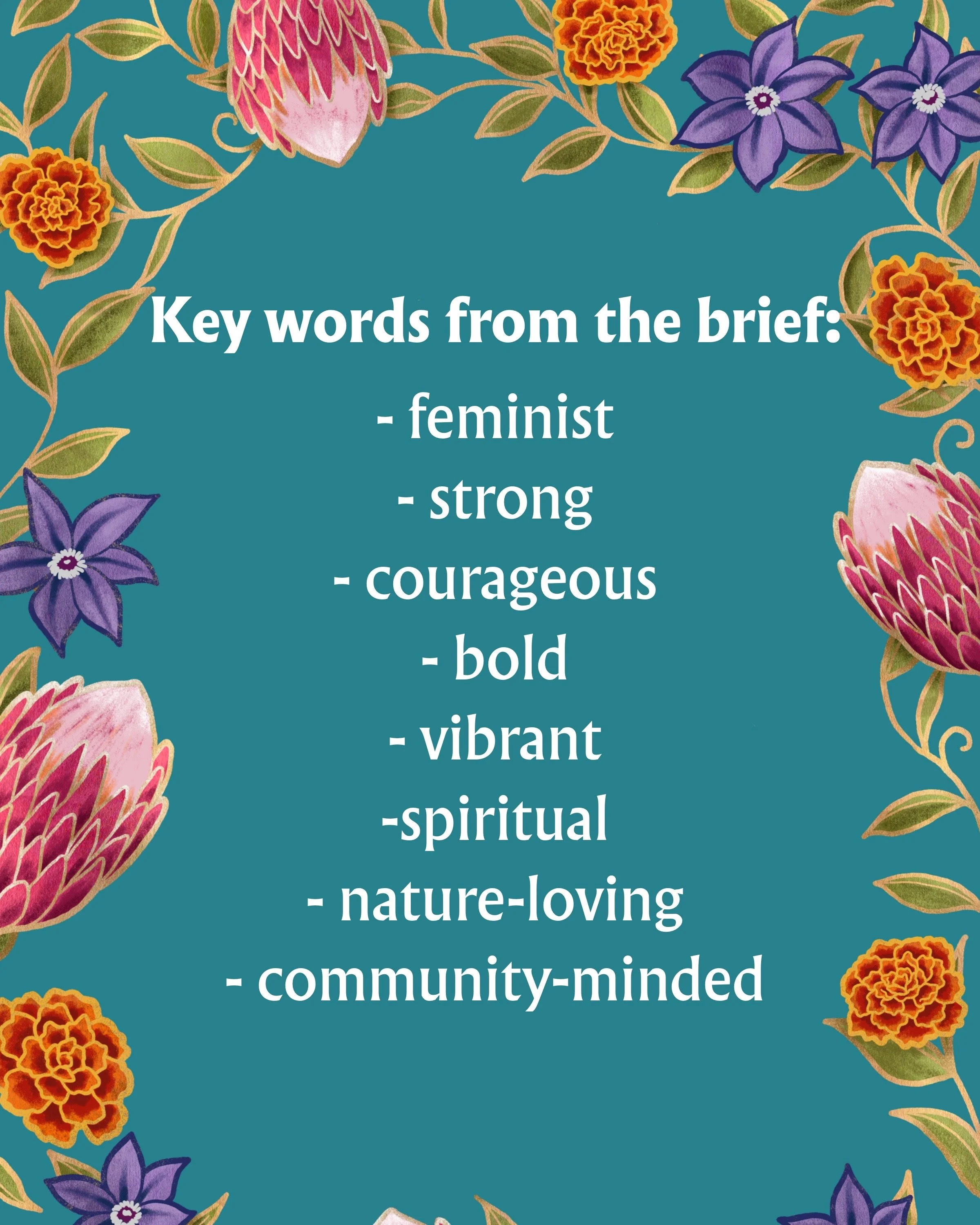
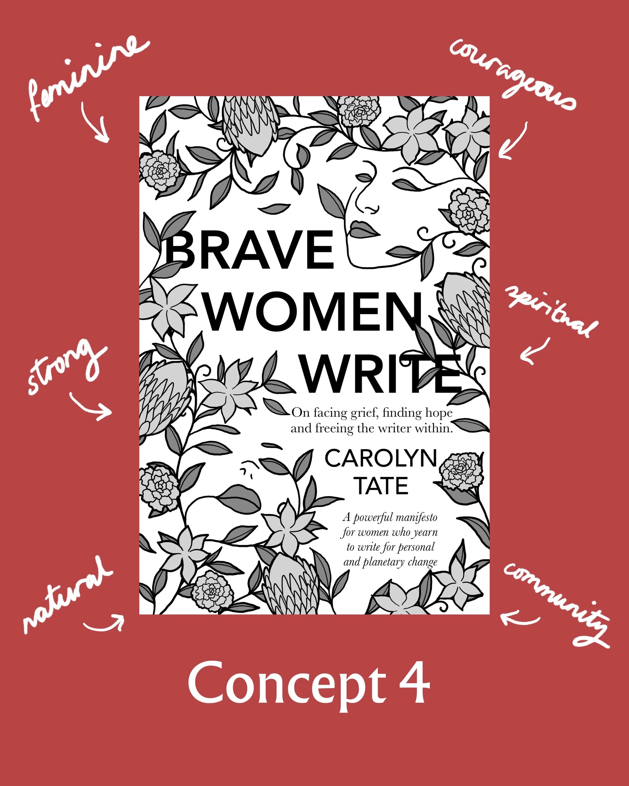
Her target audience was very specific: women in their 40s who are moving through grief, wanting to write a book and make writing a practice for life. We talked about her themes and what she wanted from the cover over a Zoom call. She wanted to convey themes of feminism, strength, courage, boldness, vibrancy, spirituality, nature and community.
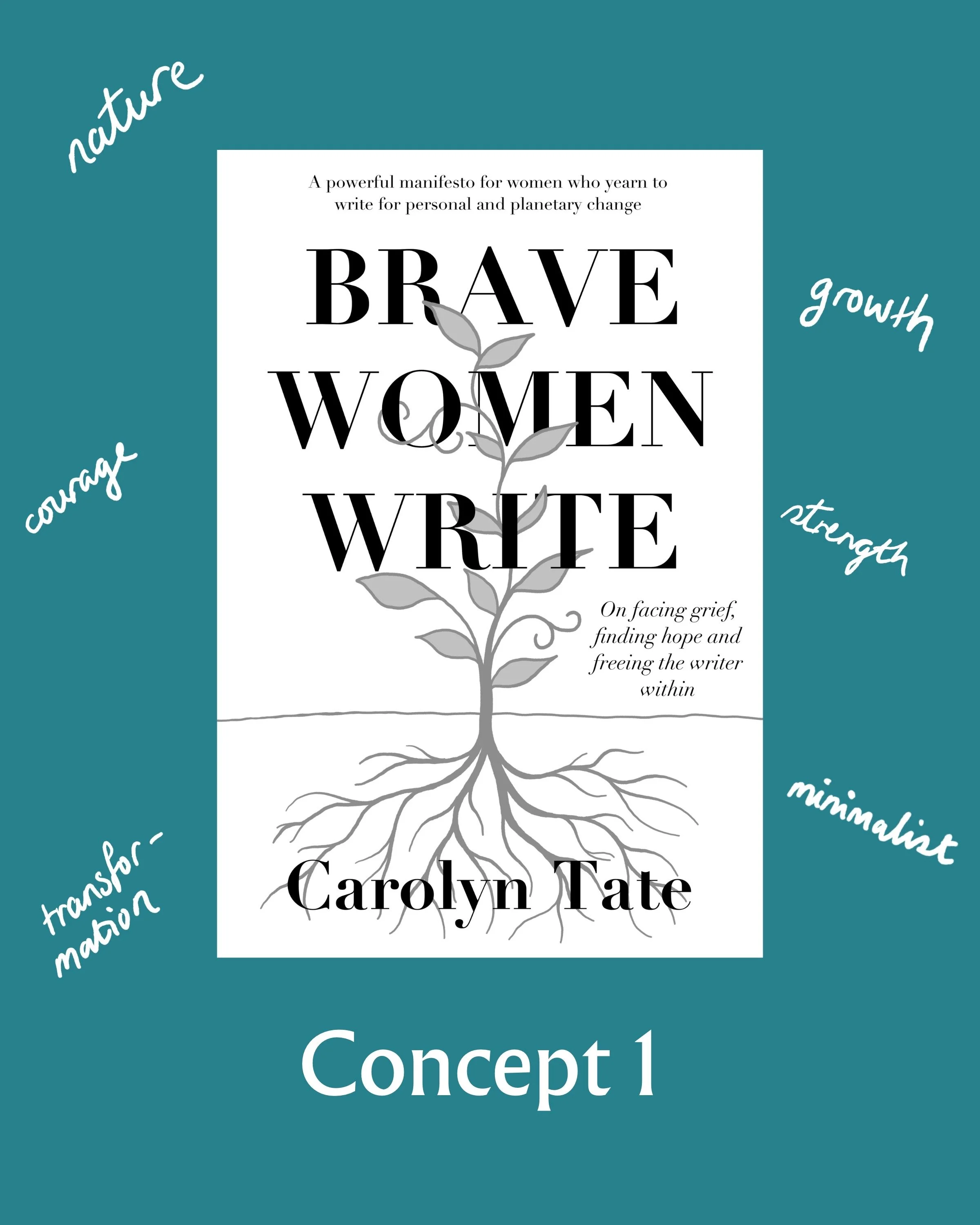
Conforming to genre

The first concept was a very simple one. The book’s genre is self-help and spirituality, as well as writing. I wanted to use some of the conventions of those genres in at least one of the cover concepts. This one explores the idea of growth and transformation while still being quite minimalist. In a bright colour, this would look right at home in the self-improvement or writing sections of a bookshop.
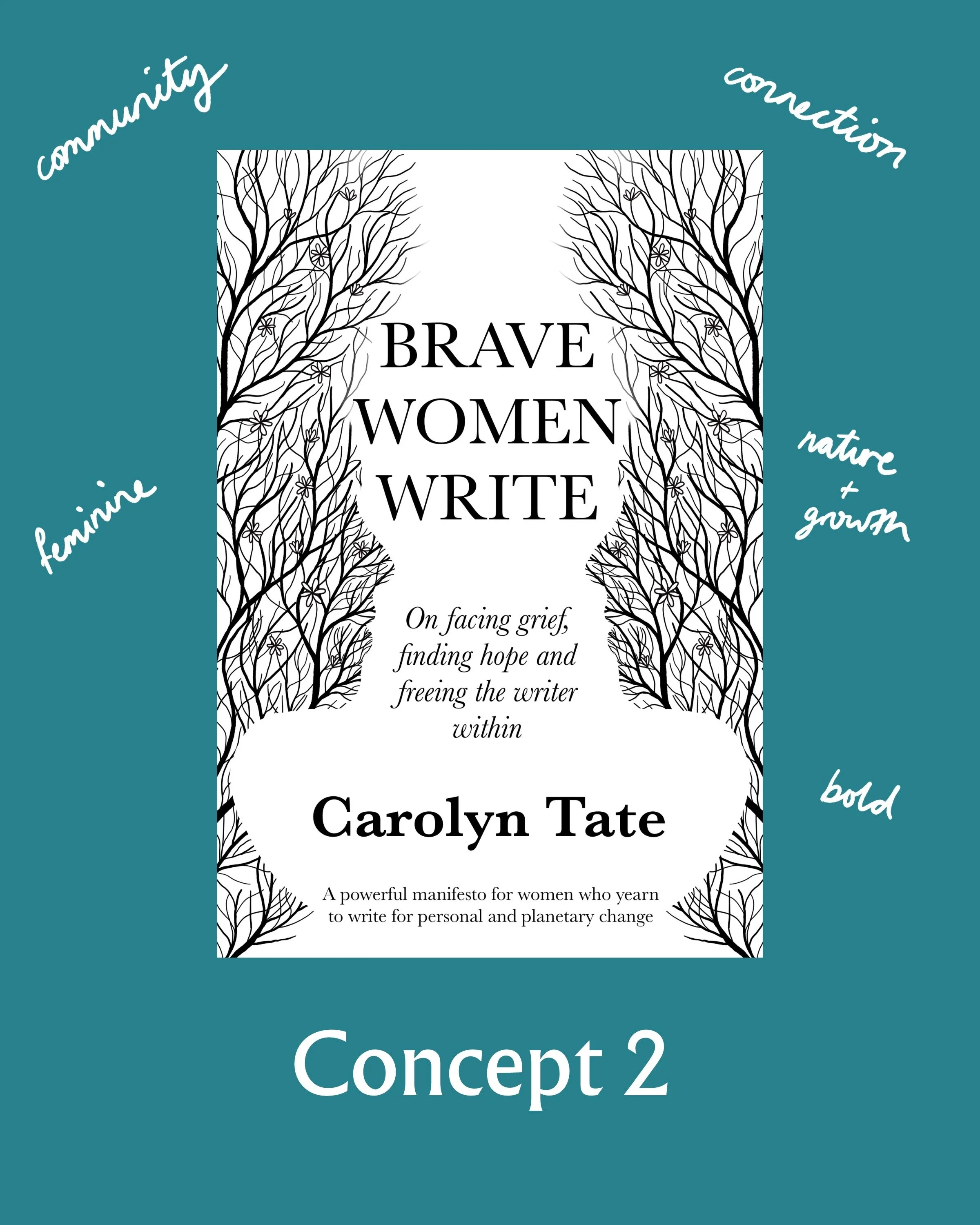
Branching out

For something more feminine, I tried using two faces in profile with flowering tree branches representing growth. I liked the symmetry, but this cover seemed a little too plain.
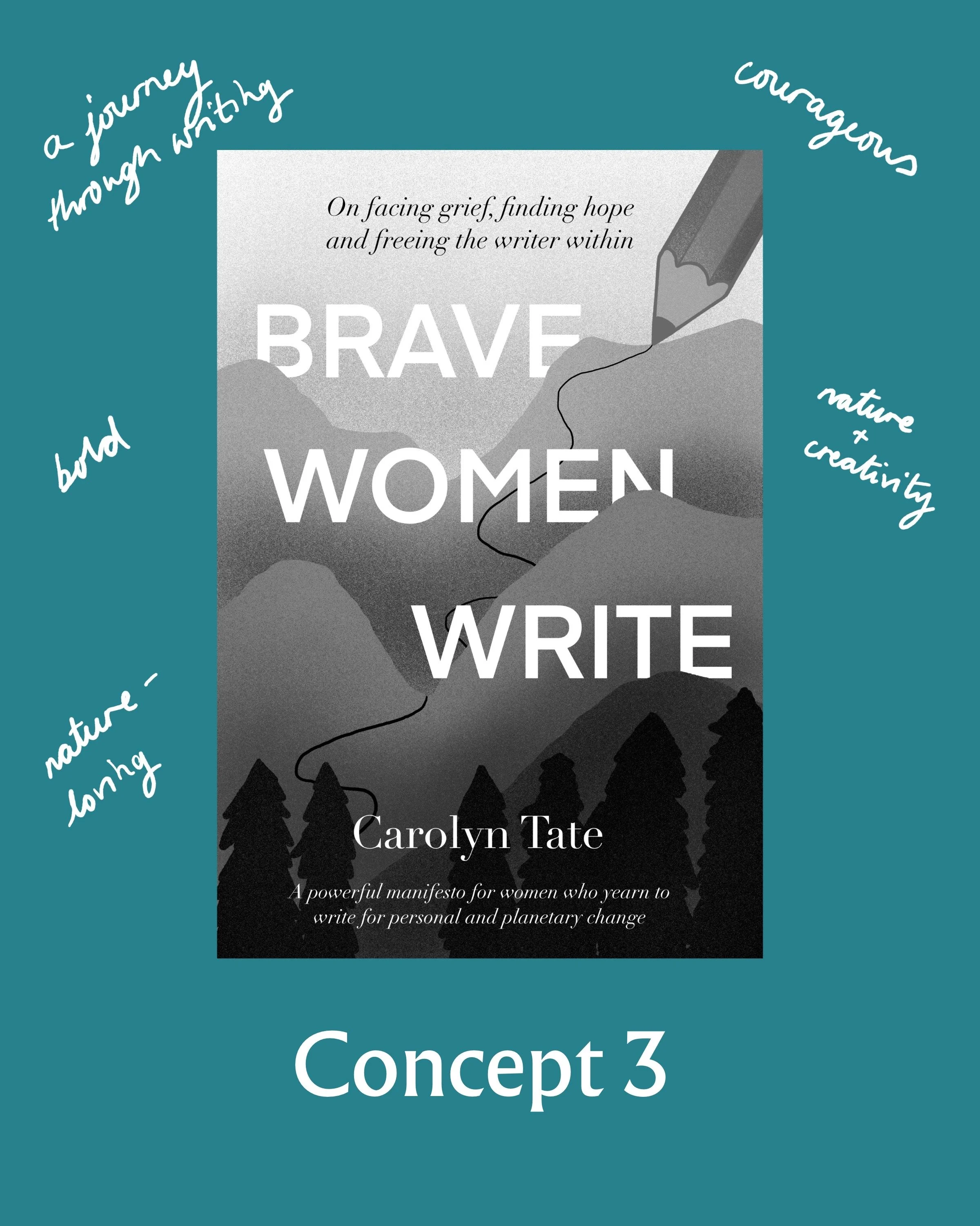
Forging a new path

This was one of my favourites. It works more with the idea of a creative journey (and creating your own path) and feels very tied to nature. There was also the possibility of hiding some female forms in the trees in the foreground. I thought this one could look fantastic as a paper collage with different colours and textures.

Blossoming

And finally, we have the concept we ended up going with. The flowers I’ve chosen are based on the Victorian language of flowers. We have marigolds for grief, protea for transformation and clematis for creativity. I also suggested adding some yarrow to mean ‘a cure for a broken heart.’ These flowers would lend themselves to a strong colour palette too.

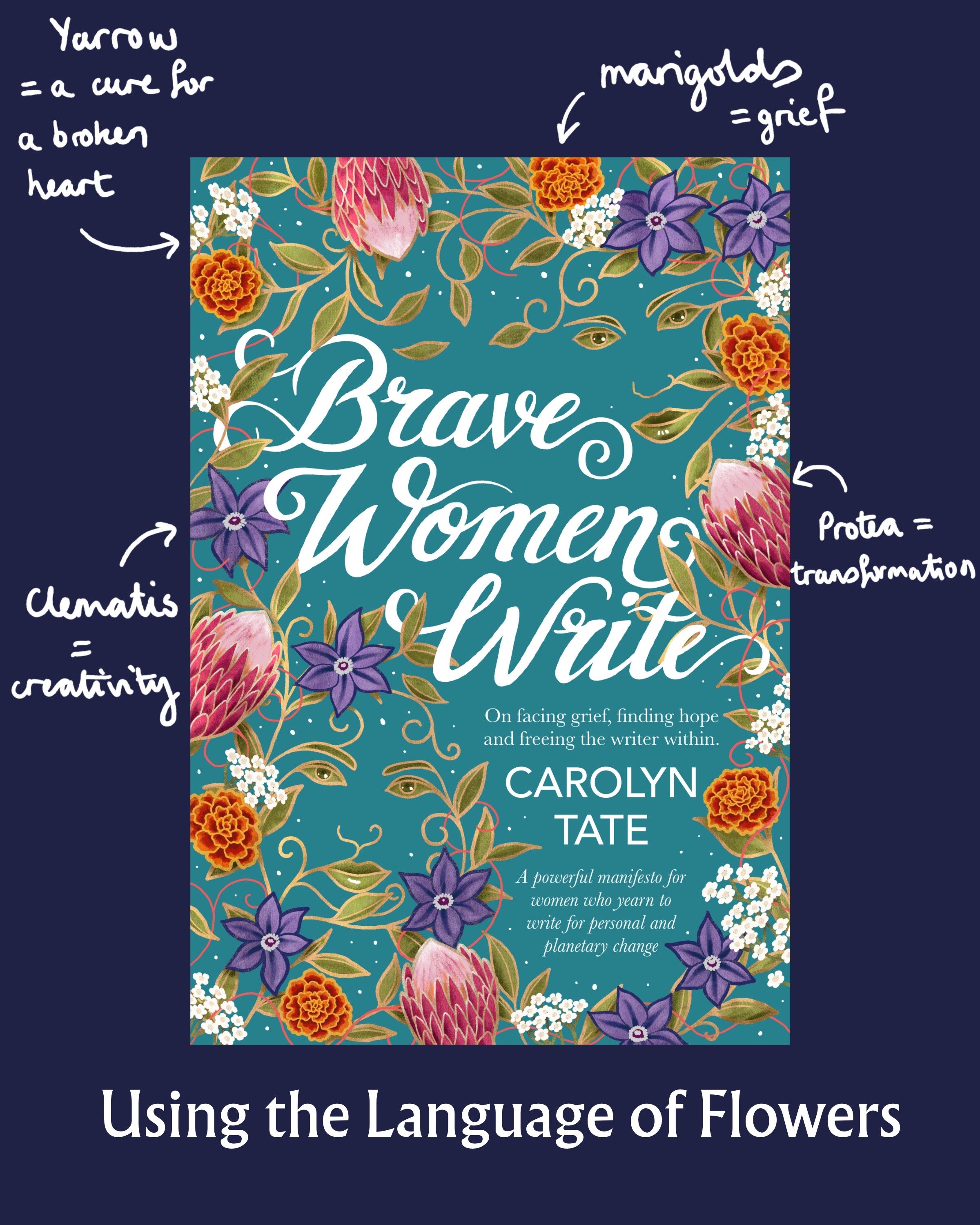
And indeed, this is the direction we decided to go in. Carolyn asked for a few adjustments to the faces. She wanted them looking out at the viewer. We also changed up the typography. I hand-lettered the title so that it looked more like script handwriting to match the writing theme.

The final design

Here’s how the final design came together! Big, bold flowers have been a big trend across many genres of book covers recently and I think it will be sticking around for a while.

Check out Carolyn’s book here.

Or, if you’d like to read about some other recent design projects, click here.

A Greek Mythology Romance Book Series

Cupid’s Fall Book Series

When romance author Beth C. Greenberg came to me with her brief, I knew it was going to be a good one.

The Book Design Brief

It went something like this:

  • A Greek myth retelling

  • Cosy romance

  • Modern setting

  • Gods behaving badly

  • A pansexual protagonist

Uh, yes please, count me in!

Here were the initial concepts. I experimented using motifs inspired by ancient Greece. Beth also wanted feathers and arrows to be central to the design.

Concepts

I liked the third design here, and Beth agreed. Some changes needed to be made though.

While she liked the idea of having the upper part of the cover represent what was going on on Olympus and the lower part representing the mortal world, she thought that the figures made it too literal. I agreed that the depictions of the gods on the cover might be a bit much.

Development

In the next round we removed the figures and added symbols in their place. For the first book, that meant an image of the Pantheon instead of Aphrodite and Hephaestus and a falling quiver in place of Cupid. For the second book, we have Aphrodite’s chariot drawn by doves and a typical suburban American house. The third book has Hephaestus’ forge with a golden arrow above a swimming pool scene. And finally, we have Cupid’s wings and an autumnal scene on the fourth cover.

Then we started looking at some colour options.

Developing the Colours and Adapting the Lettering

Beth wanted to continue with the colour sequence used on the original book covers, which made a lot of sense thematically for the stories.

During this process, we both realised that we might need to make some changes to the lettering on the title. Looking at the covers in thumbnail size and in colour, the text wasn’t as legible as we would have liked. Beth pointed out some lettering samples from my website and I got to work making the new titles.

Nailing Down the Line Art

With those changes made and a few more tweaks to the illustrations, especially for Book 3, we were ready to move on to the final colour schemes.

The Finished Covers

And here we are! The final covers include more detailed shading and some gold touches. A drop shadow on the title text helps it to stand out against the background and all those details in the clouds really pop with that extra shading and highlighting.

Beth went for three formats: paperback, hardback and ebook. Here’s the full design for the hardback version of First Quiver.

All of the illustrations were drawn in Procreate on the iPad. I prepared the final files for print in Adobe InDesign.

For more information about the Cupid’s Fall series and Beth’s other writing, visit her website: https://bethcgreenberg.com/