Hand lettering has become more than just a trend at this stage. While different types of lettering will go in and out of style, the form is so versatile and so ingrained in our history that it seems an inevitable part of visual communication, like illustration or graphic design.
I've been lettering for the past few years and it has been an invaluable skill, especially when combined with illustration. When I first started out I was not great (see photographic evidence below) but with the help of a few resources, I started seeing improvements. Several years later, lettering is an integral part of what I do.
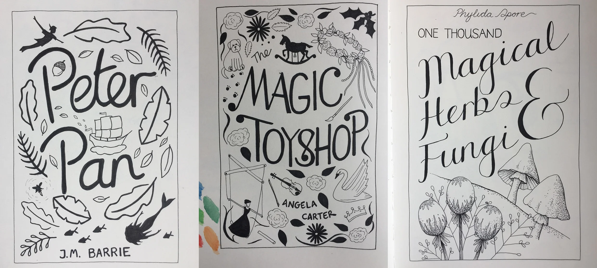
Some early lettering attempts
One of the first resources I used was Jessica Hische's Skillshare course on creating drop caps which helped with the fundamentals of drawing letters. She’s got a bunch of other ones on there now, including one on book cover design. She’s also got a book where she breaks down her process in a way that is easy to follow and apply to your own work.
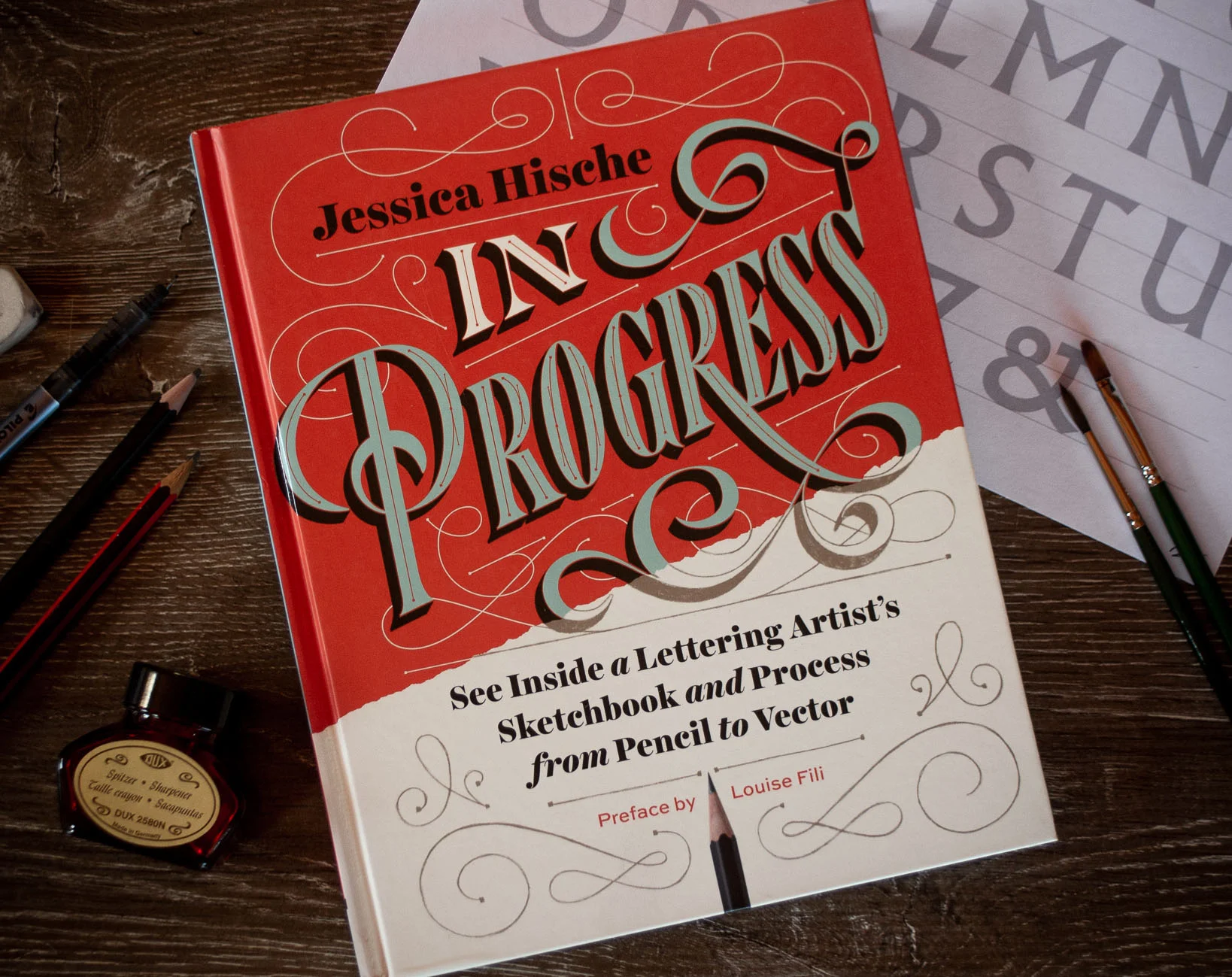
Work in Progress by Jessica Hische
A few years later I took Jon Contino's online course in which he advocates studying typefaces in minute detail to learn different styles. From there you start to build your own letterforms.
Buying an iPad Pro revolutionised my process, allowing me to quickly draw and redraw my lettering. In this you can also use things like Ian Barnard and Stefan Kunz's grid builder tool, along with countless brushes and effects. I love how easy the iPad makes it to edit your work too, rather than having to do so much tracing on paper.

A recent lettering and illustration piece for @thebookishbox
Book resources
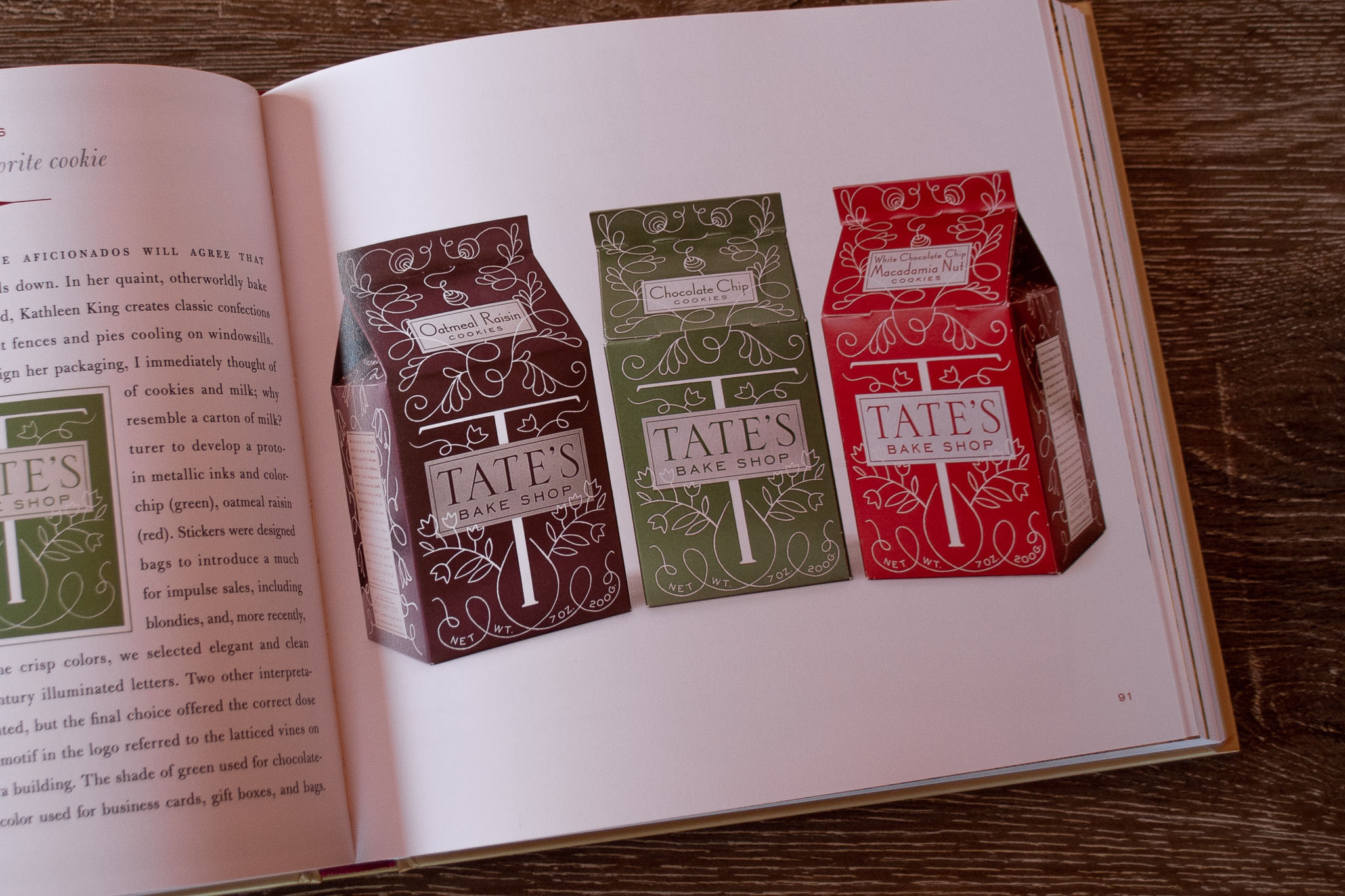
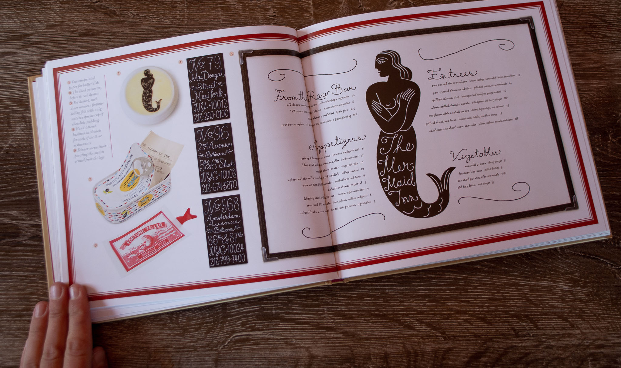
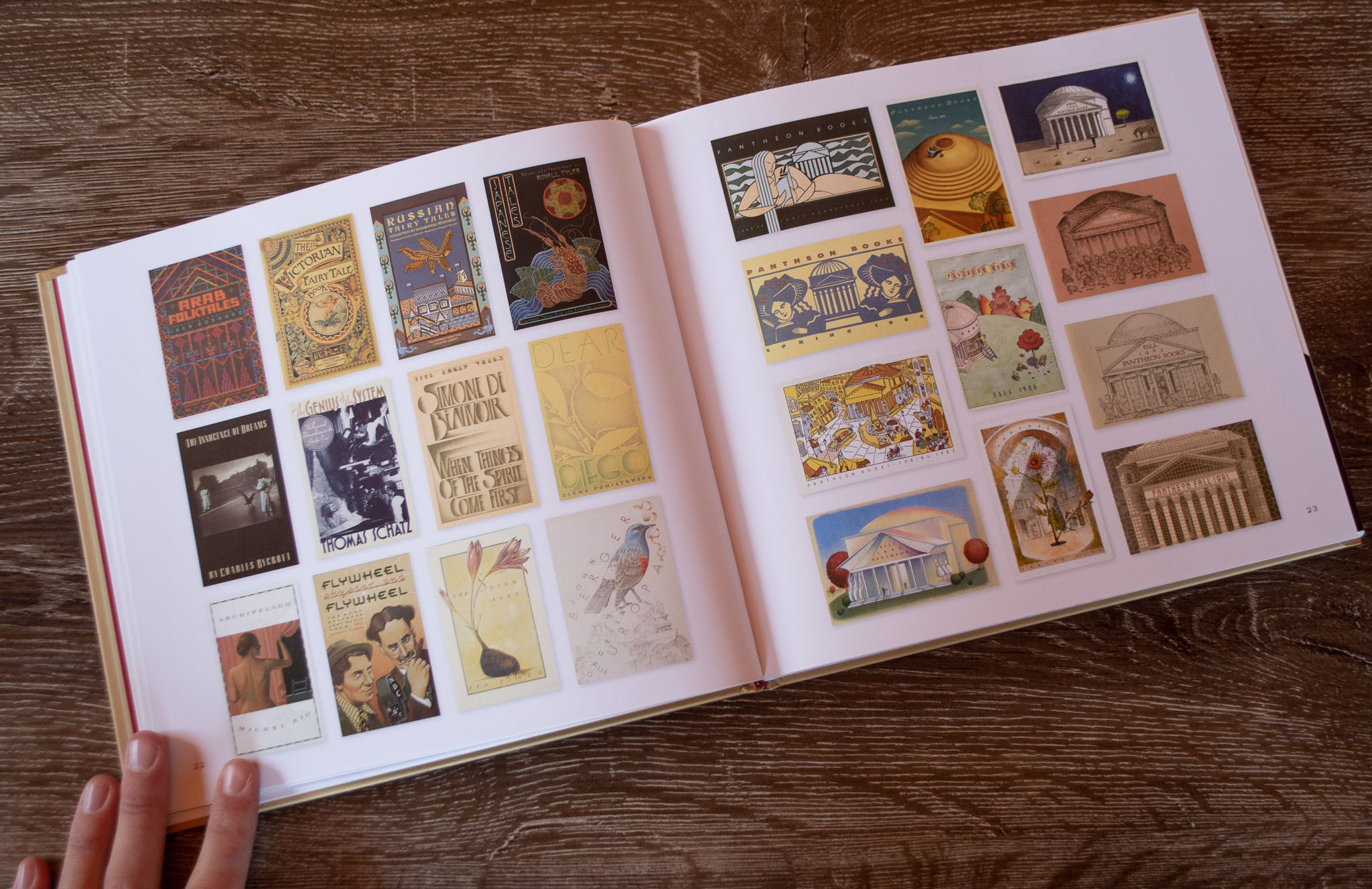
Here are some lettering and typography books from my shelves. All of them are fantastic for reference and inspiration, whatever your skill level.
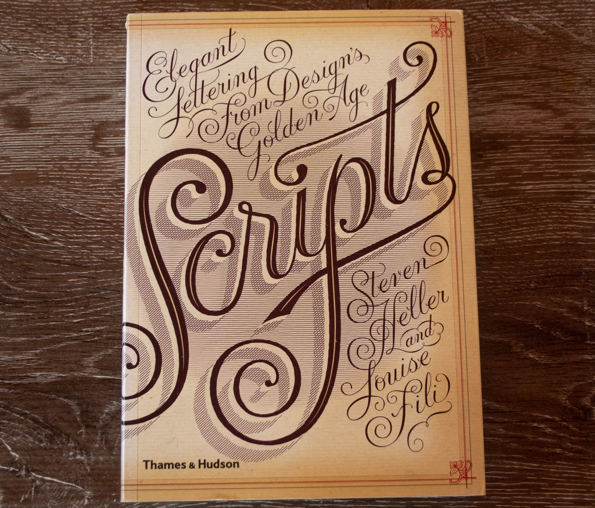
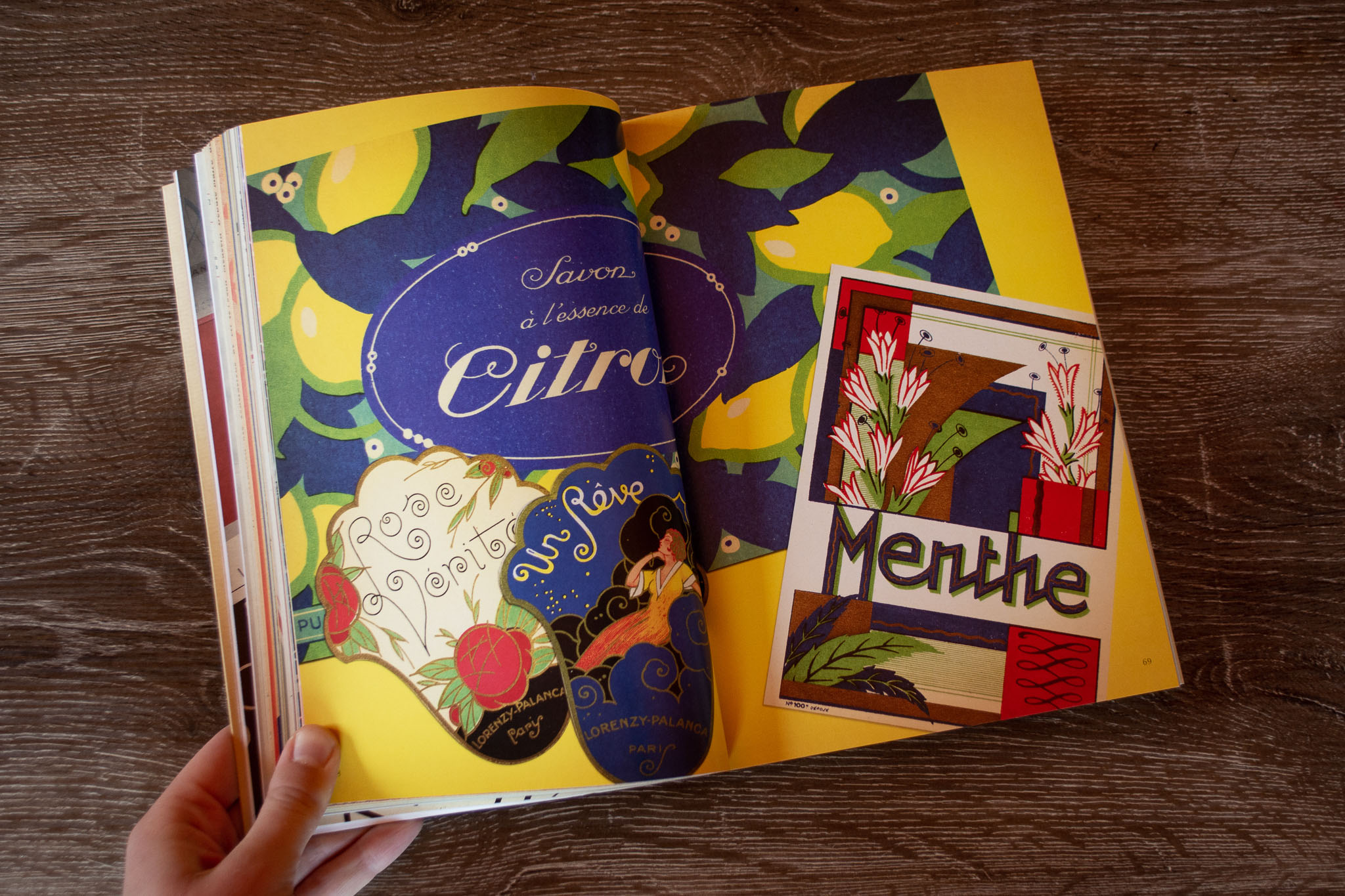
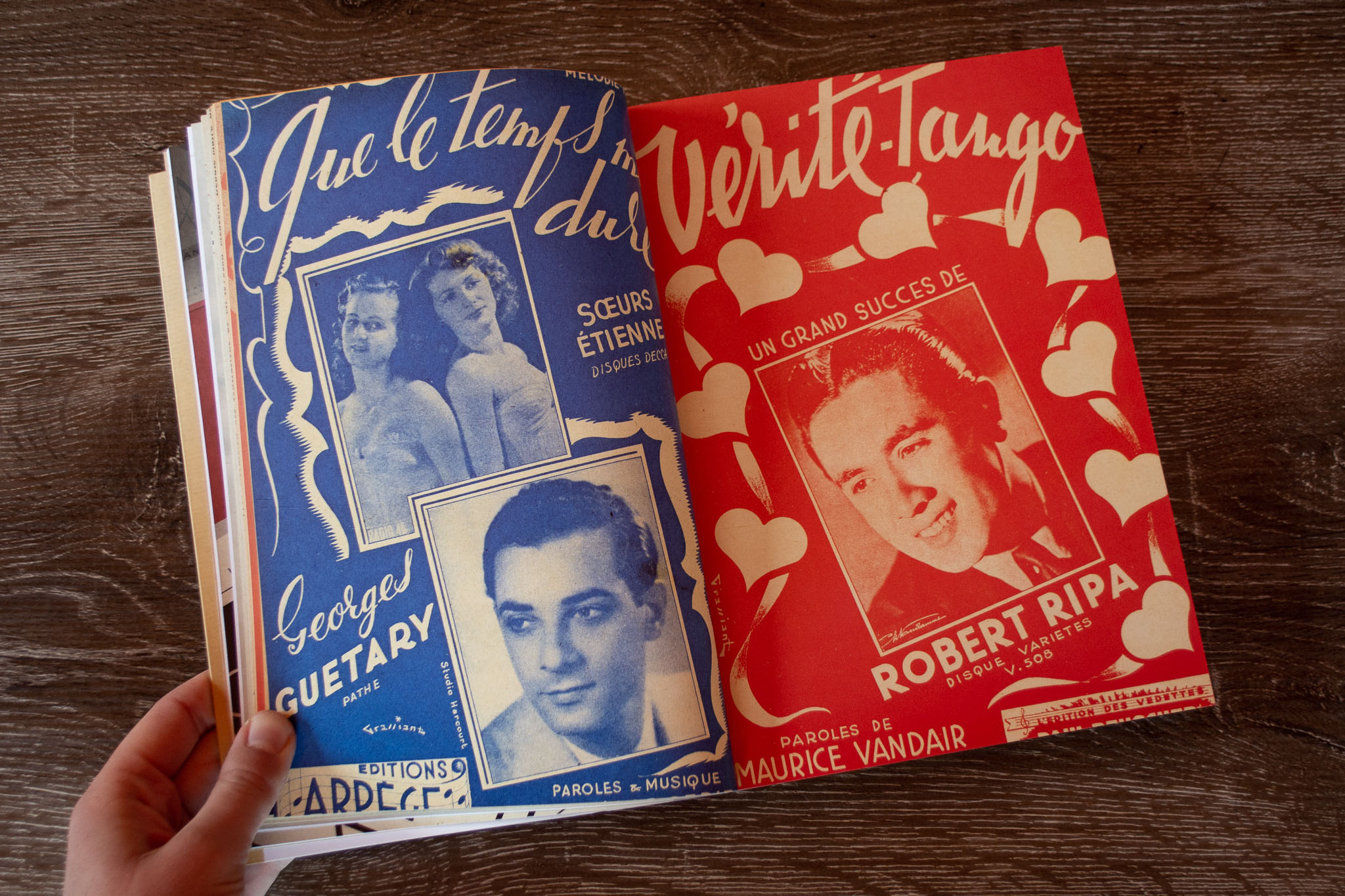
Scripts: Elegant Lettering from Design’s Golden Age
by Steven Heller and Louise Fili
Heller and Fili’s books are an absolute goldmine when it comes to typography and ornament. This book is full of marvellous script lettering from advertisements, packaging, handwritten letters and more.
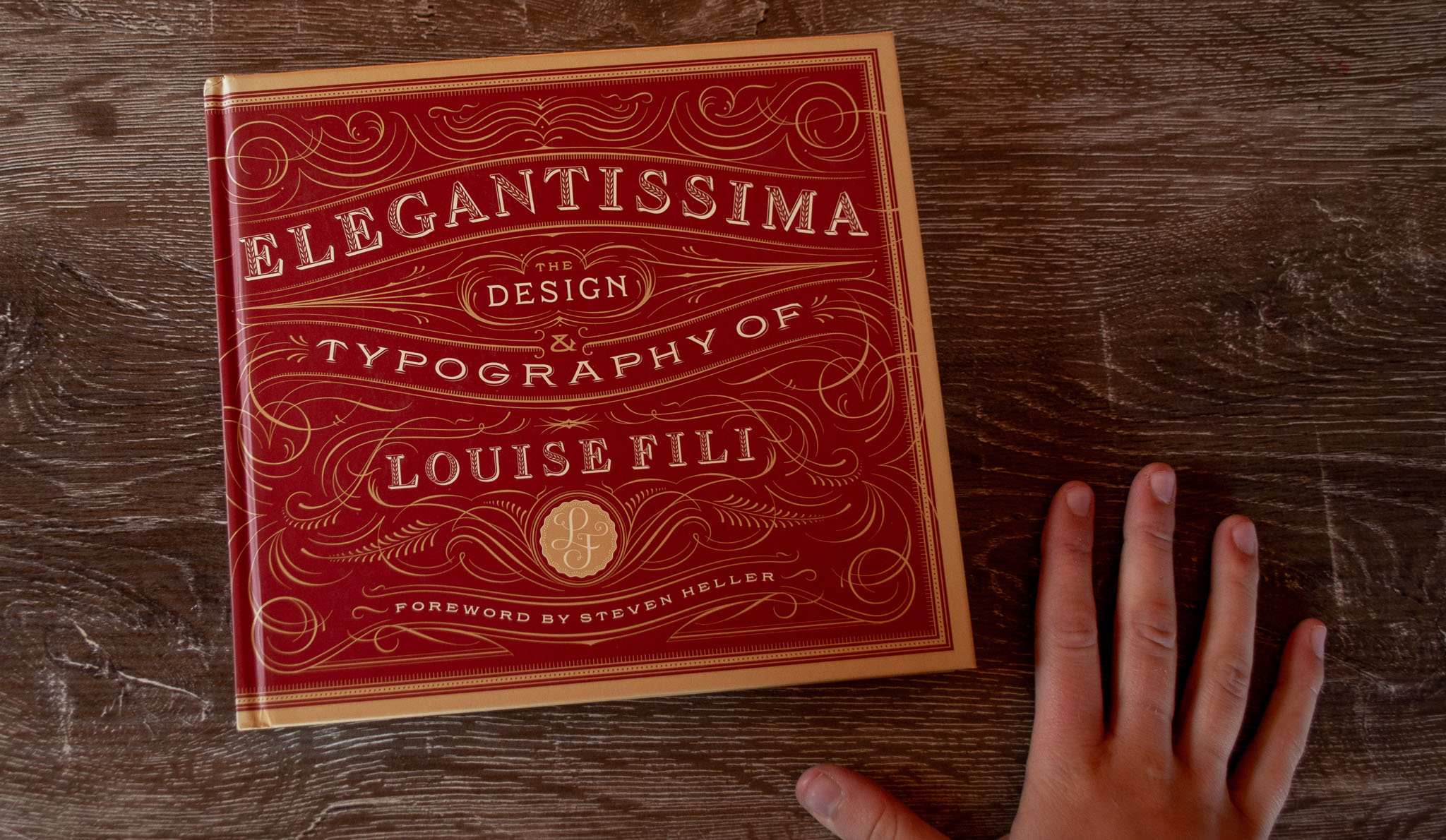
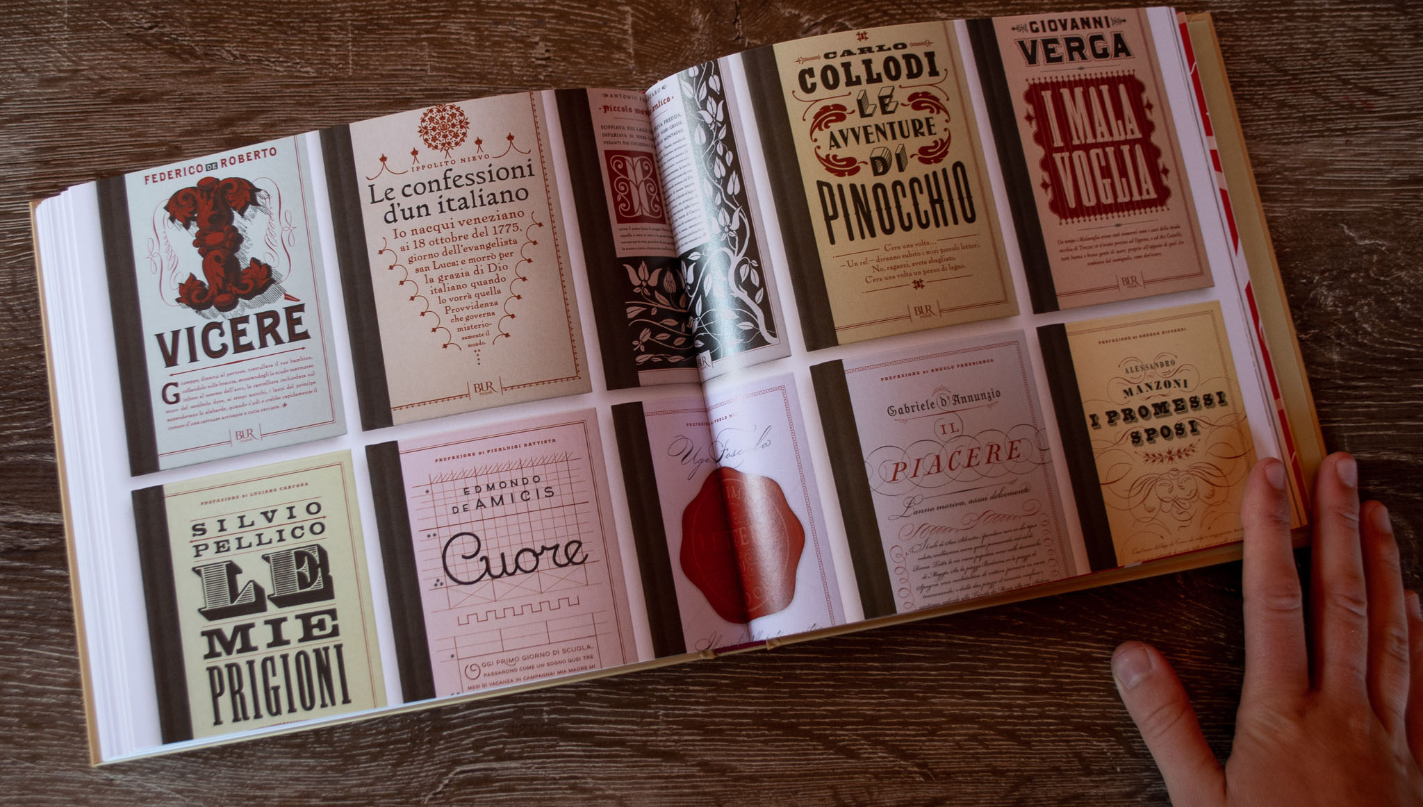
Elegantissima: The Design and Typography of Louise Fili
by Louise Fili
Fili demonstrates how she turns these influences into modern day client work. This book is a masterclass in design and type.
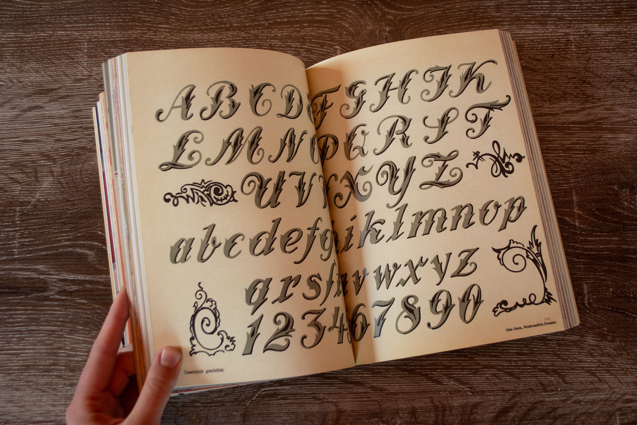
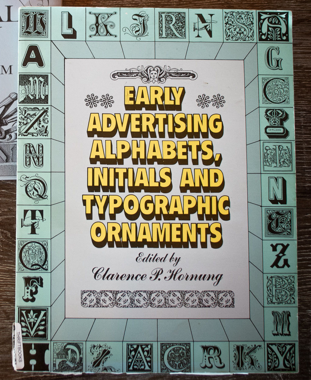
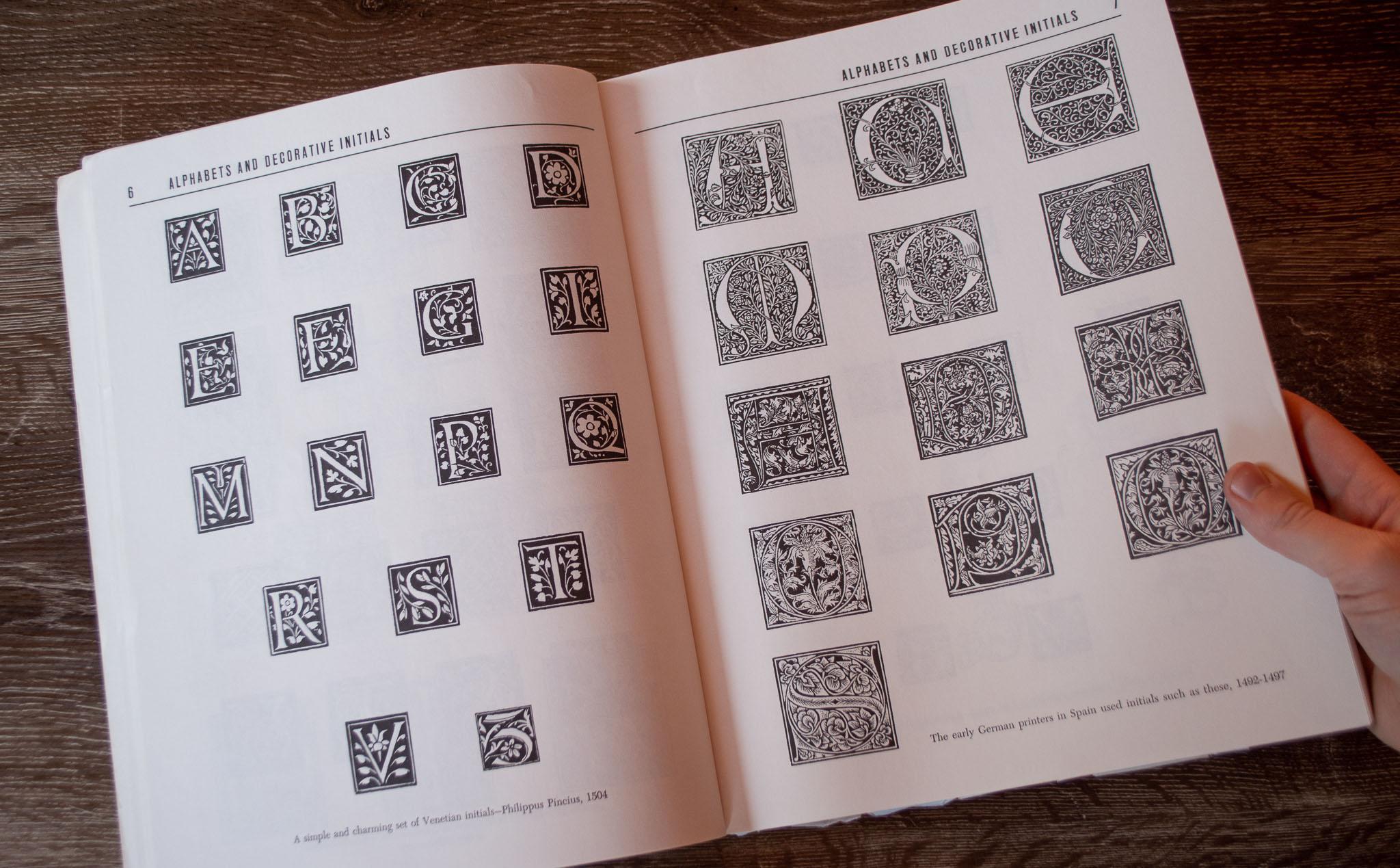
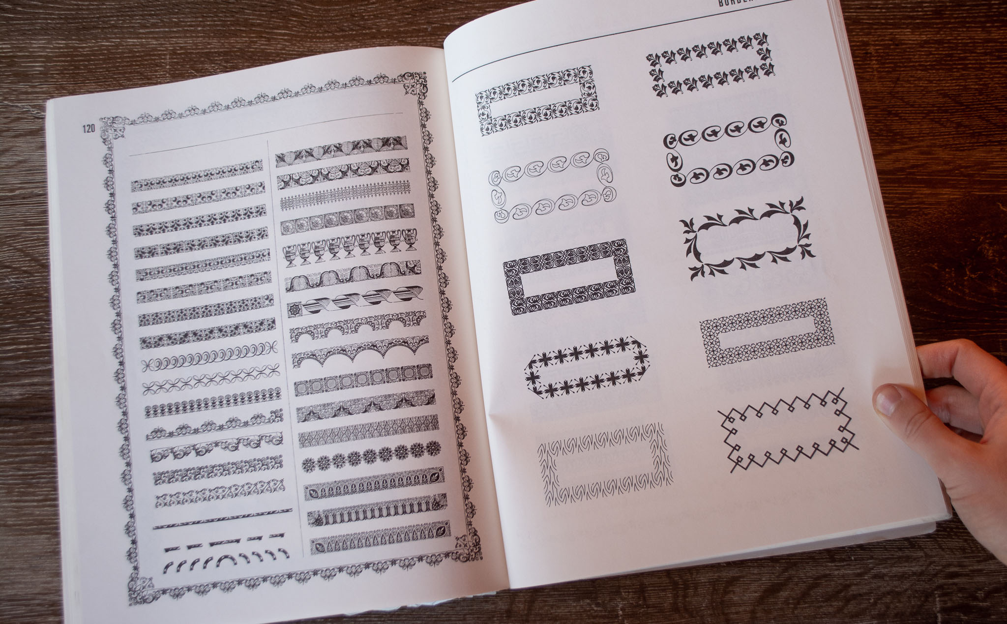
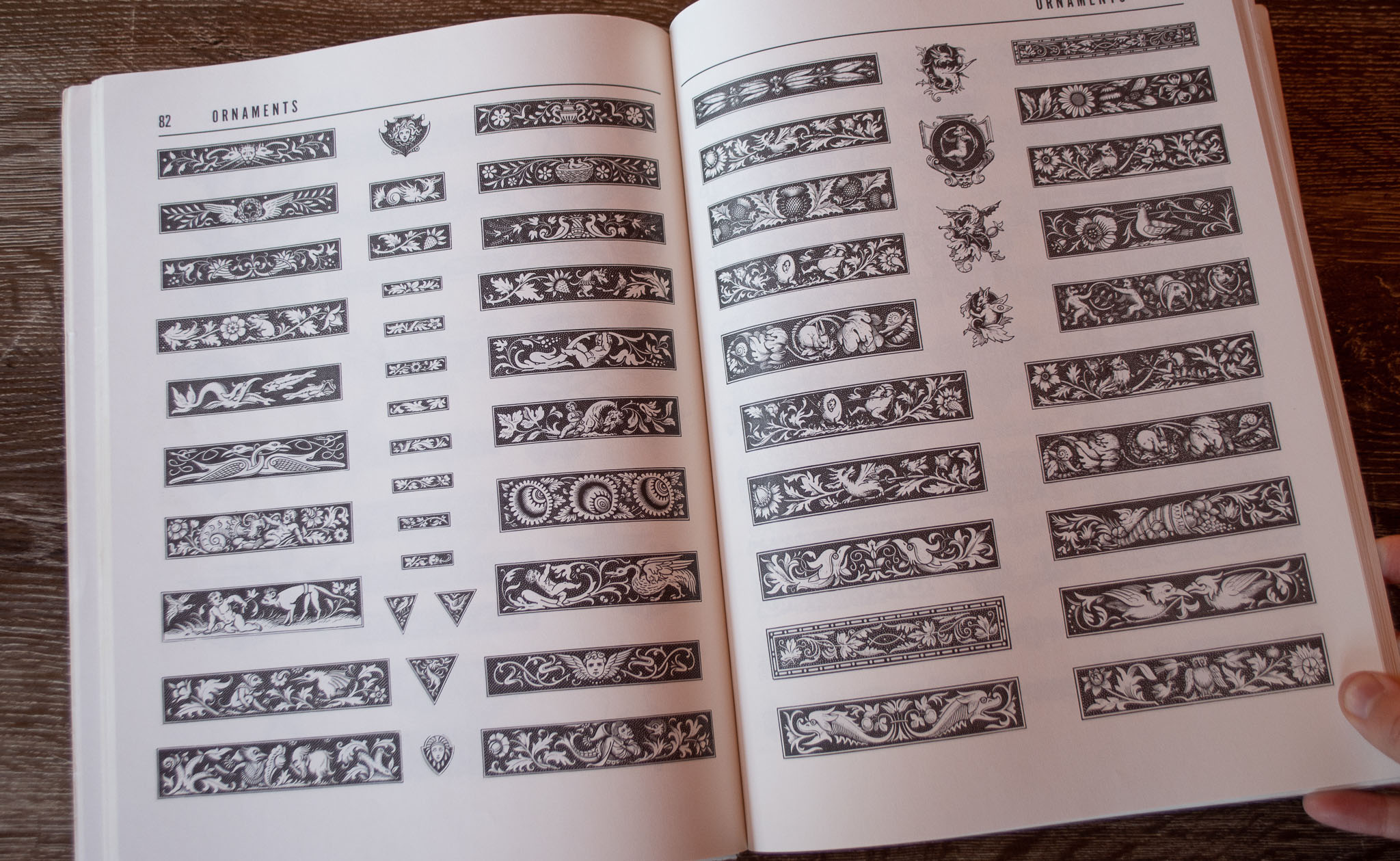
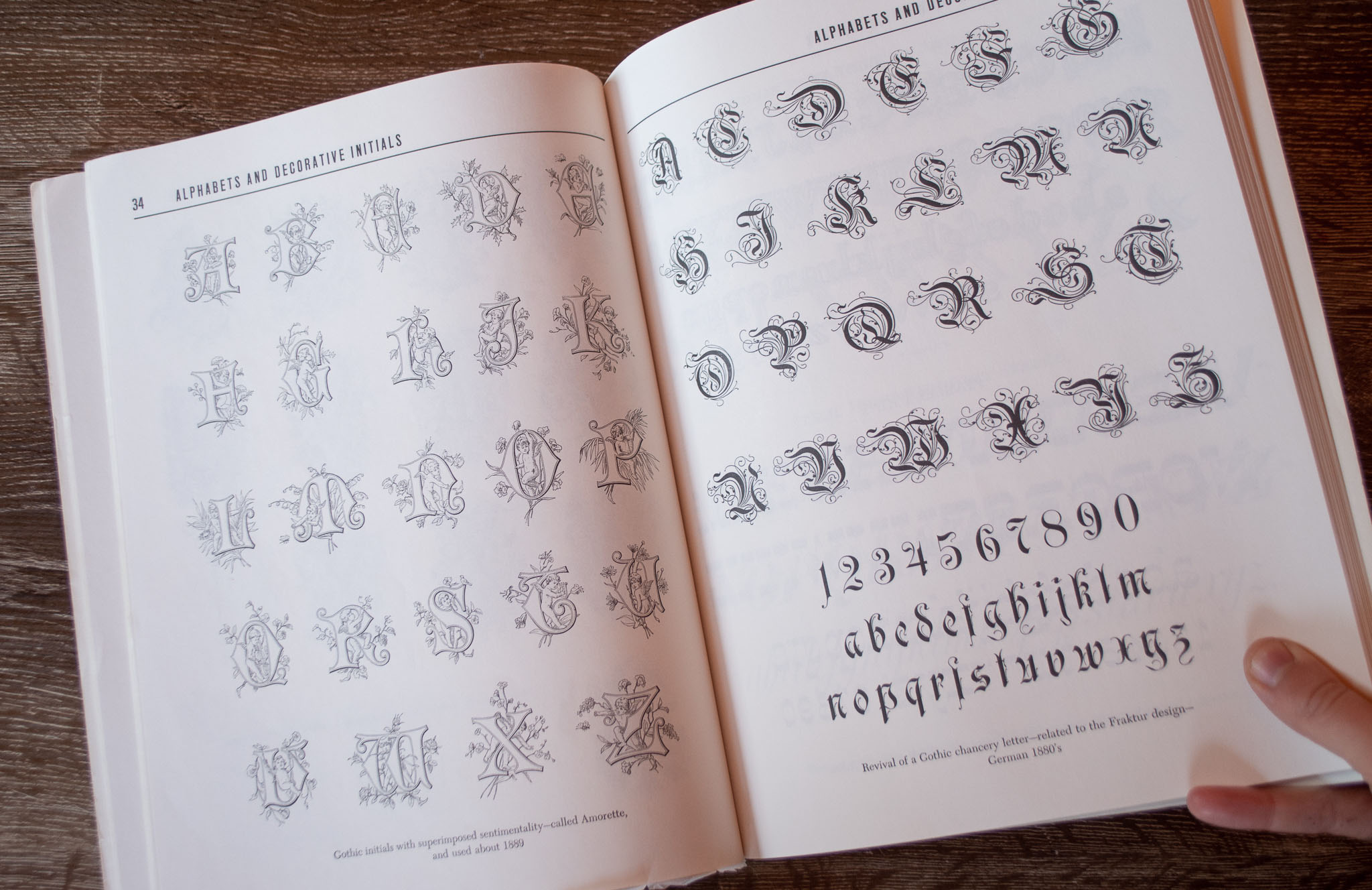
Early Advertising Alphabest, Initials and Typographic Ornaments
Ed. Clarence P Hornung
This is one of the many Dover books of royalty-free images. I like this one because it takes you through many different styles and includes the vintage typographic ornaments.
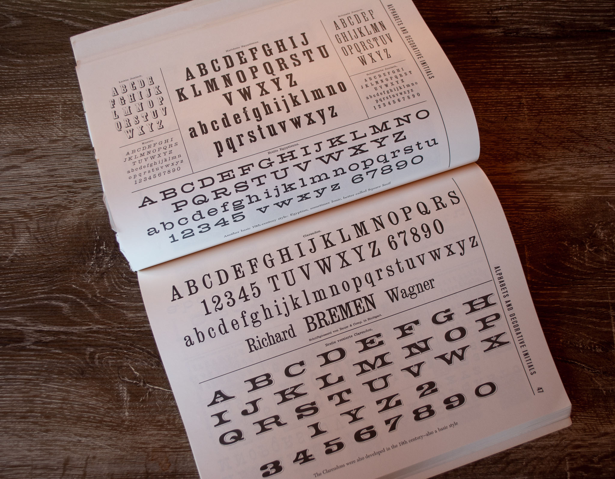
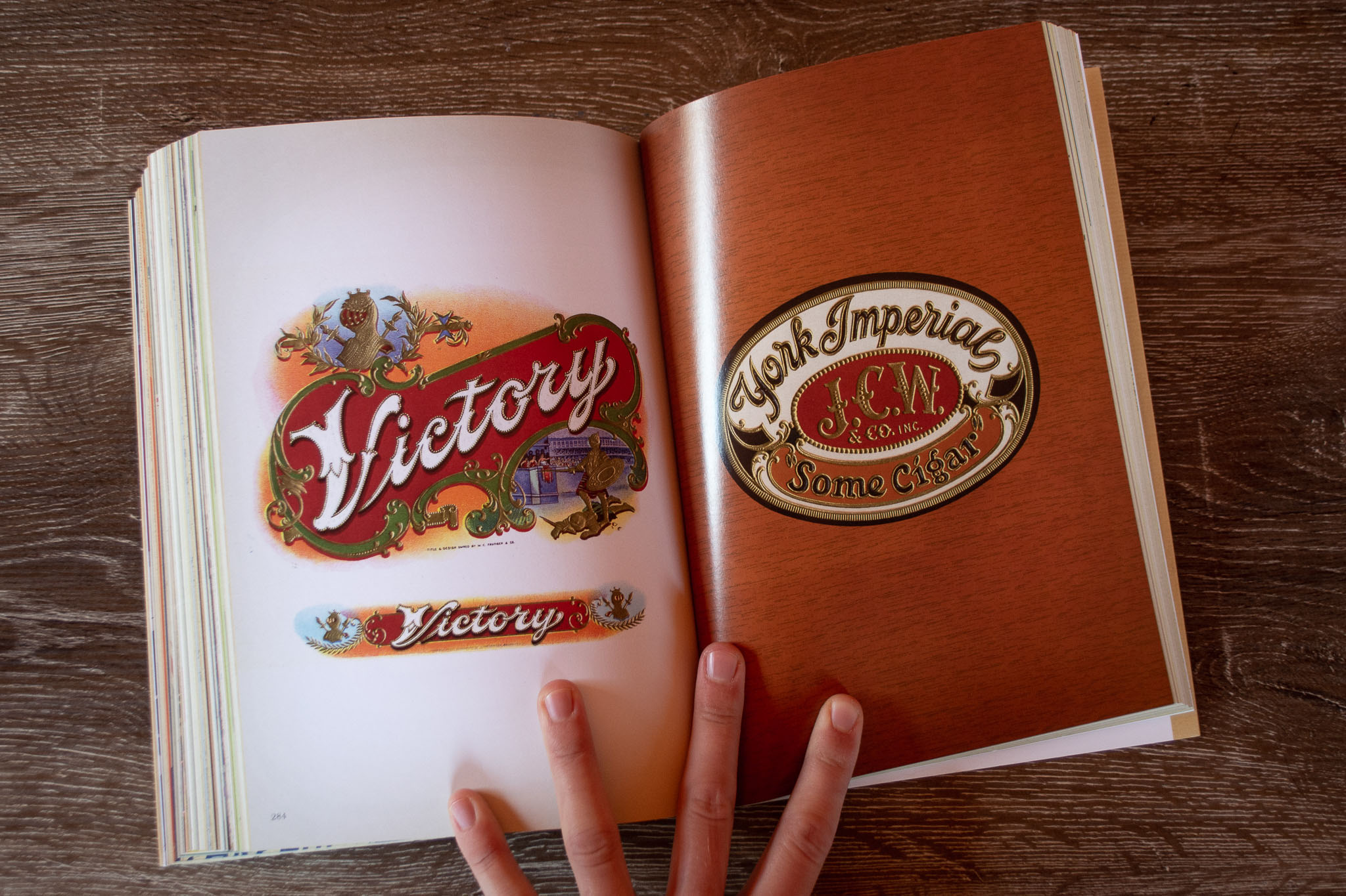
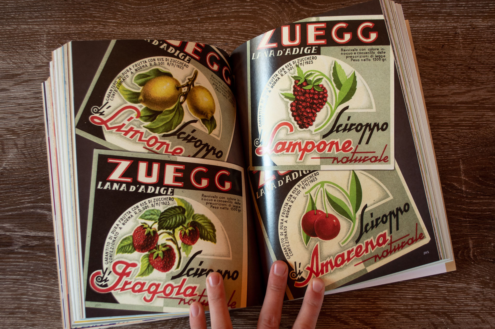
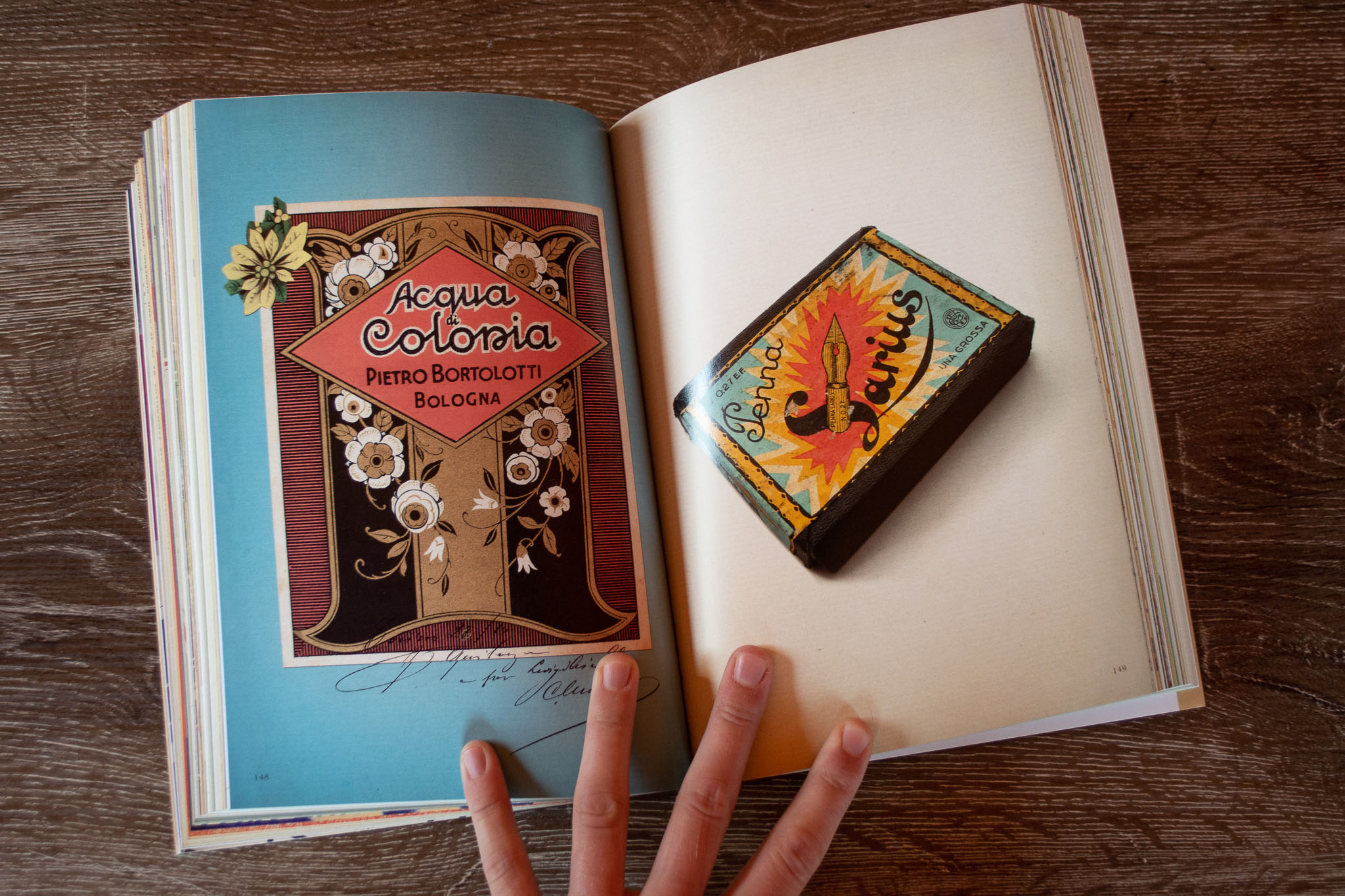
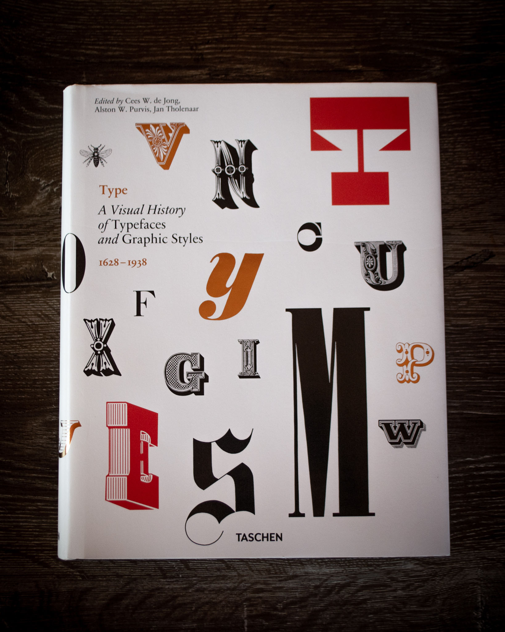
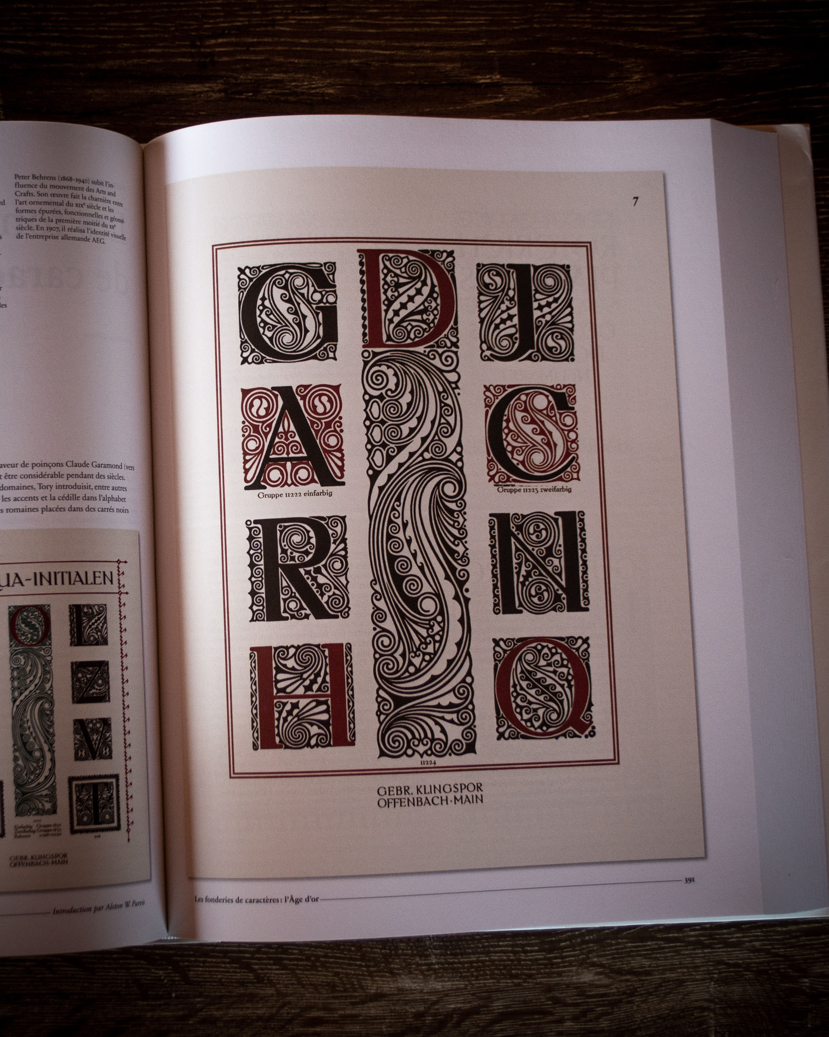
Type: A Visual History of Typefaces and Graphic Styles 1628–1938
Ed. Cees W. de Jong, Alston W. Purvis and Jan Tholenaar
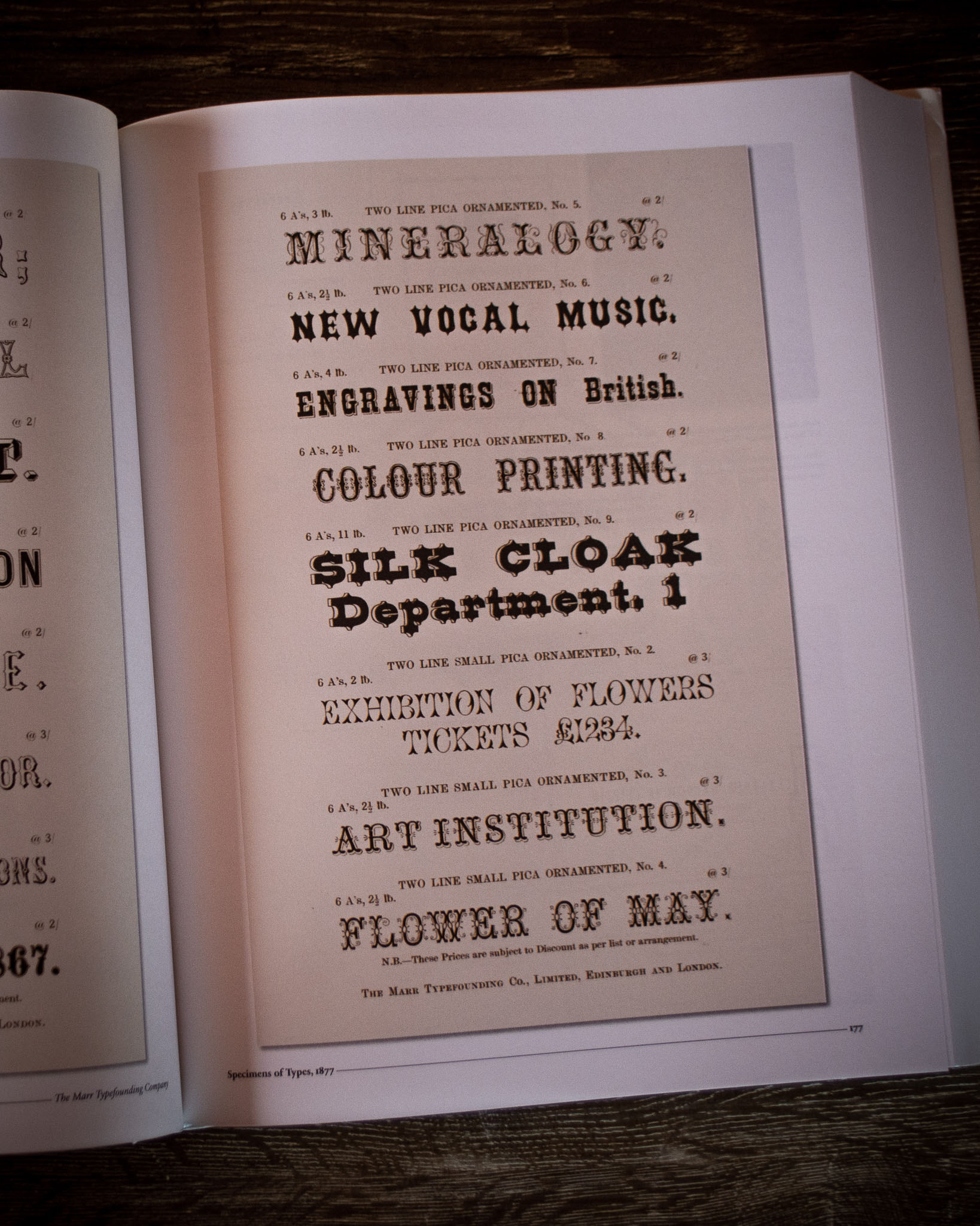
One of the biggest books on my shelf, this one is packed full of historical typographical examples. A great overview of lettering history and useful if you need to look up a particular period.
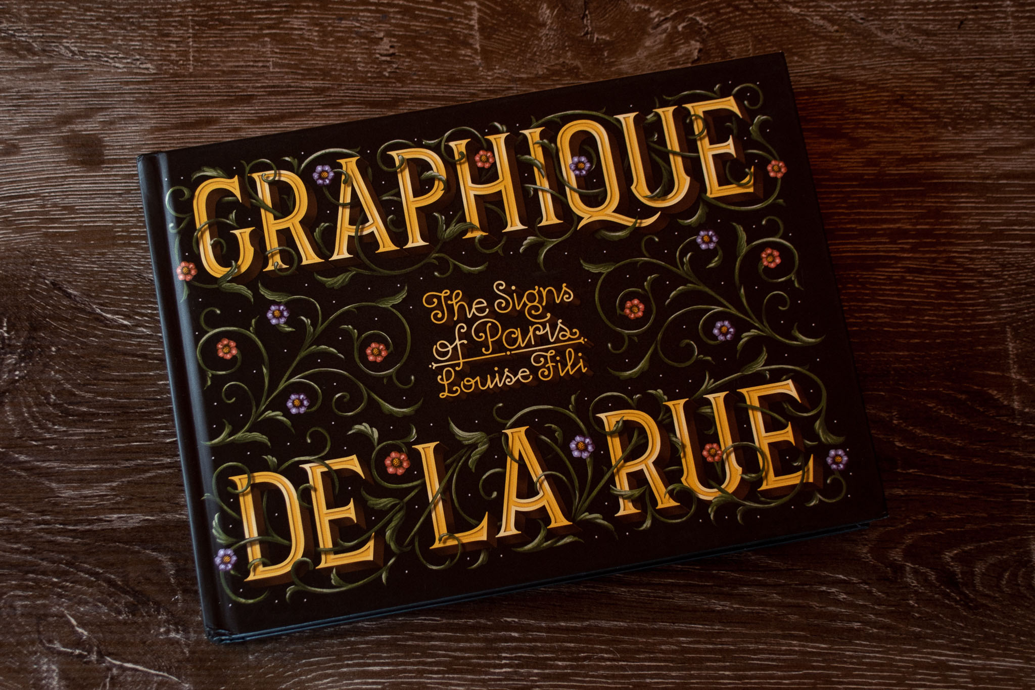
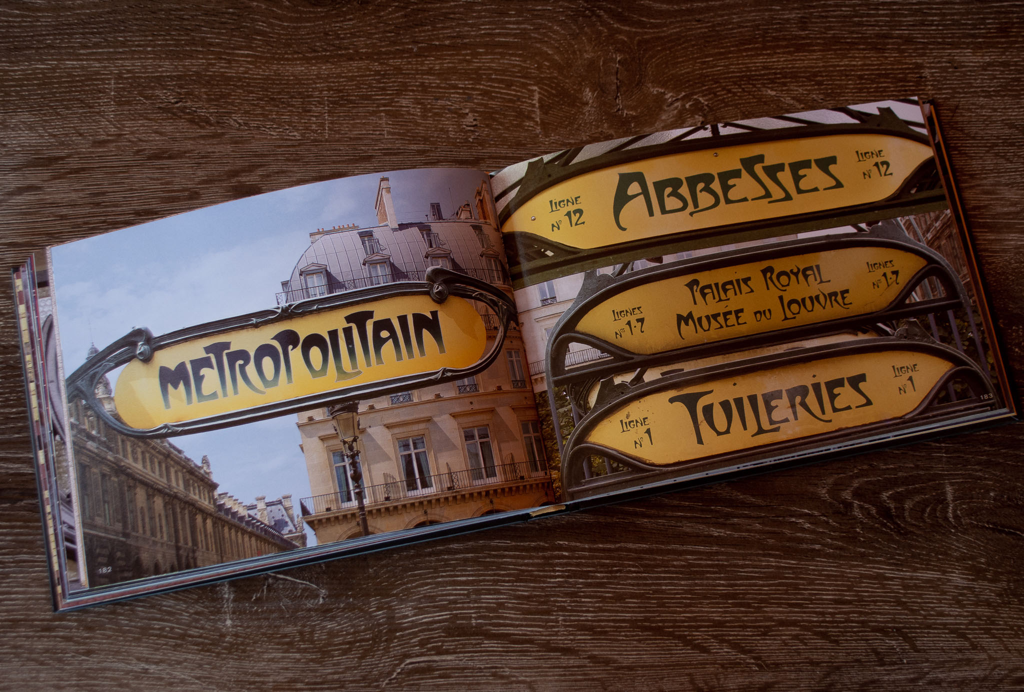
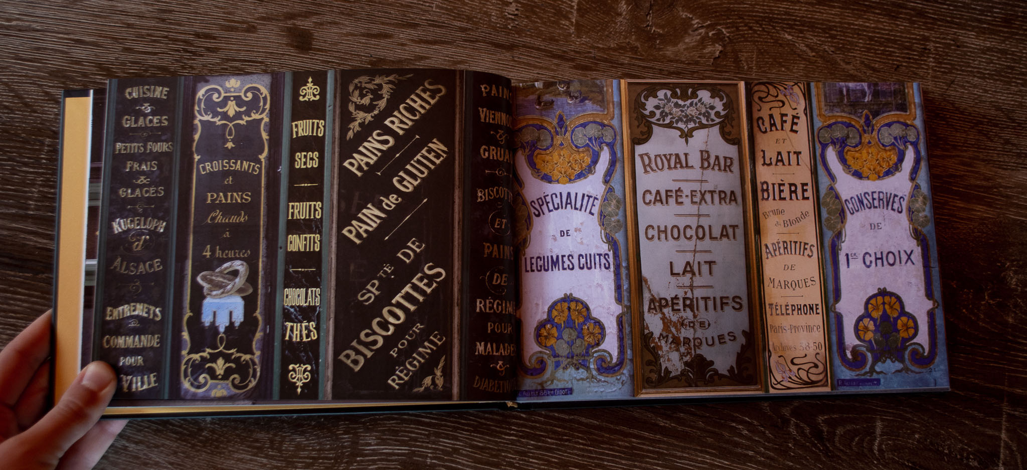
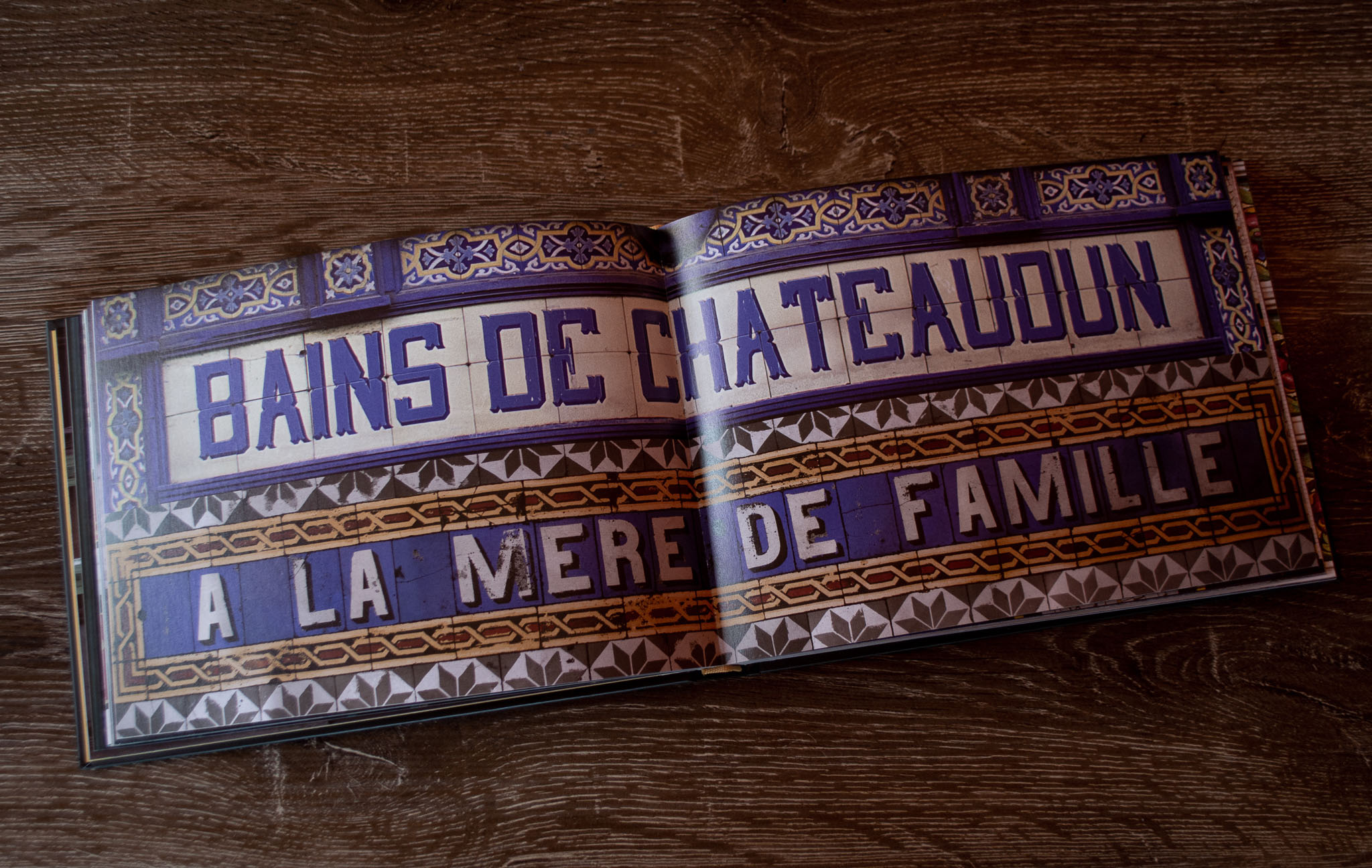
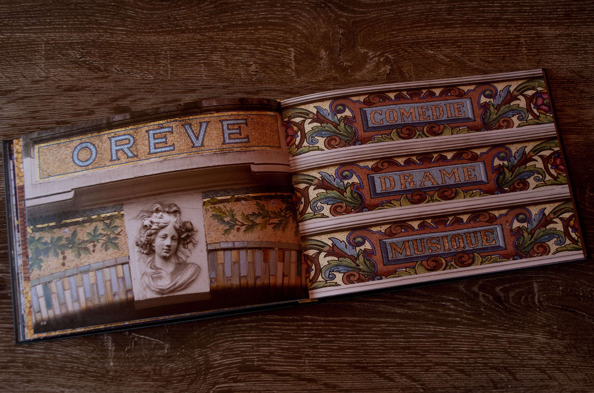
Graphique de la Rue: The Signs of Paris
by Louise Fili
Paris is full of extraordinary typography and in this book Louise Fili curates a bunch of it. A real range of mediums, from metalwork to mosaic. There’s a lot of Art Nouveau in here too, which makes me very happy.