Owlcrate Tapestry
Owlcrate, 2018
Commissioned by Korrina Ede
When Owlcrate emailed me I was over the moon. For one thing, I love what they do. Owlcrate is one of the biggest book subscription boxes out there, and I had ordered a couple of crates from them in the past. For another, they wanted me to do a design based on His Dark Materials, a trilogy of books I have adored since childhood
THE BRIEF
This was an item to go in Owlcrate's 'Magical Artifacts' box for January 2019. They had chosen the quote 'Without stories we wouldn't be human beings at all' from Philip Pullman. On the one had they wanted a design that used imagery inspired by His Dark Materials (especially a polar bear), but they also wanted something that was going to be more universal, so that their customers who hadn't read the books could still appreciate it. As a reference, they liked my Magical Textbook series, especially the design I had made for Fantastic Beasts.
THE PROCESS
I started with sketches on my iPad, experimenting with different images and compositions before choosing four or five to render more thoroughly. This was a tight deadline, so I sent through the compositions as blue and white line drawings.
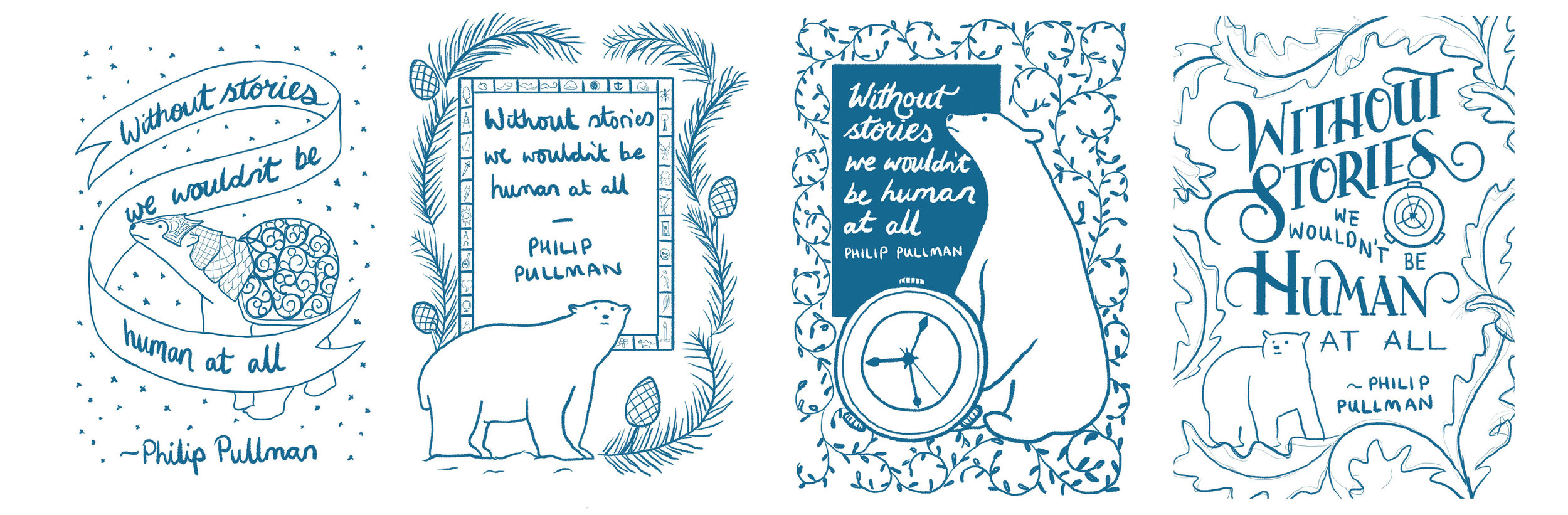
Korrina and the team liked what I had come up with, especially the design with the bear, compass and text in a box. They asked if I could use this composition, but make the text more detailed, like in one of the other concepts.
For the final piece I copied the concept onto a larger canvas in Procreate and inserted the text from the other design. I then adapted that lettering so that it fit better in the available space. I traced the polar bear, compass and vines, making a few tweaks along the way. The Procreate pen I used mimics an ink pen with a little bleed, which give it a slightly more organic look than using a hard line.
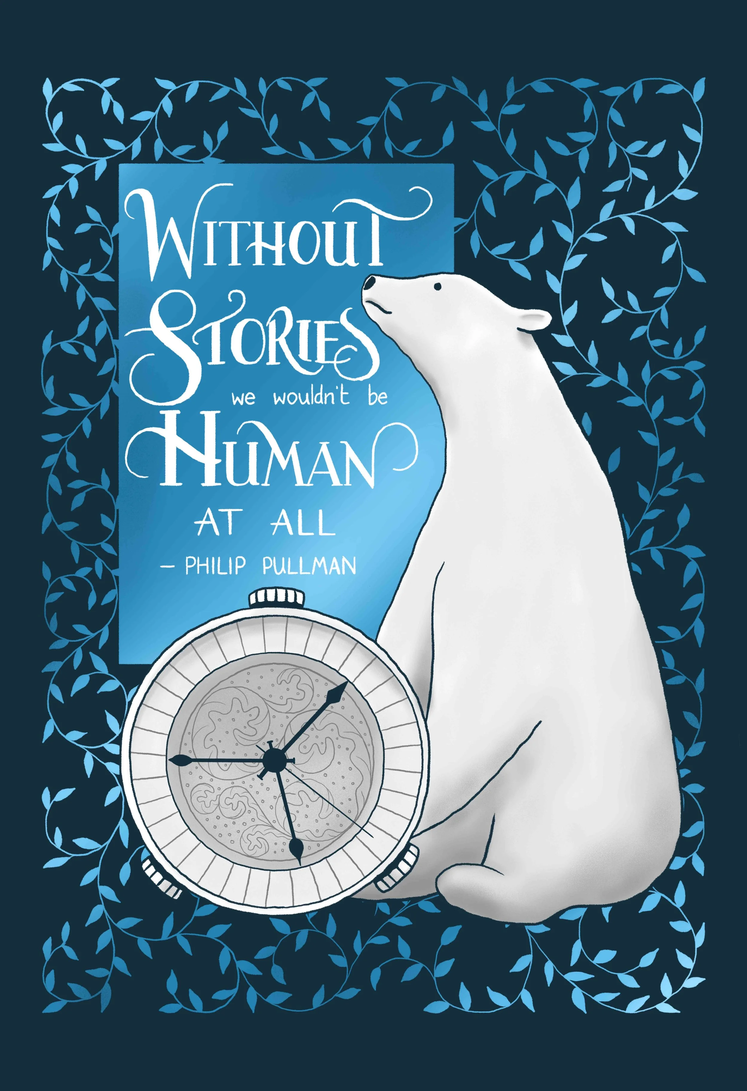
Owlcrate's main advertising channel is Instagram, and their customers will often film or photograph unboxings to share what's in the box. This was something I had in mind as I was coming up with the colour scheme. It needed to have plenty of contrast so that it would photograph well. I experiemented with giving it colours from the aurora, as the northern lights feature strongly in the first book, but I found this was too fussy and didn't provide the necessary contrast. In the end I kept it simple with a navy blue background, the box and vines in a graduated lighter blue, and the most important parts of the illustration and text in white. Korrina and the team loved it!
The feedback from this item has been amazing. Lots of people have messaged me to say that they'll be putting it up on their classroom wall or in their child's nursery. Those people who love these books like I do have been delighted to see some new designs based on this trilogy. ★
Do you run a book subscription box? Click here to get a quote or email me at info@hollydunndesign.com.