Vladimir Nabokov's Lolita is a novel that fascinates me in the ways that it has been interpreted visually. It has been designed and redesigned countless times and there has even been a book published on the novel in art and design (Lolita: The Story of a Cover Girl ed. John Bertram).

I recently read Lolita and found it to be one of the most difficult novels I have ever read. Not because of the writing, Nabokov's writing is famously lyrical, but because the subject matter was so difficult to stomach. Of course that is the point of the novel, you're supposed to be made to feel uncomfortable by the material whilst being seduced by the language. This tension is part of what drew me to it as a design challenge.

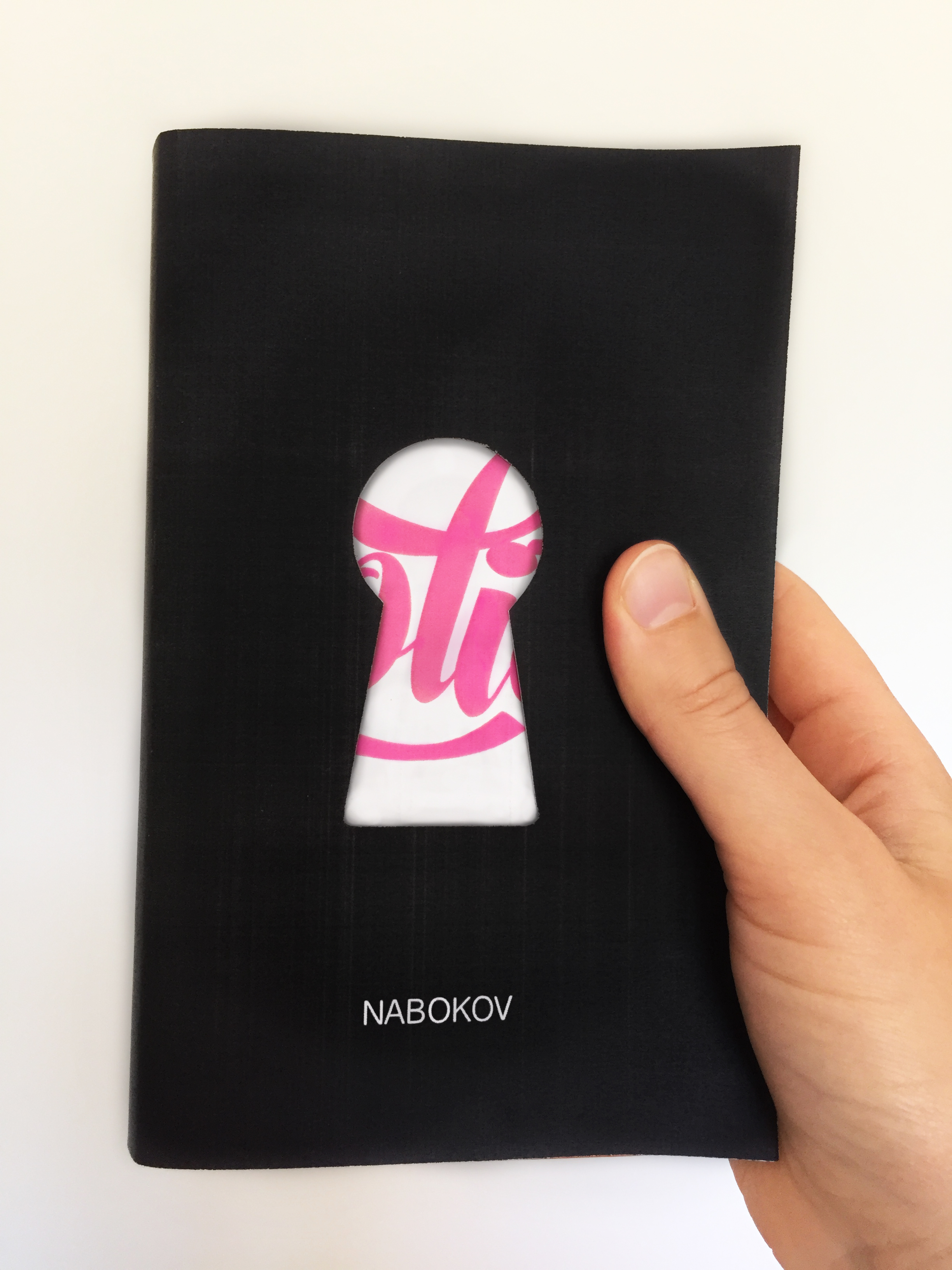
While many existing covers suggest that Dolores is the main focus of the novel, I concluded that the main focus was actually Humbert Humbert's fixation on her. It's a subtle difference, where the act is the most important thing; the verb trumps the noun. Of course this idea has been noted by many designers who have suggested Humbert's gaze in a more sophisticated fashion, rather than simply showing a sexualised young girl (which is the most obvious way of putting us into the shoes of the male viewer).

When designing this I decided to take a more symbolic approach. While trying to steer clear of cliche, some commonality with previous designs was inevitable, most notably in the use of the colour pink and the stereotypically 'feminine' script type. But I am yet to come across another design for this novel that uses the keyhole. Symbolically the use of this motif is threefold. Firstly there's the obvious sexual symbolism of a lock and key. Other symbols used to similar effect on other covers include a water gun, socks and even the typography itself. Then there's the male gaze. The placement of the keyhole puts the reader/viewer in the place of Humbert, viewing Lolita from behind closed doors. Finally there is the sense of secrecy, of something (Lolita's sexuality) being locked away and out of reach. Symbolically speaking, when the reader opens the cover and begins the book the door is unlocked and Lolita is no longer innocent to the view of Humbert. This makes the reader complicit in this betrayal. All three of these ideas are crucial to the text.

Type used:
Script for 'Lolita' title: Bonbon (bold) created by Emily Bertell 2013.
Font for author's name: Helvetica.

Originally published on Behance, March 2015.