Katherine Mansfield is one of my very favourite authors, so I was upset to find that there were so few beautiful editions of her works. Many look like textbooks or simply have paintings from the time that she wrote. Most of these are very typically feminine and old fashioned and don’t capture the vitality of her stories. So I decided to create my own cover for a modern Mansfield, one that would appeal to a wider and more modern audience.
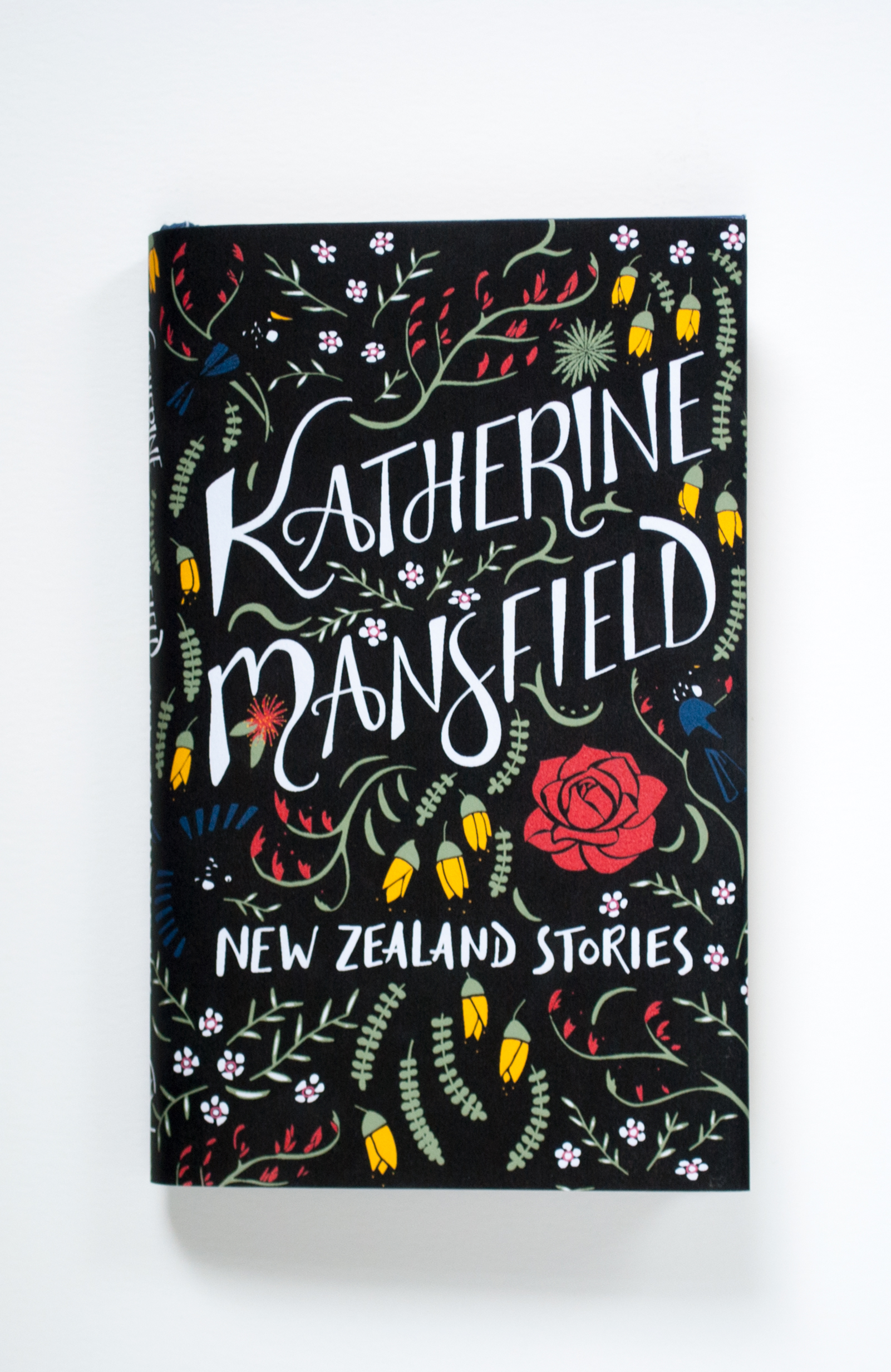
I started by finding an edition of her New Zealand stories, one that had a dust jacket that was less than inspiring. I chose her New Zealand stories because I wanted to do a botanical design that represented her antipodean roots.

My initial sketches were of various New Zealand plants, especially ones that I knew were mentioned in her stories such as kowhai, manuka and an aloe. I also sketches out some different typographic configurations. My ink drawing expanded the thumbnails and I worked in the botanical elements around the type.


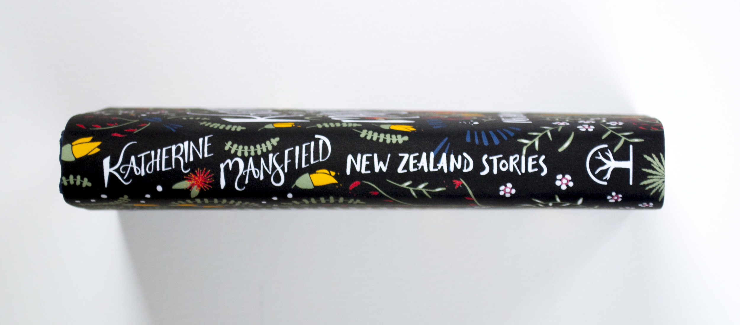
In Adobe Illustrator I added in extra flowers to fit the dimensions of the dust jacket and ensure that the graphics flowed seamlessly through the front, spine and back cover.
Choosing colours was also a challenge. The flowers were dictated by nature, as I wanted to remain true to the actual colours. The background colour was the most difficult to determine and I went through countless iterations of greens, greys and blues. In the end the simple black background was the most effective in making the feature colours and title stand out.
The main problem with the black background was the black of the tui birds. They didn't stand out very well, but I wanted to keep them true to their actual colour. My idea for getting around this was to apply a spot uv coating to the birds so that they would show up in the light.

To make the dust jacket I printed out the design from my home printer onto watercolour paper. Luckily the hardback was small enough that it would fit onto an A4 sheet. I then used the plastic that was covering the original jacket to protect the new one, as the ink can smudge with use.

The full bleed image that I printed.
The photographs of this jacket were what I posted on my website, Pinterest, Instagram and Twitter. Several months after posting this I got an email from HarperCollins in the US.
HarperCollins wanted to license my cover for use on their new edition of The Garden Party and other stories. I made some changes to the design, namely the change in title, typography for which was provided by Allison, the art director. I also rearranged some of the flowers to accommodate the new type and made the birds blue so that they would show up against the black.
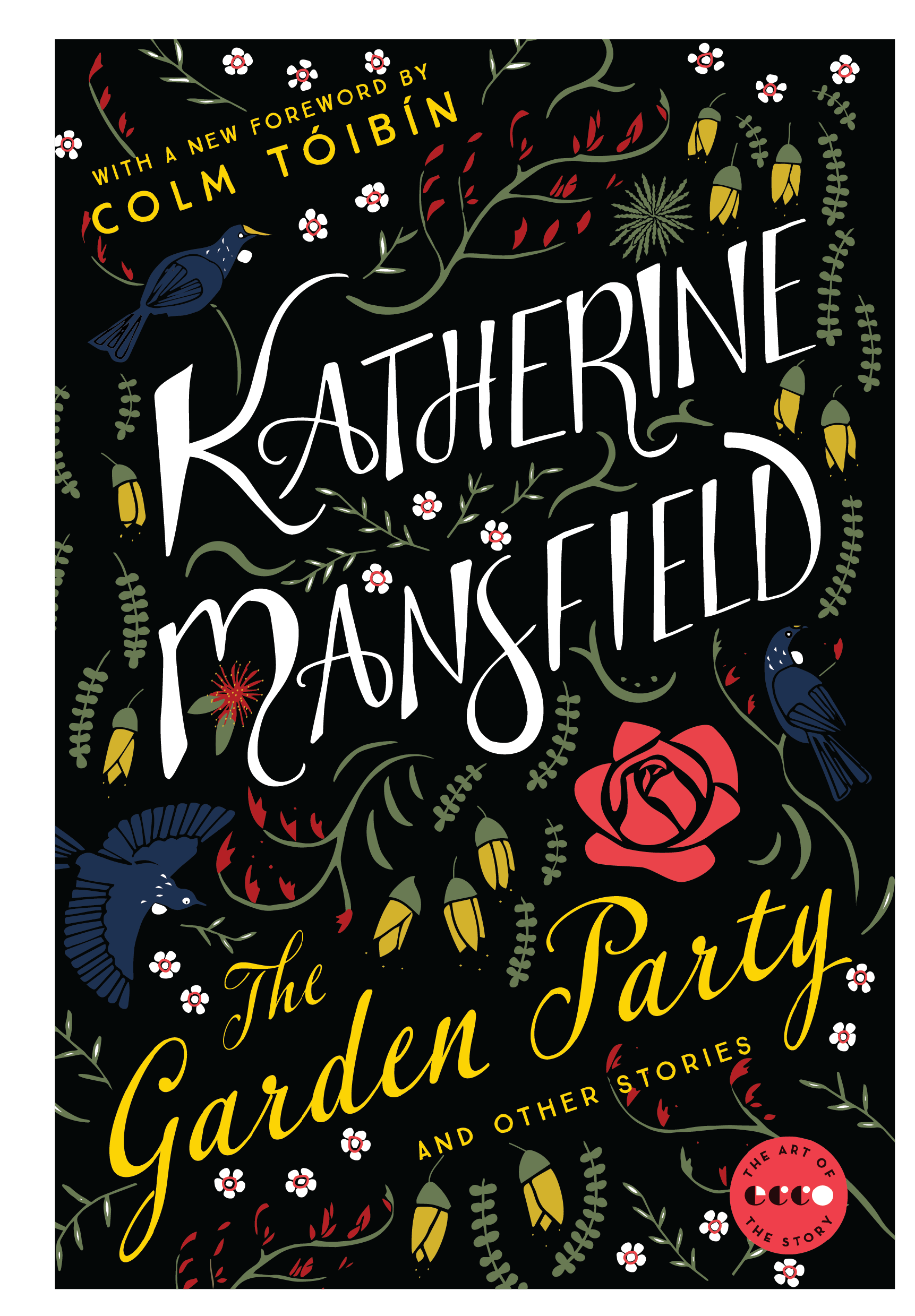
And here's the finished result! You can be sure that I will be sharing pictures of the paperback when it is published.